Before & After: 3 NYC apartments get a photo facelift

Subscribing to the truism that a picture is worth a thousand words, the job of a real estate photographer is to brighten up apartments and make them more drool-worthy.
Of course, there are tricks of the trade. We turned to Elizabeth Dooley, a real estate photographer in New York with VHT Studios, to get a better idea.
Dooley has been called in to photograph thousands of properties and here, in some of her before and after shots, is proof of the magic she can do with her camera.
"Apartments are supposed to be in open house condition when the photographer gets there, but that's often not the case," Dooley says.
She regularly walks in to cluttered, badly lit, cookie-cutter type apartments. Her challenge is to show what is unique about the apartment, to bring the light in, show it at its best.
“I like design, “ she says. “I usually concentrate on the design features in my photos. Sometimes I have to do some staging, too. Clutter is usually the main problem.”
"Sometimes with the high-end properties, I'll have a stager there to help, but in the majority of cases I have to manage pretty much on my own," she says. "I'm known for scavenging apartments to find the right props, even taking oranges out of the fridge to put on the countertop.
Click through the slideshow to see some of the work Dooley's done.
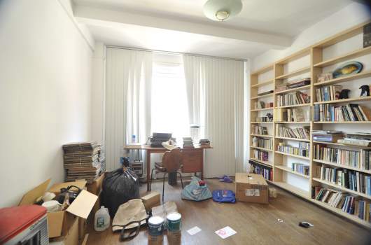
BEFORE- Bedroom Located in a two-bedroom, one-bath apartment on the Upper West Side, this room was in a right-before-the-move mess and there was no way to see what the view was outside the window in front of the desk. The bookcase had lots of things in it the viewer didn’t need to see, including that tacky fish plaque.
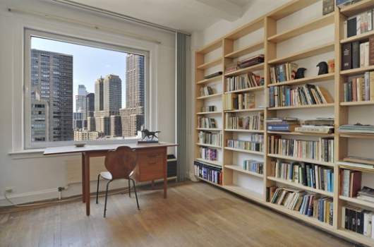
AFTER- Bedroom Dooley’s photo emphasized the great view. She straightened out the bookcase, swept open the ugly vertical blinds, shot at an angle that hid the pile or record albums, and cut out the not very attractive light fixture.
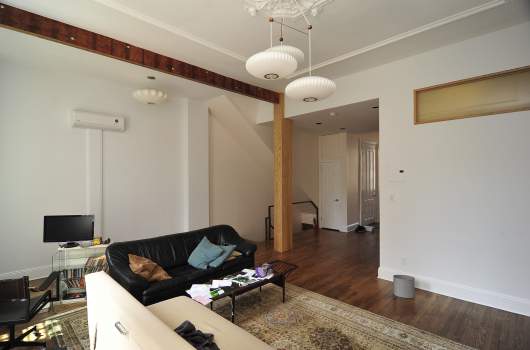
BEFORE-Living room The parlor floor of a three-bedroom Brooklyn townhouse. The sellers had recently divorced and the place looked disheveled and picked over when the photographer arrived.
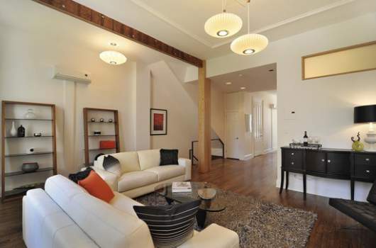
AFTER- Living room To show how one room leads gracefully to another and communicate a sense of openness, Dooley straightened up and decluttered, added an open bookcase and excavated the glass table. She also swapped out a black sofa for a white one in order to lighten the space, and changed a beaten-up oriental rug to a shag.
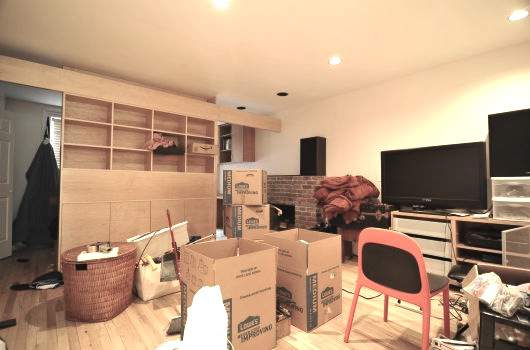
BEFORE- Den at first glance, it's hard to tell what the basement level of the townhouse is for. And what's that weird room in the back?
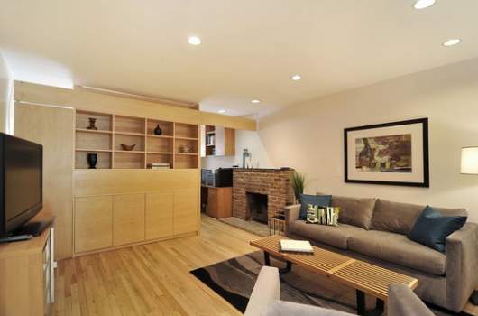
AFTER-Den Dooley made the room into a den. She angled the television to give perspective, emphasized the fireplace, closed off the “weird room” and made sure to make it apparent that there was room for a home office next to the fireplace.
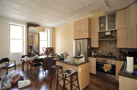
BEFORE - Kitchen Here is the kind of clutter that Dooley often encounters. Besides the problem with the mess, which included a murky aquarium on the kitchen island and straggly plants, the kitchen looked dated.
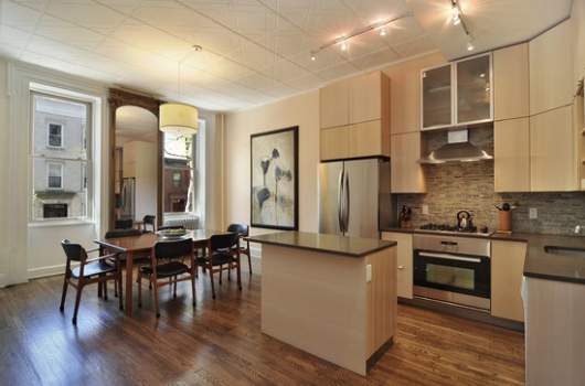
AFTER- Kitchen Dooley got rid of the stools, put art up on the blank wall, corrected the color temperature of the shot and made the view from the windows visible.
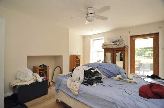
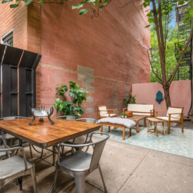
BEFORE - Master bedroom Besides the mess (that the photographer cleaned up with the help of stager Marlene Gold), the way the bed was positioned made it impossible to get to the backyard space without a detour. The odd looking nook in the wall made no sense and didn’t add anything to the room.
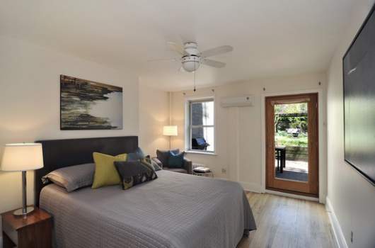
AFTER-Master bedroom Moving the bed accomplished two things: it covered up the odd nook and gave the viewer a good look at the now-accessible outdoor space. She put the chair in the background to show that there is room for a reading nook with an appealing view of the outdoors. She also made the grill outside the window visible to help the viewer imagine how much fun it would be to have a barbecue in the back yard.
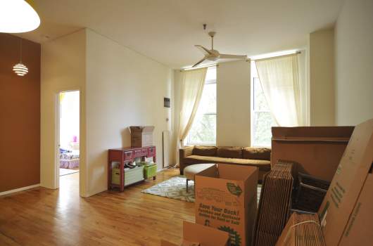
BEFORE-Living room This two-bedroom, two-bath apartment in Brooklyn needed some work. You don’t get much of a feel for the view out of the living room window in this shot and you can’t tell that there’s a nice green view from the bedroom window as well. The light is bad in the first shot and the walls are much too bare.
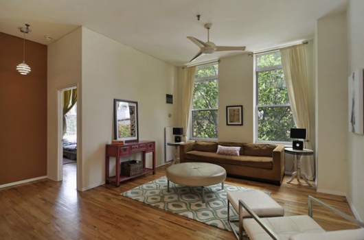
AFTER-Living room This shot shows how green the view is from the living room and lets you see that there’s a similarly verdant view from the bedroom. Dooley scavenged the rest of the apartment for furniture to add to the shot and she cooled the light down. One of Dooley’s favorite “tricks” is to lean a piece of art up on a table.
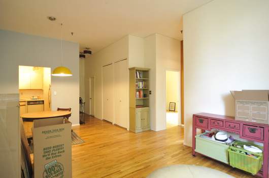
BEFORE-Living room This two-bedroom, two-bath apartment in Brooklyn needed some work. You don’t get much of a feel for the view out of the living room window in this shot and you can’t tell that there’s a nice green view from the bedroom window as well. The light is bad in the first shot and the walls are much too bare.
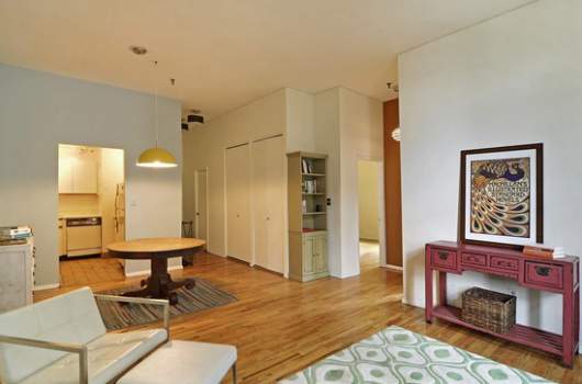
AFTER- Living room/dining area The final photo shows how the space flows from kitchen to dining area to living room. The flow of space is central to any good shot.
Related:
4 photo staging tips for serious sellers
How to make a killer video of your apartment (and why you should)

