Apartment entryway a mess? Here's how to add organization and style
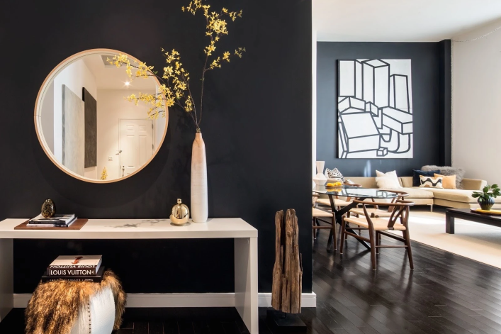
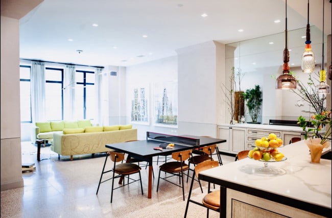
Apartments with open floorplans often lack a distinct foyer, like this Union Square loft, where Interior Marketing Group painted the entry wall a deep charcoal to define the space. Decorative elements help the space make a statement.
Evan Joseph
Entryways in New York City apartments and townhouses are typically given short shrift—even a true foyer might lack obvious storage capabilities. Newer developments tend to forego foyers altogether in favor of offering a large, open living space. Yet the entry is your home's first impression, so who wants it to signal disarray and disorganization? It's also the last place you see when you leave, ideally without having to hunt down your Metro card or car keys.
What's more, the hallway is off limits in most apartment buildings, meaning you need a parking place for the stroller and kids' sporting gear. Sometimes the laundry room or mudroom (we've got tips on how to add one) can do the heavy lifting, but more likely the entry bears the brunt of daily life.
“Entryways that are stuffed with coat and shoe racks can feel chaotic," says Adam Meshberg, principal of Meshberg Group, an architecture and interior design firm specializing in new developments and historic restorations. He advises New Yorkers to think about the entryway as the mood setter for the rest of the home—i.e., keep it clean but warm and inviting.
Cue the clutter-free chorus: "Entries are a special thorn in my side and point of pride because it's important to have everything very orderly and within reach," says Carolyn Pressly, principal of Carolyn Pressly Interiors. Meaning nobody needs to see that jumbled mess. An organized entryway "allows the house to flow and be organized in a more comfortable way," she says.
And while custom cabinetry is the de facto choice, it's not the only route. (IKEA being a popular detour, especially for affordable dual-purpose shoe storage.)
"For tight spaces with no or little closet space, being rigorous and creative is key," says Jennifer Jean Morris, principal of JMorris Design. For her, having a surface that can capture keys and mail, even if it’s just a shelf, with baskets below that you can toss shoes in and a few wall hooks can be a start. Ottomans with storage inside can do double duty.
You are also encouraged to imbue this transitional, contained space with serious personality. Here is where you might want to go for broke—or to at least go bold. Bonus points for having one wow factor—be it a striking pendant or wallpaper.
Read on for Brick Underground's guide to creating an entry or mudroom that strikes a balance between form and function, no matter your dwelling or design sensibility.
Creating an entry moment where there is none
No designated entry? No problem.
"You don't need four walls to fake a foyer, all you need are some strategic appointments," says Christina Slater, creative director at luxury real estate design and property marketing firm, Interior Marketing Group.
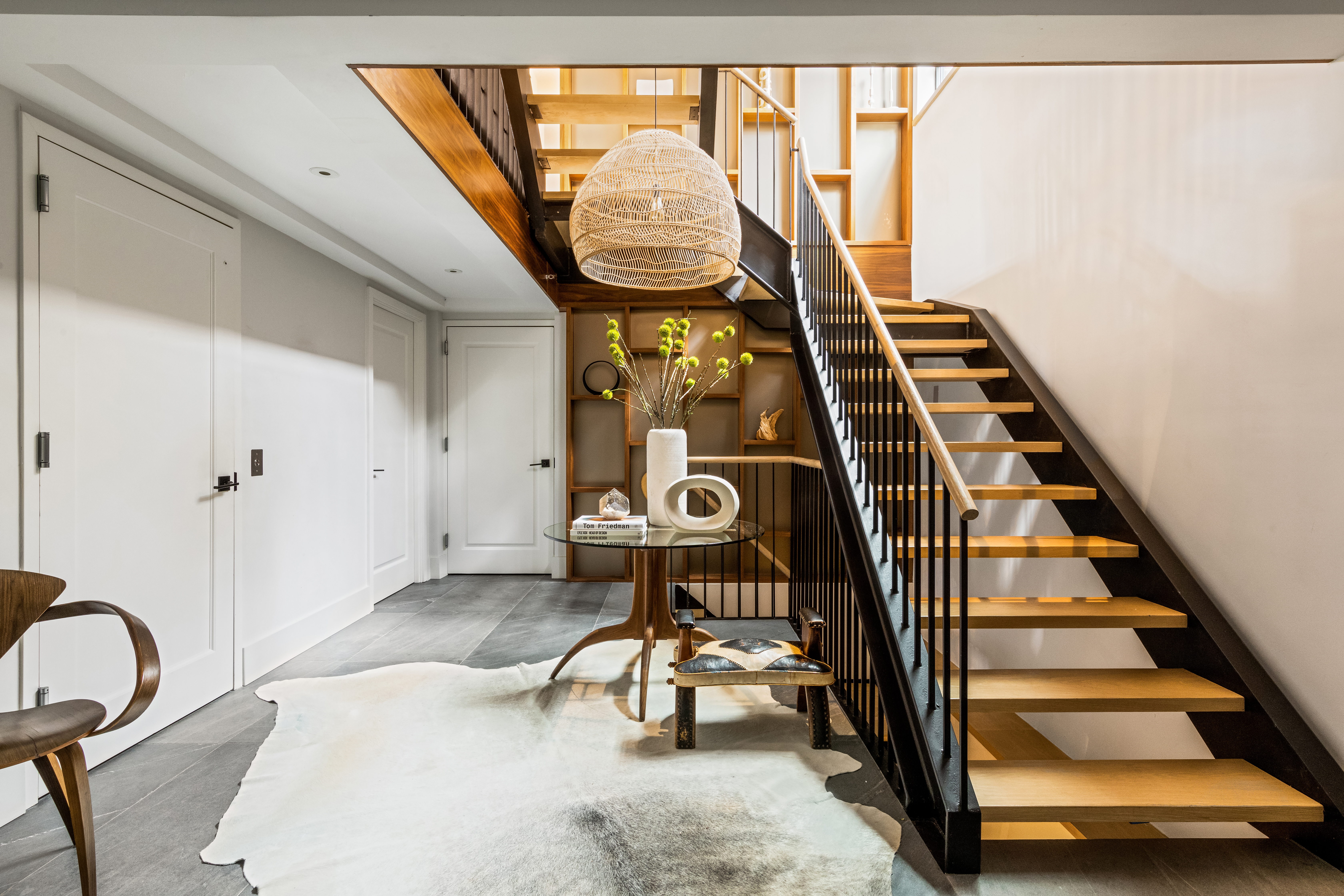
She shared her staging trick for creating an instant entry: Park a "foyer table"—preferably a round one—near the entrance; appoint it with a large spray (aka floral arrangement), a couple coffee table books, and an organic catch-all bowl; and tuck an ottoman or stool underneath. Such was the solution for a Cobble Hill townhouse (above), where the entry was essentially the landing space between the stairs. Of course, an existing closet allows this minimalist approach to work well in real life.

The foyer table idea also works to ground a larger transitional space, such as in a Sag Harbor home that lacked a traditional foyer (above).
When there's not enough room for a round table, Slater will opt for a slim console with a couple ottomans tucked underneath (see photo at top). She (and others) will add a mirror whenever possible too. "They always open up a space, plus subconsciously everyone wants to look at themselves before they leave the house." (She says Anthropologie has awesome mirrors at all times. Or check out CB2's vast selection.) A full-length mirror lets you walk out and call it a day.
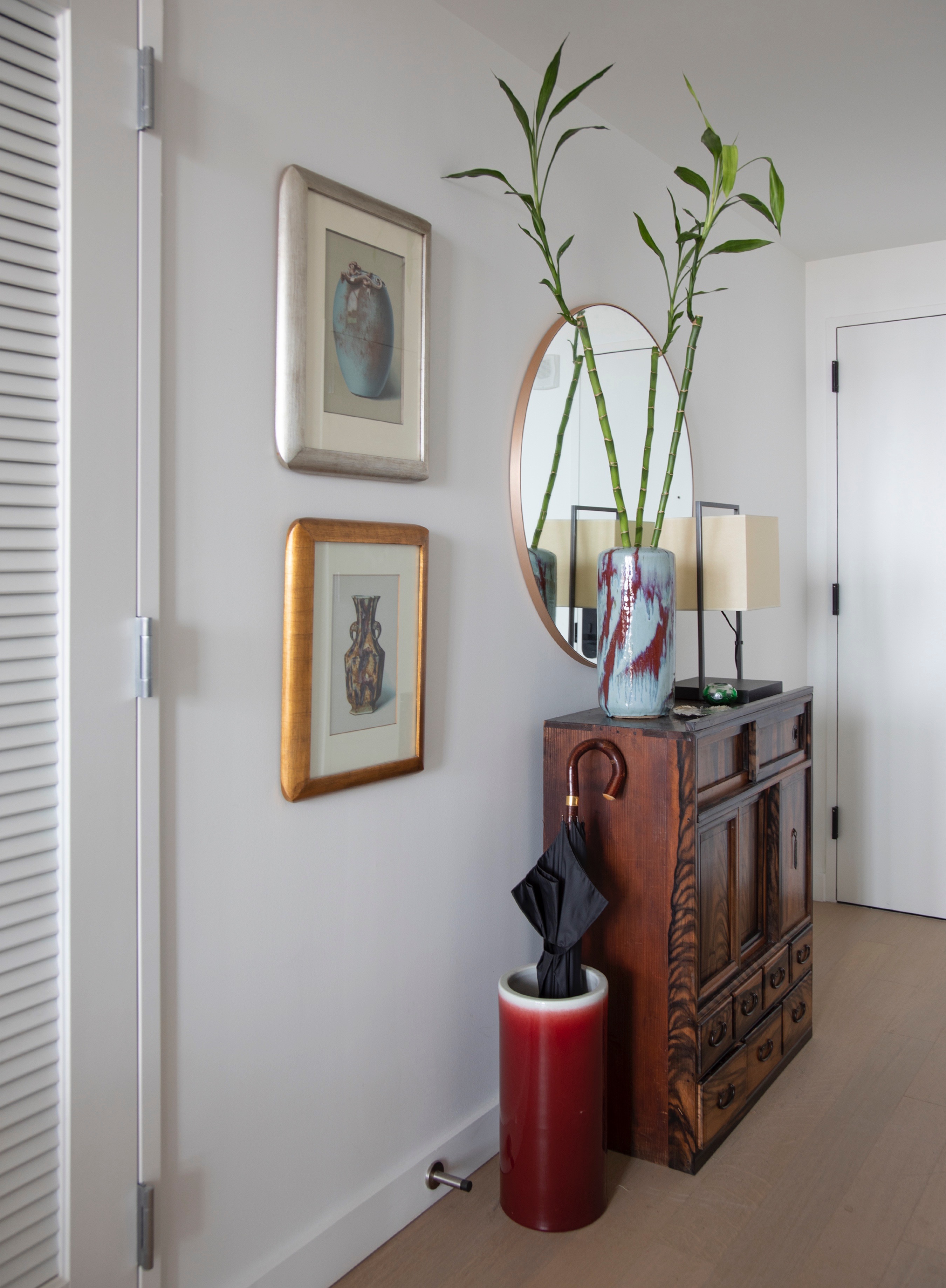
Manhattan-based interior designer Perry Sayles takes a similar tack in space-deprived footprints.
"You can create an entry moment in just two square feet and with a piece of furniture," he says. That was his solution for a pied-à-terre in a new development where one entered through a galley kitchen. There he put a Japanese chest and an umbrella stand (above). He is also fond of having a lamp that you can leave on for a cozy touch when you come home. (Use LED bulbs to conserve energy or control it with your smart home assistant.)
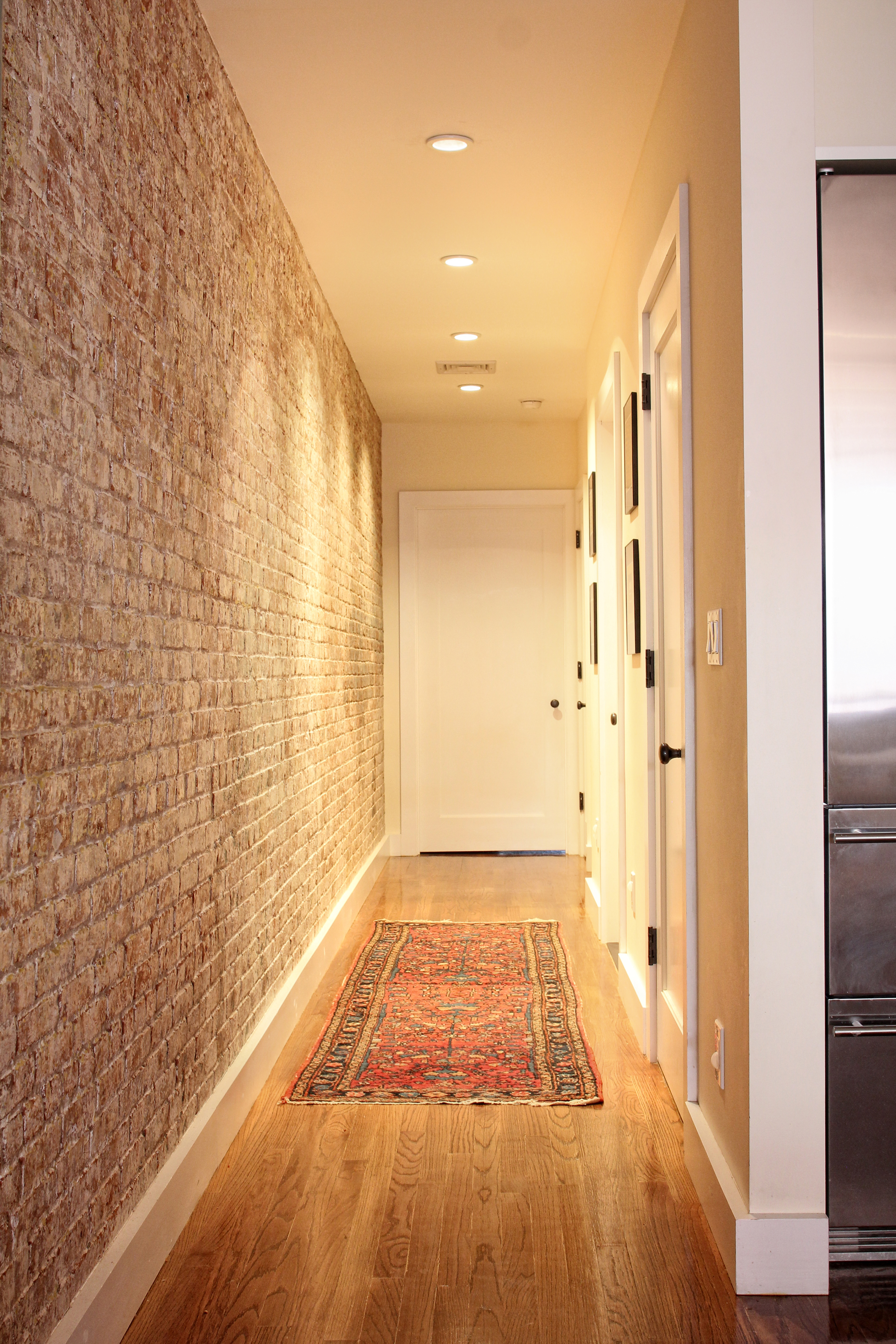
Meshberg also likes to use lighting to make an entryway more inviting. For example, in a Jay Street loft-to-condo conversion project (above), the elongated hallway has warm lighting along the ceiling, "creating a welcoming pathway that opens up to the rest of the unit," he says. This certainly beats being confronted with a pile-up of shoes (which here can be kept behind the closet door).
Adding storage in lieu of a hall closet
"Just because your entry area is pea size doesn't mean you can't do anything," Slater says. In those instances she likes using slim floating shelves from Room & Board, many of which have a latch for you to put your keys or rest a mirror on top. She also recommends LACK floating shelves by IKEA, which come in various sizes. "These clean up the floor space in a tight apartment," she says.
Wall hooks and peg rails are other options. For a brand new townhouse in Fort Greene where the entrance was effectively the dining space, Sayles applied shiplap paneling on the wall inside the front door to help define the space, adding hooks for the kids. "Because if you put hooks on the sheetrock wall it's going to get scratched all the time, so applying shiplap with a couple coats of higher gloss paint boosts the durability," he says.
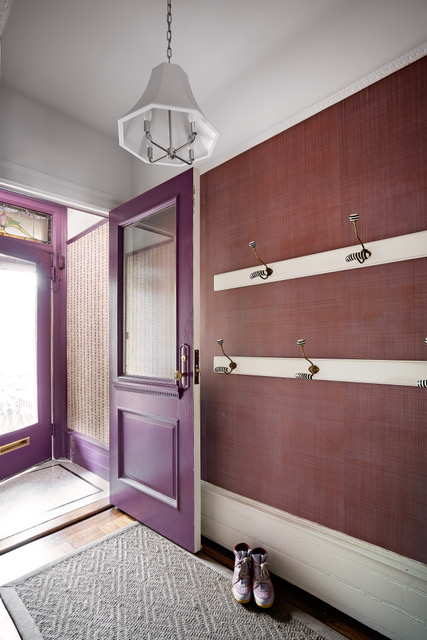
Morris too relied on wall hooks in the entrance of a Windsor Terrace brownstone (above). The white wood panels were added for the hooks to really hold onto—a good idea if you plan to hang heavy coats and backpacks on them. (The grass cloth wall covering will also mask the wear and tear on bare walls.)
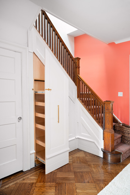
And because there was no room for a cabinet or other hidden storage in the same entry, she carved out a solution around the corner, under the stairs. "It’s like a pull-out pantry for your shoes," Morris says. Indeed, that otherwise underused space is ideal for adding drawers, should that describe your situation.
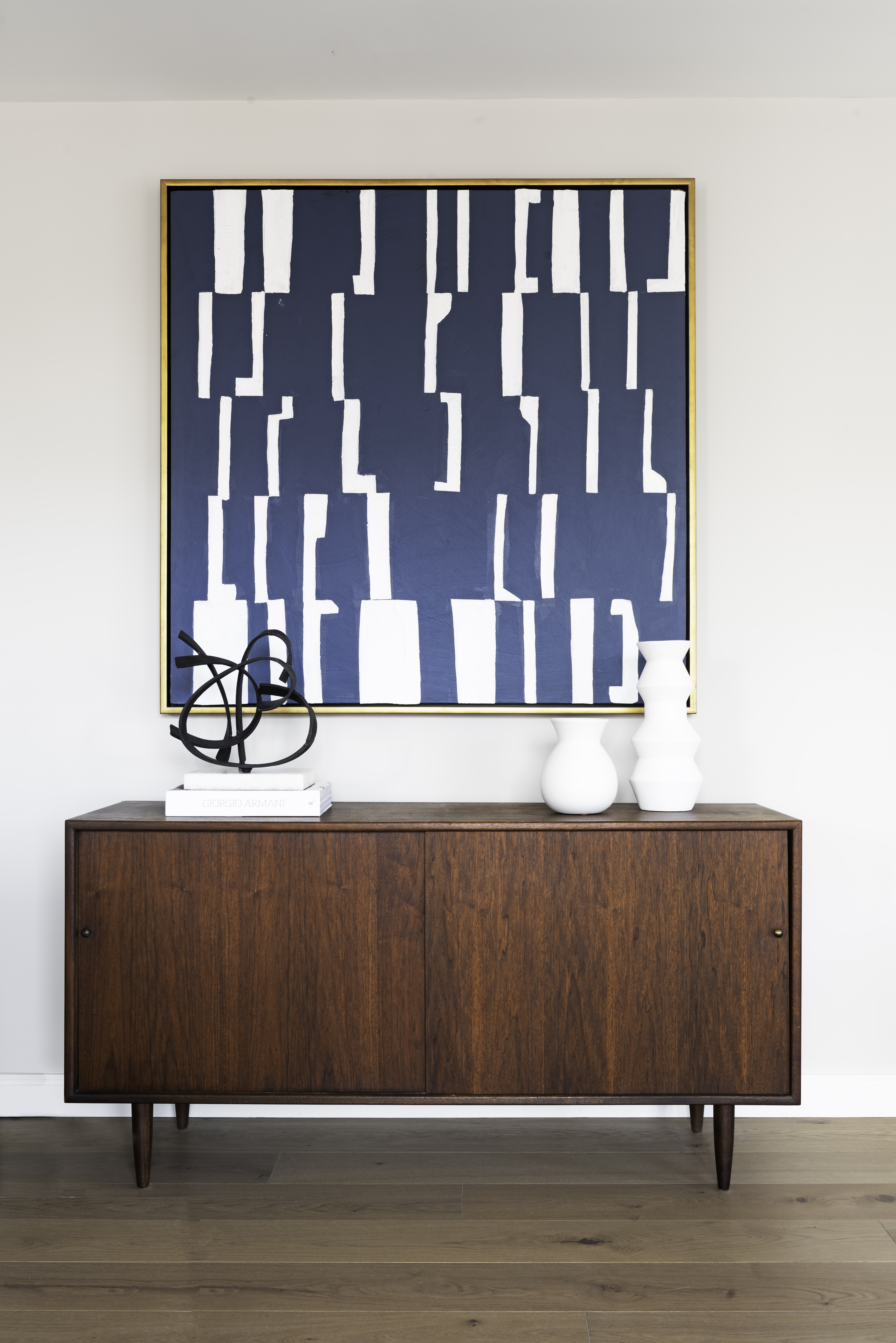
Otherwise, if space allows, Slater prefers to have a credenza in the foyer, especially if there is no hall closet. "The top serves as a drop zone with concealed storage below," she points out. The abstract artwork adds visual interest.
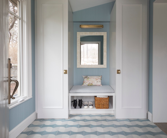
Using built-ins for hidden storage
Creative millwork is the gold standard—it can be designed to use every available inch and to meet your specific needs.
Morris added an all-in-one custom unit with cabinets and open storage bench in a spacious foyer of a Bronx house renovation (above), with flooring that is decorative and durable.
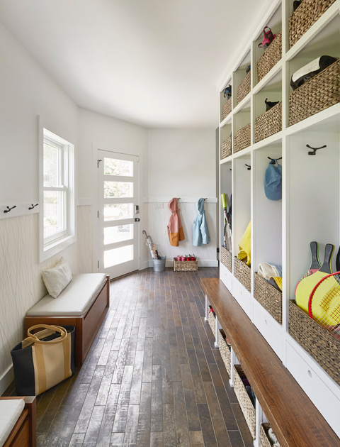
For an extended entry in a house in Larchmont, Morris opted for an open-cubby design, concealing the contents in coordinated bins. This way the kids can easily grab—and put back—their gear. "It's a great example of how you can make slim areas work for you," she notes.
If custom is not in the cards, consider off-the-shelf alternatives, such as Nolan Entryway modular pieces by West Elm or Room and Board's Hover Wall-Mounted Cabinet.
Adding a mudroom (yes, in the city!)
Space and budget permitting, a mudroom is a veritable NYC fantasy—and not just for townhouse owners.
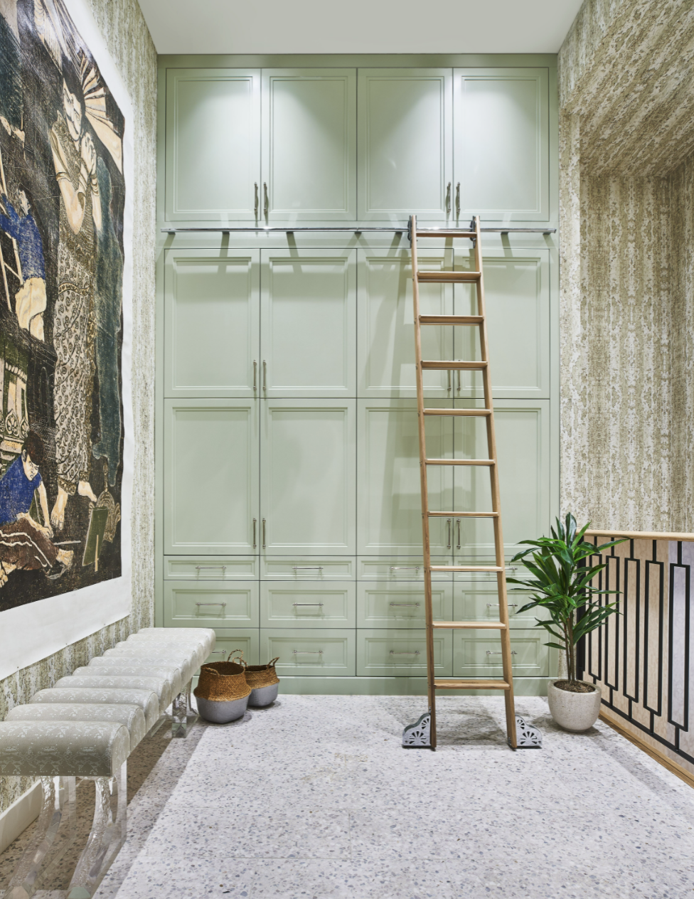
Jenny Kirschner, principal of JDK Interiors, added a mudroom in her own Dean Street loft, fitting it out with a floor-to-ceiling built-in with drawers and cabinets that are easily accessible to kids. "This can be decorative and functional, and in a smaller space you could just have a custom storage bench with room for drawers and shoes below," she says. (Check out the The Container Store for budget, space-saving options.)
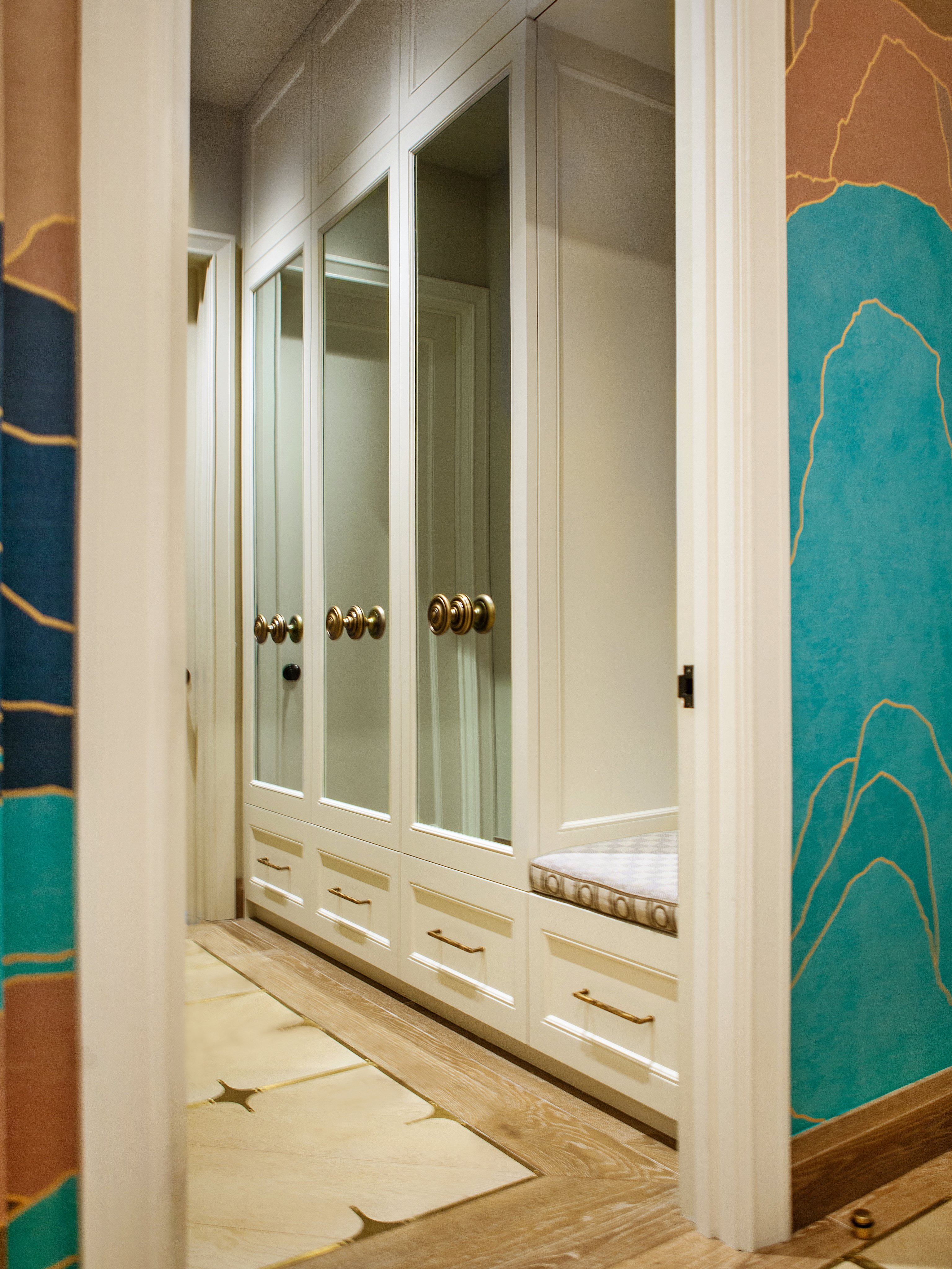
When possible, Pressly likes to build in a mudroom that's off the entryway but not visible as a way of keeping the entry clean and organized. In her Tribeca loft, for example, she installed custom cabinetry to hold her kids' sporting gear, winter coats, and the like, with pull-out drawers along the bottom for shoes they wear with higher frequency. "To keep massive amounts of built-ins from looking too monolithic, I conceal them with mirror panels, which also bounces light around and expands a smaller space," she says.
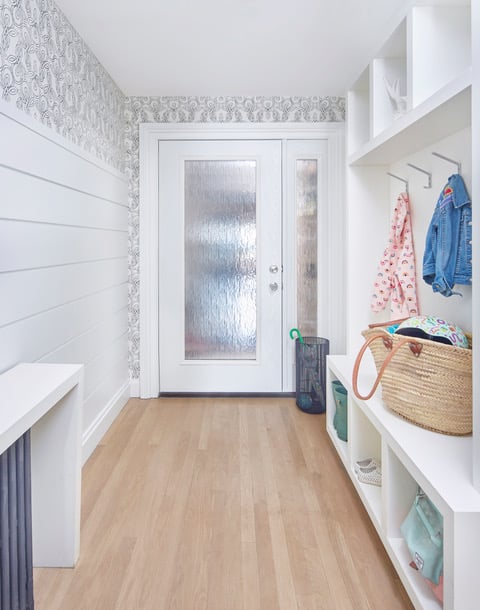
You do have a bit more leeway in a townhouse, where the mudroom can be the back entry. You can even build a space under the stoop stairs in a brownstone! Morris created just such a garden-level entry for a Clinton Hill brownstone (above), with custom built-ins; the covered radiator serves as another drop zone.
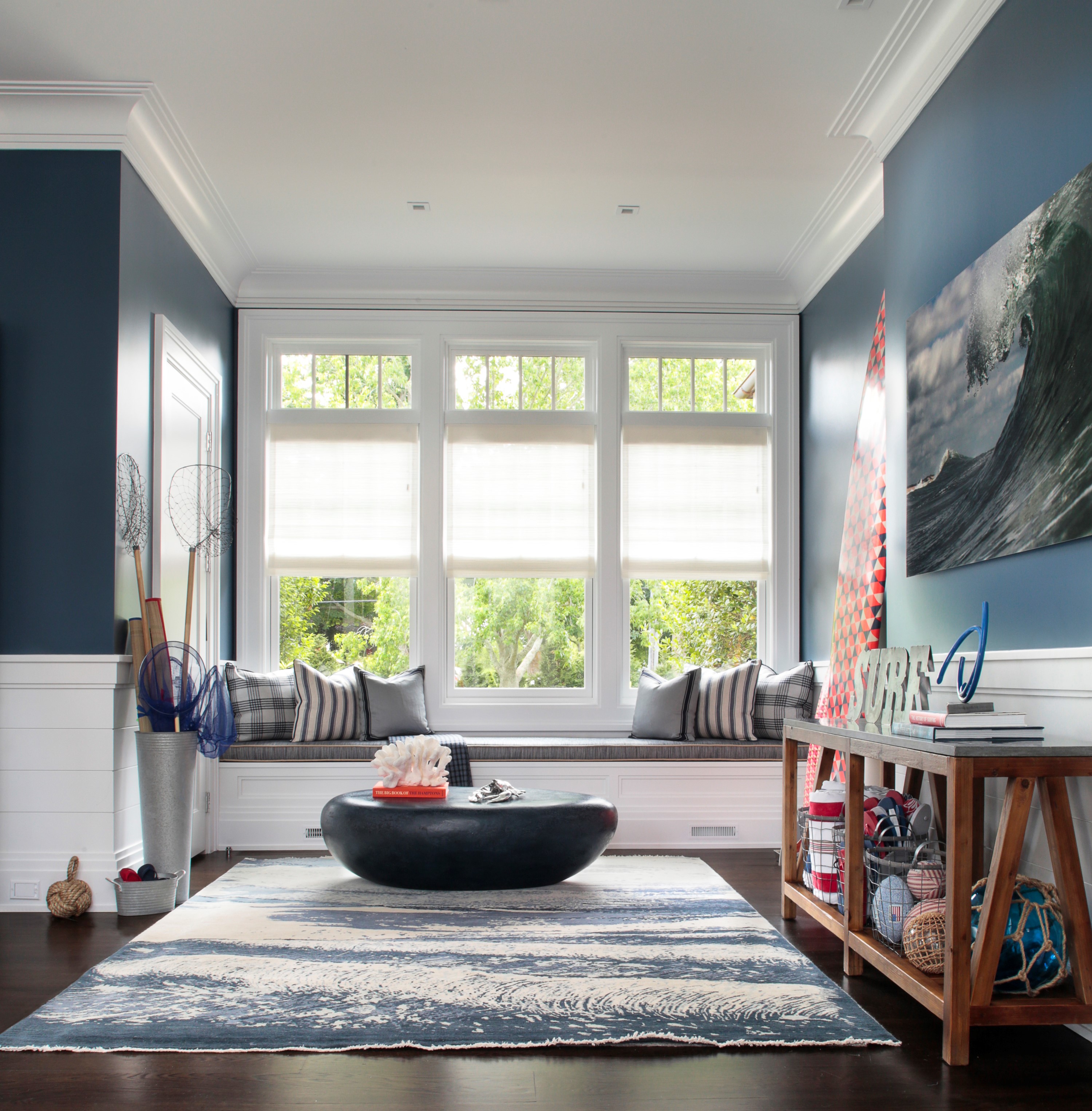
And if you happen to have a second home, a mudroom is practically a must. For the above Hamptons mudroom, Melanie Roy, principal of Melanie Roy Design, used wire bins to hold sunscreen, pool toys, and beach gear. Once the weather gets cooler, these bins can also be used to store hats, gloves, and umbrellas. "We also incorporated a window seat made out of Sunbrella performance fabric so you can come in from the beach or pool, sit down, and not have to worry about your wet bathing suit destroying the fabric," she says.
Making a statement with wallpaper
Every single designer Brick spoke with recommends wallpaper in the entry.
"This is where you can use a really fun pattern because you won't tire of it unlike in a living room or bedroom," Slater says. Plus a bold pattern actually makes a small space feel larger and more impactful, and can help unify all the different components (and distract from any clutter).
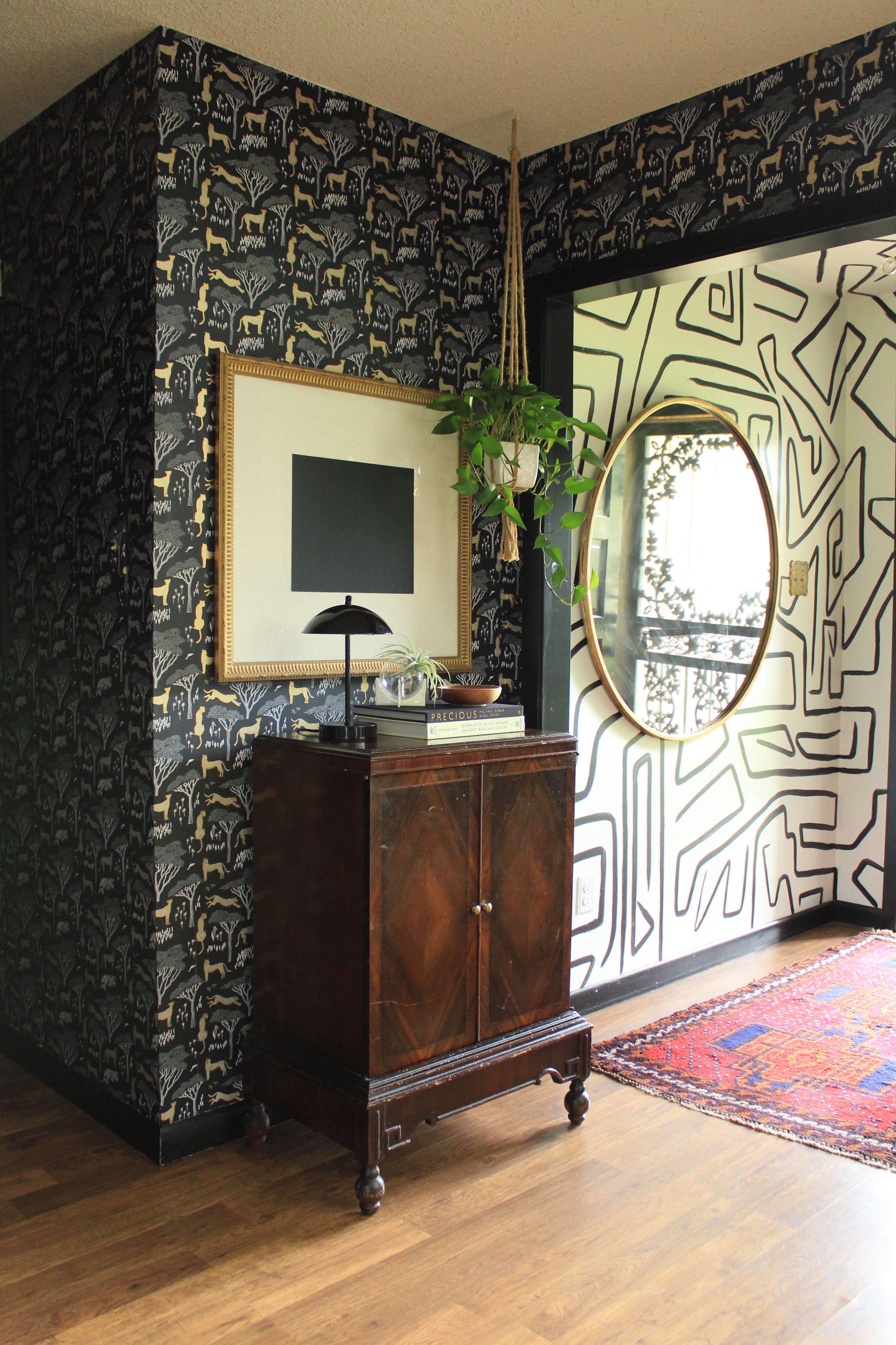
Aimee Lagos, co-founder with Christiana Coop of Hygge & West, a boutique wallpaper and home goods company, says foyers are a popular space for wallpaper because there tends to be a delineation there, and people struggle with transitions. She is especially fond of pattern mixing as an excellent way to create a flow, especially when you can see both patterns at the same time and they have something similar, such as the color, the pattern, and/or the style—preferably all three! "The example above by designer Cameon Hamilton works because the two papers share black grounds and the themes are not disjointed." (The wallpaper on the left is Serengeti by Hygge & West; the designer hand-painted the pattern on the right herself.)
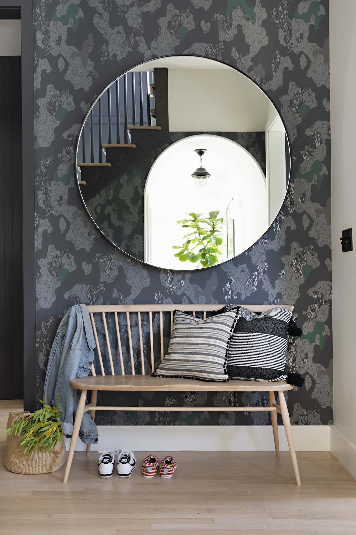
Wallpaper can also be used more for texture and color, as in the above example (designed by Raili Ca Design using Hygge & West Sycamore paper in slate). "This pattern is somewhat abstract, so unlike with our narrative wallpapers you can put a huge element over it like the mirror without losing a sense of what the wallpaper is," Lagos says. And even though the mirror is covering some pattern, it is also reflecting a pattern. ("And there's this crazy showstopper bright yellow piano in the entry.")
Rest assured wallpaper is durable enough to handle mirrors as well as shaker peg rails and shelves. "You need it to function. You don't want to create a situation where everything is beautiful but you don't have a place to put your shoes or to hang your coat," she says.
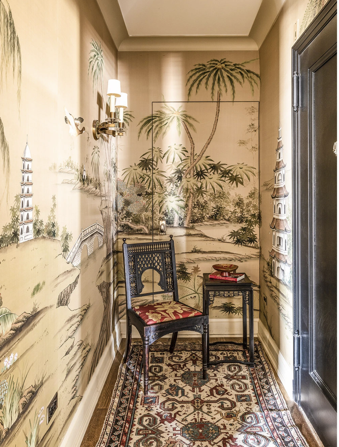
Wallpaper can also serve another function. Sayles covered the small vestibule (including closet door) inside the larger foyer of his prewar Chelsea apartment (above) with painted-silk Chinoiserie wallpaper from Griffin & Wong as a design statement—and because guests kept confusing the closet door with the exit.
If you find the whole "permanency" of wallpaper a drawback, know that modern technology has come a long way from your grandmother's chintz-covered days. Lagos says lots of clients remove wallpaper themselves and put that money towards a professional to put up the replacement.
Hygge & West even sells peel-and-stick options, which can be replaced on a whim. (Other sources or removable wallpaper include Chasing Paper and Spoonflower; West Elm offers multiple brands too.)
And if you are still gun-shy about wallpaper, you can make a statement with paint. Slater's favorite for foyers, where wall's suffer a lot of abuse, is Farrow & Ball's Modern Emulsion, billed as a washable, wipeable paint. (Same with peel-and-stick vinyl wallpaper.) You don't have to spend the money on Farrow & Ball in the whole house, just splurge here on the small space. "The colors are super rich too, so it will really saturate the space," she says.
Employ tried-and-true storage hacks
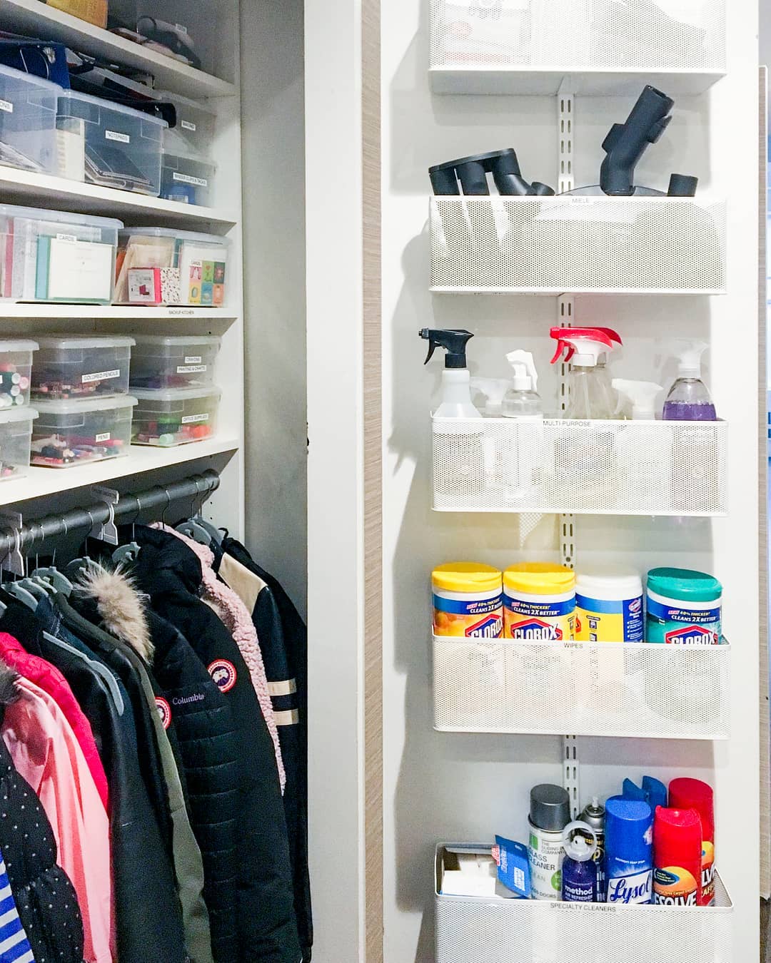
Fillip Hord, director of operations for professional home organization company Horderly, shared helpful tips and sources to allow your entry—and thus your home—to function better and save you time and money in the long run. "Our favorite hack is to use over-the-door systems—like The Container Store’s Elfa Over the Door Rack and Fabric Over the Door Shoe Bag—to create additional storage for shoes, cold weather accessories, pet stations, walking or running accessories, and more!" In one instance (above) he used the inside of the door to hold cleaning supplies and vacuum attachments, corralling craft supplies and other sundries in labeled bins on the interior shelves.
Other of Hord's suggestions include:
- To make your closet look and feel more organized, use wooden coat and suit hangers for all your hanging items. If you’re tight on space, use velvet hangers—the slim design allows you to hang more in a small space.
- Use Water Hyacinth Storage Bins with Handles or Acrylic Serving Trays with Handles (both from The Container Store) to serve as a “catch-all” in your entryway so everyone knows where to leave their smaller belongings when the day is over, and where to find them at the start of the next day.
- If you’re renting, Command Hooks are a great, damage-free solution to creating hanging space inside a closet for coats and jackets being worn regularly, or for accessories like hats and scarves.
- If your entry table has drawers, use hallow Drawer Organizers to create designated spaces for items like sunglasses, keys, wallets, and other items you may need to quickly grab for while walking out the door.
His ultimate advice? "Don’t feel obligated to make a certain closet what it’s 'supposed' to be—use that space for whatever your own needs are. If your hall closet is better served as a shoe closet or an extended pantry, then do that!"
You Might Also Like


