Want a child-friendly renovation? Here's how to do that without making it all about the kids
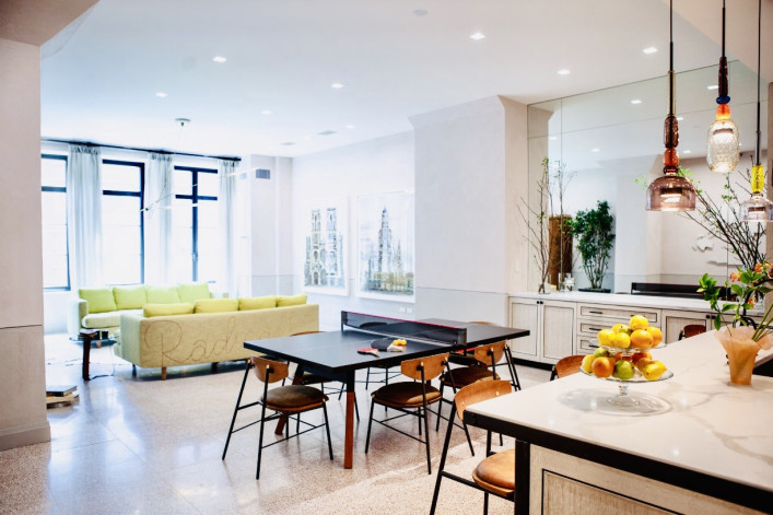
Family-friendly dining with a dose of humor (the ping pong net comes off and notice the writing on the sofa) in a Tribeca loft, courtesy of Carolyn Pressly Interiors.
Patrick Cline
If you have young children—or are expecting (congrats!)—you may be feeling the urge to renovate your New York City apartment or townhouse with their every need—and toy—in mind. And let's be frank: Being on lockdown with little ones only served to put any problem spots in your living spaces under the spotlight. So now that the city is opening back up again, these updates and improvements are likely on your front burner.
Reality check: Toddlers won't be toddlers for long. Instead, it's important to approach the project holistically and take a broader perspective. "Every person in the family is going to have different needs and yet you want a cohesive flow and design scheme," says Carolyn Pressly, principal of interior design firm Carolyn Pressly Interiors (and mom to two school-aged kids).
Certainly there are big-picture concerns—any kid-related reno has to address safety (um, to a degree) and especially storage. Integrated solutions are de rigueur among designers—they look great, save on floor space, and can be configured to match your blueprint. No budget for custom built-ins? Pros that Brick Underground spoke to have hacks to achieve the same end goal—hiding all that stuff—without breaking the bank.
Kid-friendly surfaces and materials are also important and now there are more dashing and durable options than ever to put in your own project. Or not—being a parent doesn't mean tearing up your design-purist membership card (spills and stains be damned!).
Those low-maintenance choices don't have to pervade every square foot either. Nathan Cuttle, principal and design director of architectural and design firm Studio Nato (and father of two toddlers), recommends focusing those design opportunities on the places kids gravitate towards—namely the kitchen and living area. That way you can incorporate the kids into the space without letting them overwhelm it.
To help in renovating your own NYC roost, Brick Underground plucked the following tips and tricks from design experts, some of whom have tested them out on their own brood. Read on and breathe easy.
Considerations around kid-proofing
Understandably, safety is topmost of mind for most new parents—and tends to be the first item on the agenda. Yet the pros here say it's important to meet your children's needs while being realistic. As in, you can't kid-proof everything.
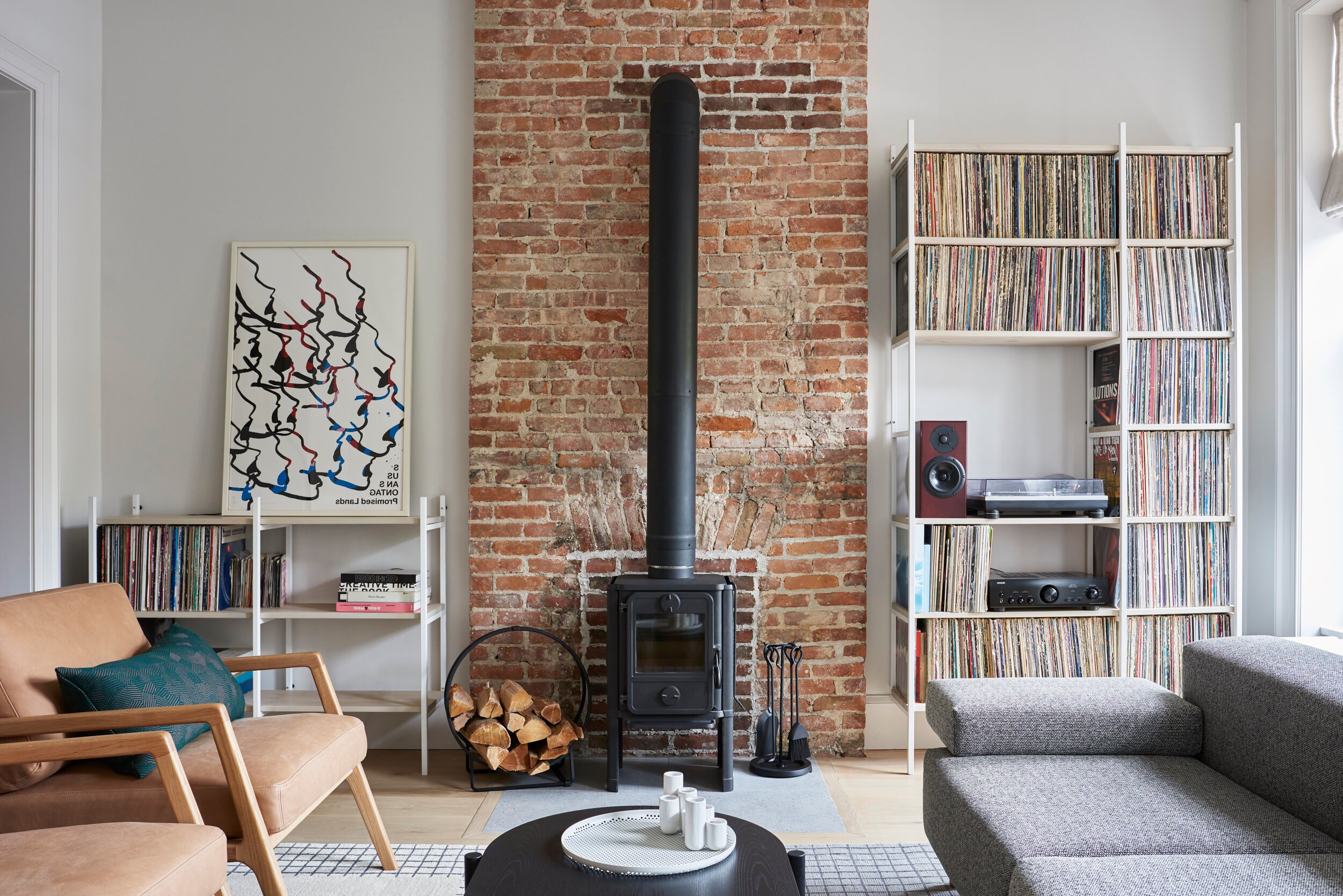
Such was the ultimate thinking by one of Cuttle's recent clients, who decided to keep the wood stove that came with their Bed-Sty townhouse despite having a baby in tow. (The husband had grown up with a stove himself and so had Cuttle.) They also left the radiators exposed and stocked the living room with a collection of (breakable and scratchable) vinyl. "Kids are supposed to do what they're not supposed to do in order to learn. If it's not a wood stove it will be something else," Cuttle says.
You may as well skip the (ugly) bumper guards too. Jenny Kirschner, principal of interior design firm JDK Interiors (and mother to two young daughters), says you can still do the marble coffee table but with a radius (slightly curved) corner, or go for round tables. You can also opt for upholstered pieces—for a rec room she roped four square poufs together and put a tray on top. Once the kids are older the poufs can be pulled apart and used as seating elsewhere. "It's critical to be thoughtful about bringing longevity to your project so the pieces evolve over time," she says.
For next-level safety, Pressly is fond of concealing electrical outlets (a definite danger to curious fingers) by installing them inside kitchen cabinets and bathroom vanities, something that also helps keep surfaces free of a jumble of cords. Same for incorporating docking stations in drawers in the entryway so everyone can park their devices there for the night. That's safety of another kind!

An open kitchen floor plan calls for sneaky storage
The open floor plan trend is still going strong, particularly among growing families.
"This conversation revolves around the way we live these days," Cuttle says. "Because the hub of the house tends to be the kitchen, we want to feel connected as a family by having the living room or play area just off of that."
As part of that scheme, Alan Berman, principal of architecture and design firm Archetype Architecture, says all of his clients—including the owners of a spacious Upper West Side prewar apartment (above)—want an island or peninsula that doubles as casual eating area and a crafts or homework station.
Thing is, as kids migrate to their kitchen perch, so do their supplies. That's where smart storage is called for, whether custom made to your specs or something more affordable (see ideas for those below).
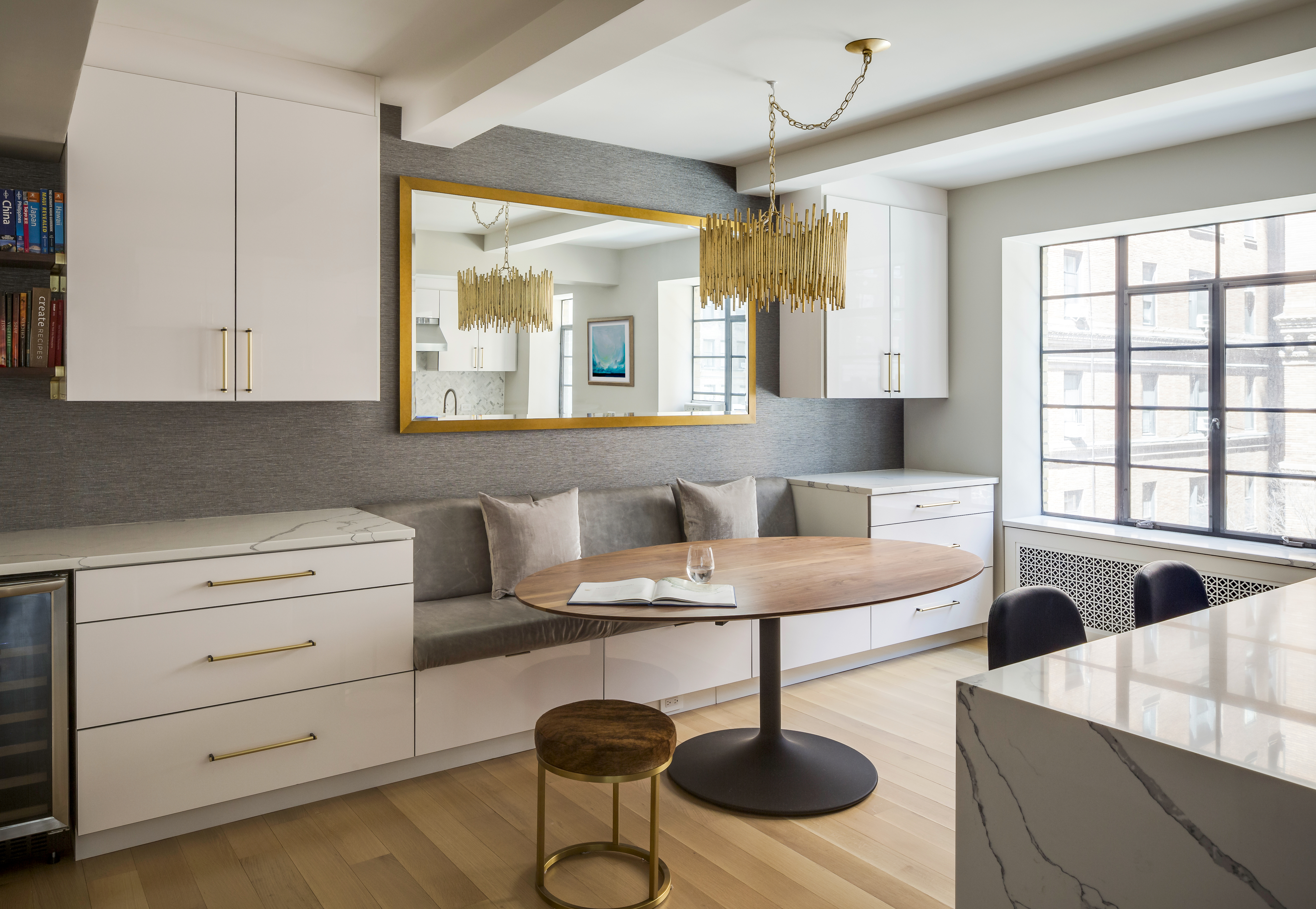
For the same West End Avenue apartment, Berman integrated a banquette into a storage system (above) so the kids have a place to stash their stuff—and another place to sit when the island's counter is needed for meal prep.
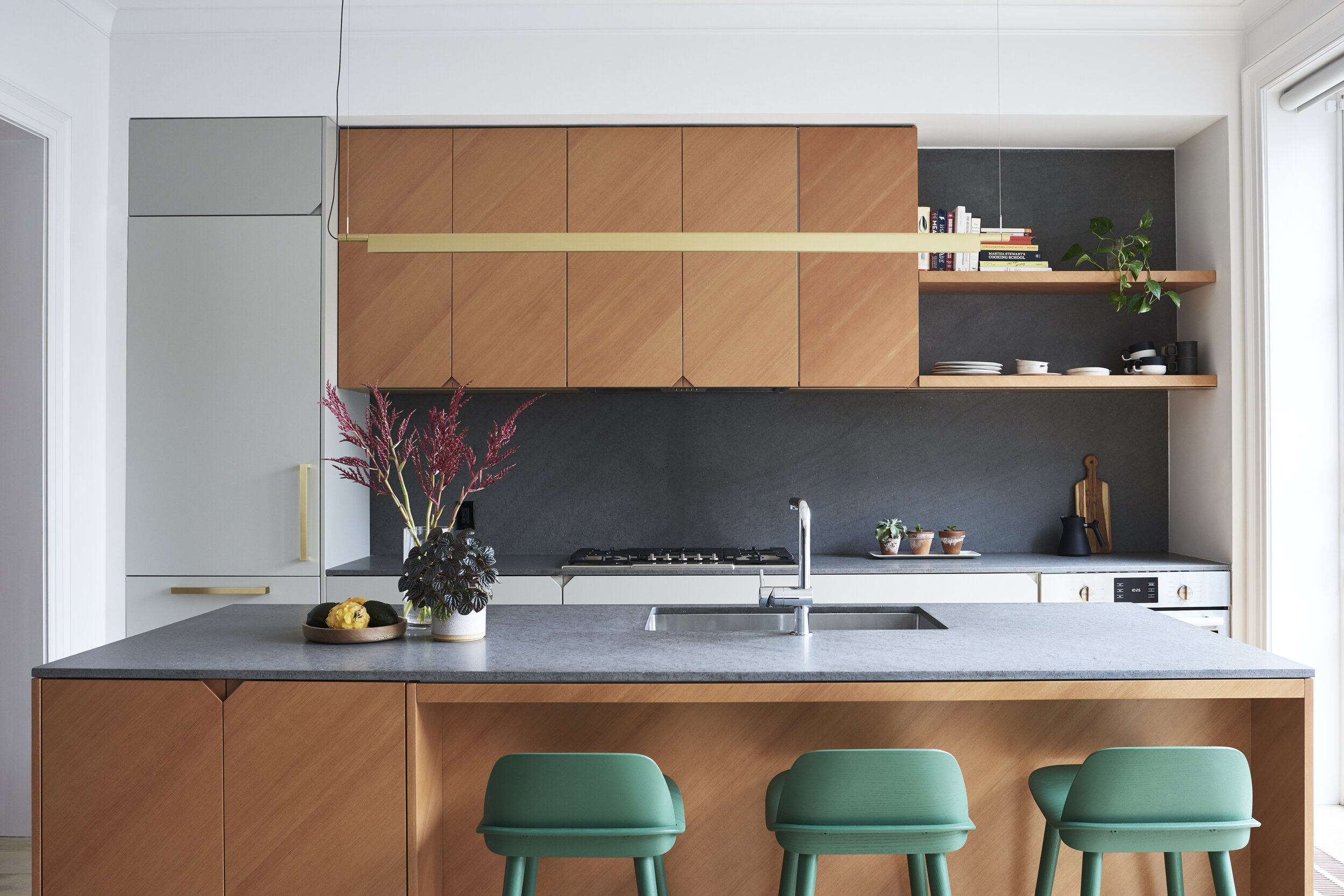
In renovating a Bed-Sty townhouse, Cuttle created extra cabinet space in the island itself (above) to house the kids' dishes and homework supplies. The integrated pulls are easy for little hands to manipulate and make it easier to clean fingerprint marks than around hardware.
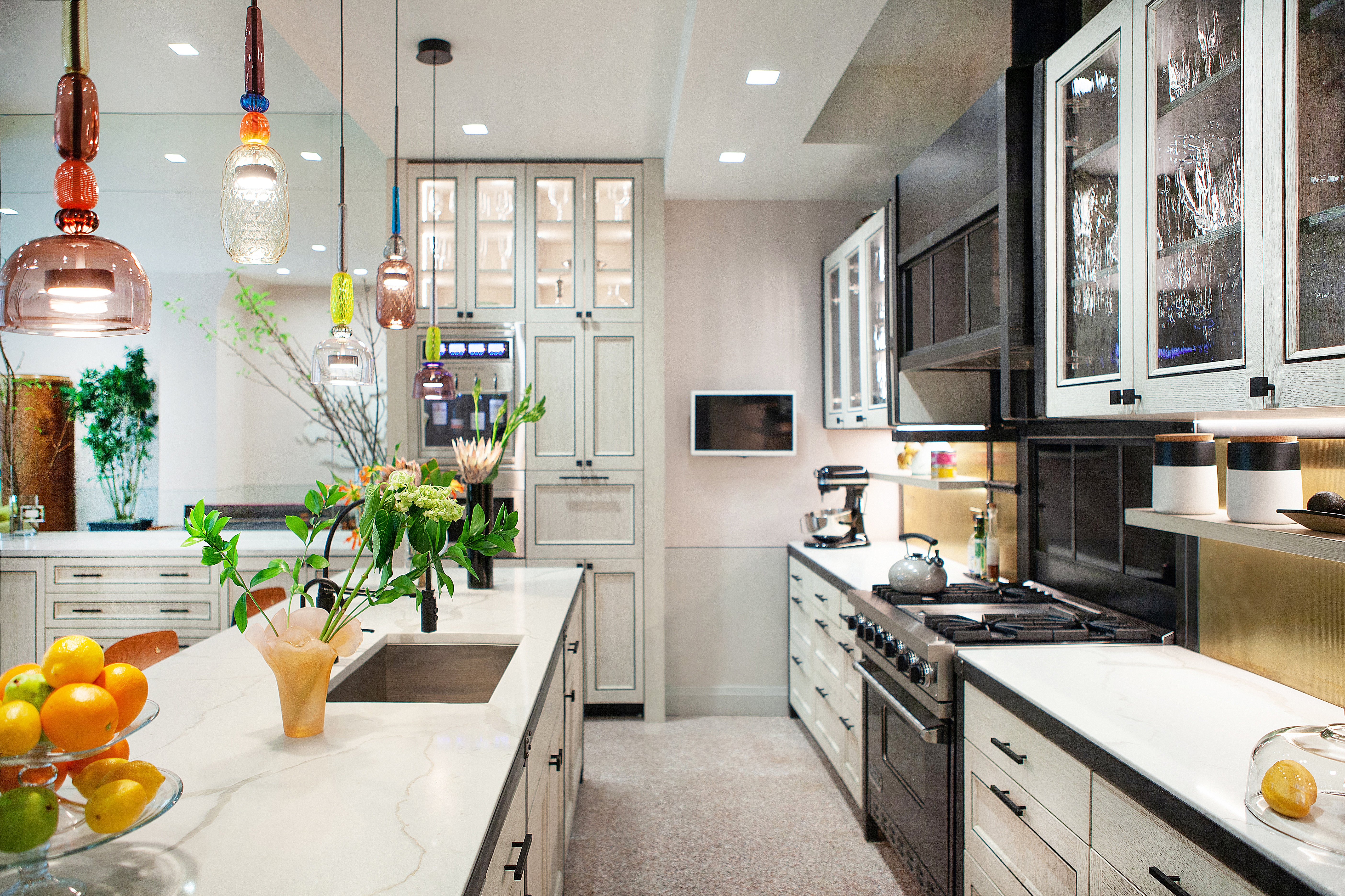
Pressly designed her own Tribeca loft kitchen (above) so child-friendly cups and dishware are concealed in the lower drawers, within easy reach. She also added a popular "snack attack" cabinet opposite those that is full of parent-approved noshes and refreshments.
"There are lots of sneaky camouflage ways to have a sleek and sophisticated kitchen without showing how useful it can be for children," she says. Plus being able to reach in and get their own sippy cup makes children feel good.
Some of her clients have even installed separate under-counter refrigerators for perishables like juice and cheese sticks. What's great is you can recapture all these spaces once the kids are no longer so little.
As for the actual cabinetry? Custom is only one (pricey) option.
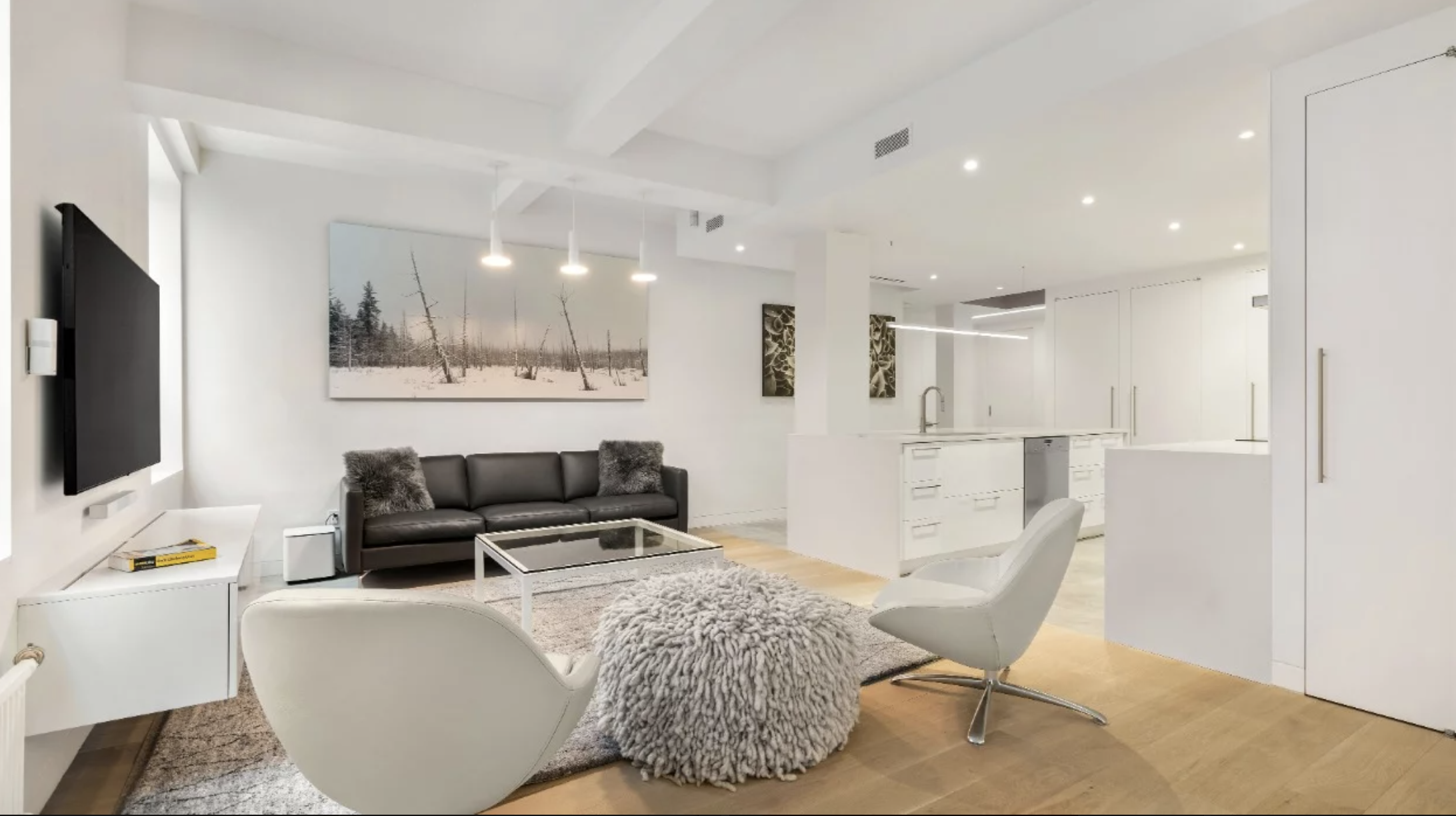
Niv Ben-Adi, principal of architecture and design firm Atelier036, says his firm uses IKEA SEKTION cabinets all the time—even in big-budget projects like a combination apartment in Greenwich Village (above).
"If the kid bangs the door with his scooter, big deal—just replace the door," he says.
Besides, he likes how the cabinets can be customized by a skilled contractor—not to the same degree as if custom made, but still. And if you protect the cabinetry with a good countertop, he says it will last for many years. (He went with a custom quartz slab here.) Here's another take away: The column by the island is painted with a layer each of magnetic and dry erase paint for displaying kids' artwork and to promote spur-of-the-moment creativity. He and Kirschner are also fond of using these paint products in kids' rooms, such as above a desk.
Opt for low-maintenance surfaces in high-traffic areas
Overall, the goal is to invest in materials that will enhance your property's value and also be kid friendly.
For the kitchen that mostly means composite surfaces like quartz—think Caesarstone and Silestone—as they tick all the right boxes: They are heat- and stain-resistant, antimicrobial, and anti-bacterial, and in many cases more energy efficient and eco friendly. Plus the designers here say that younger homeowners, who aren't as beholden to tradition, more readily lean into new technology and materials.
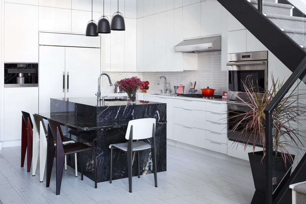
"It won't have the patina of marble or other organic materials, but I try and counterbalance that in other areas of the home," Pressly says. (You can read more about quartz and other alternatives to marble.) Berman, for example, used quartz in the kitchen shown above along with a glossy white cabinet that's easy to wipe down.
Pressly and Kirschner are also fans of quartzite, which is what is shown in Kirschner's Brooklyn townhouse kitchen (above). Note the drop-down ledge, a feature she repeats for clients with young kids. "Otherwise you need to get stools with a footrest so they can climb up by themselves." (Check out even more ideas for high-functioning kitchen islands.)
Berman suggests going with an "eased edge," which is ever-so-slightly rounded and hardly detectable, to soften those inevitable head blows.
Porcelain is having a big moment in bathrooms (walls, counters, and flooring). Or if you are dead set on marble—maybe in a shared family bathroom—Pressly suggests picking a stone with lots of movement, aka dark veining, rather than snow-white marble. The same goes for the kitchen. (Glean more reno tips for a shared bathroom.)
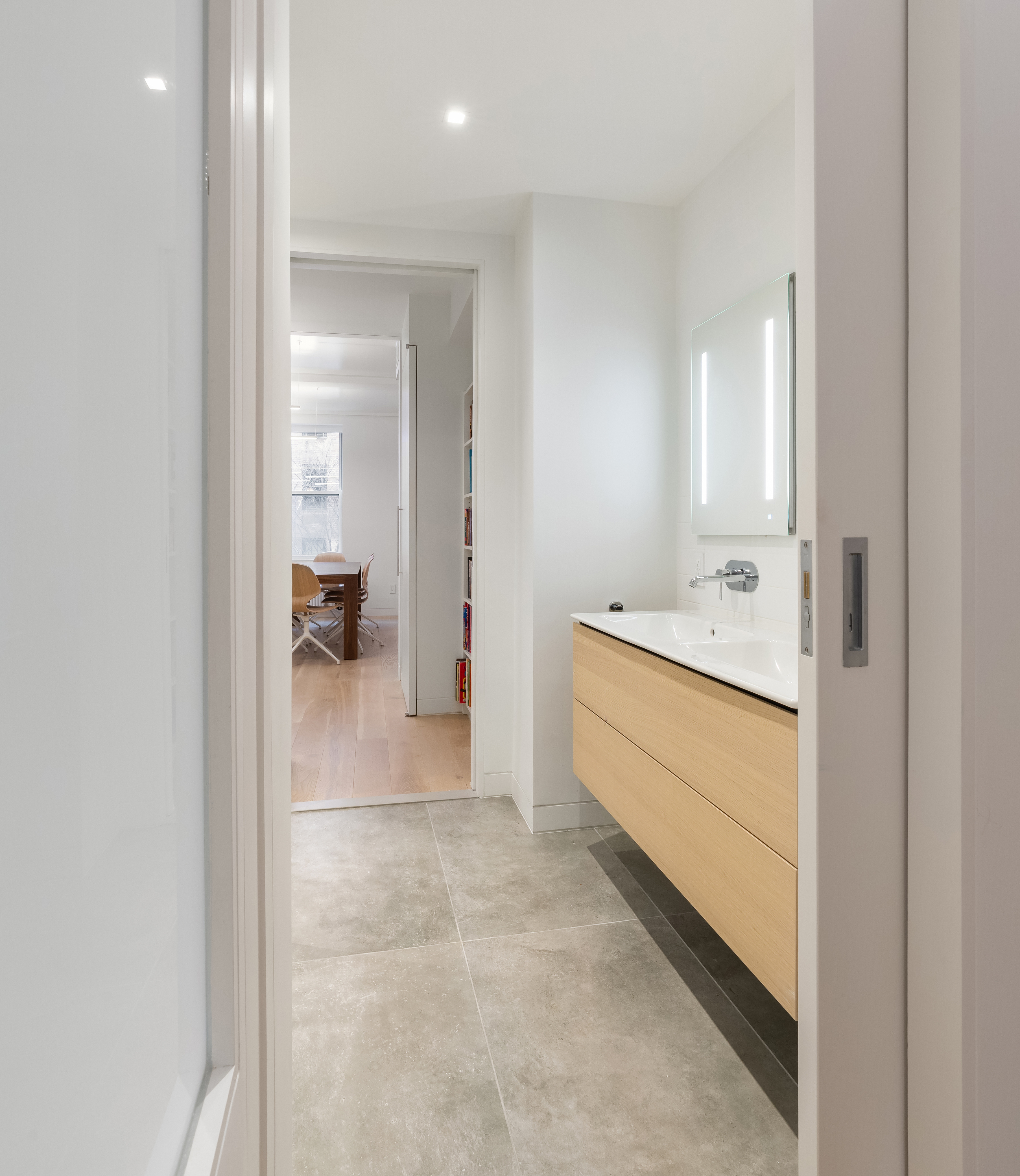
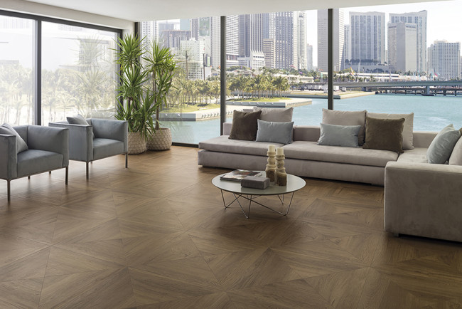
Ben-Adi used the same large-format faux-concrete porcelain tile from Florim in the Greenwich Village master bathroom and pass-through section of the kids' bathroom (above), which is part of an endless "circulation loop" that spans the entire apartment—a fun feature the kids apparently relish (and run along!). "The less joints you have, the easier on the eyes and the easier it is to clean," he says. He also likes the Beton line from Casalgrande Padana. (Porcelanosa is another NYC source.)
As for marble without the chipping and staining, consider terrazzo—Italians have been living with these floors for over a century. According to Pressly, who put it in her living and family rooms (shown at top), "it's basically indestructible and the speckles don't show dirt—there could be more spills than I'm not even aware of." Plus unlike with wood, it hasn't suffered the slightest from having her kids ride their scooters and let their guinea pigs run around on it.
Designate a kid zone in the living area
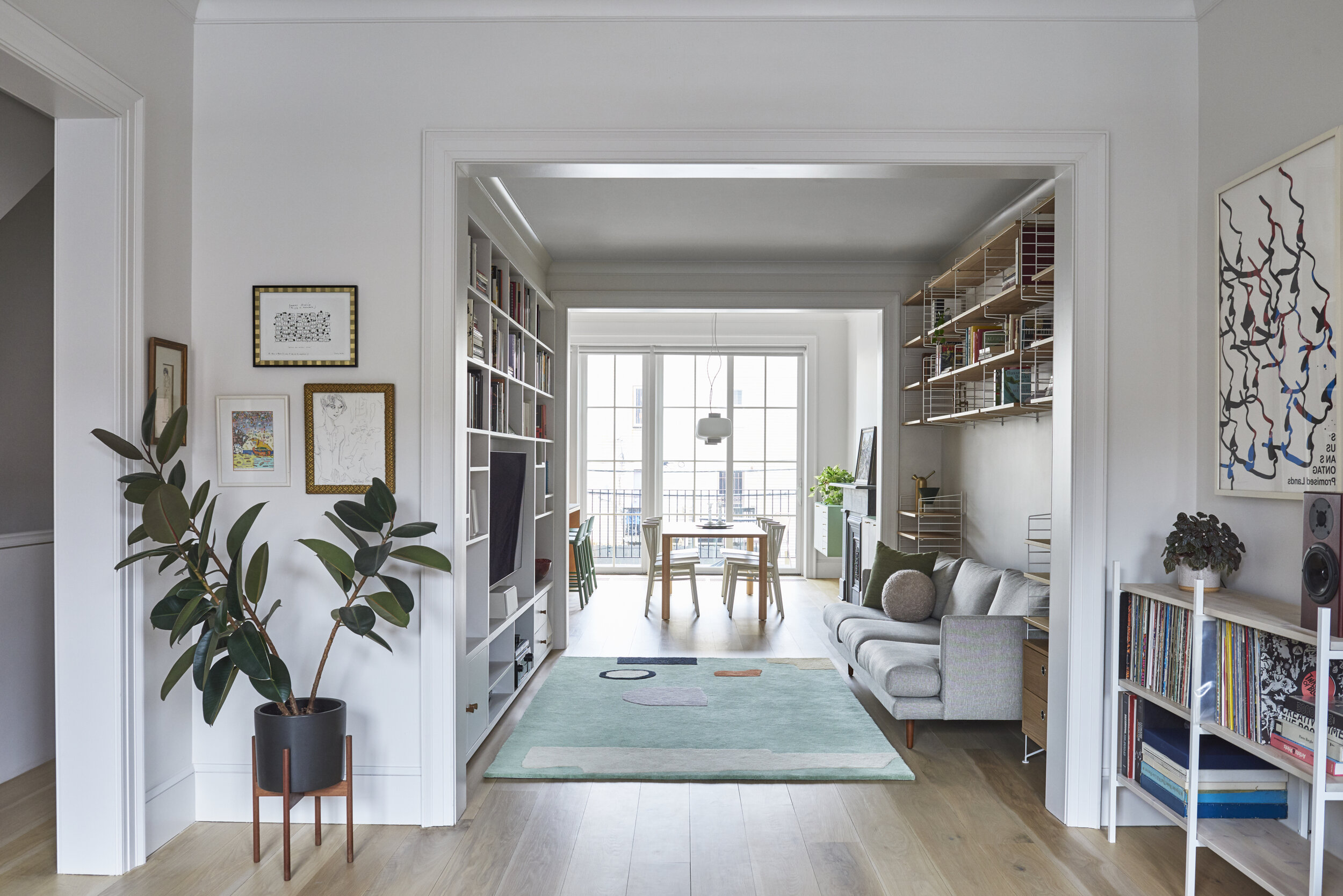
Unless (and even if) you have the square footage for a separate play area or rec room, your living area is where your children are going to hang out. It's also where grown-ups like to congregate, and having toys piled up in a corner is not going to jibe with a stylish scene.
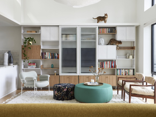
Certainly in a brownstone or detached home you have a lot more leeway to do different things. For example, in the Bed-Stuy townhouse, Cuttle transformed a transitional space leading from the kitchen and dining area into a spot for the media room (above). They knew the kids would sit and play on the cozy rug, especially the baby. So Cuttle designed the lower drawer cabinets of the custom bookcase to house the toys and books. "It's a kid's space without looking like it," he says.
He has employed this same storage idea for clients in typical Brooklyn apartments, where space is more limited—and in his own Brooklyn loft. "Our TV unit wasn't custom but we used two specific drawers with the intention that our kids would pull out toys and play on the coffee table and then have a place to put them away," he says. (Teaching moment!)
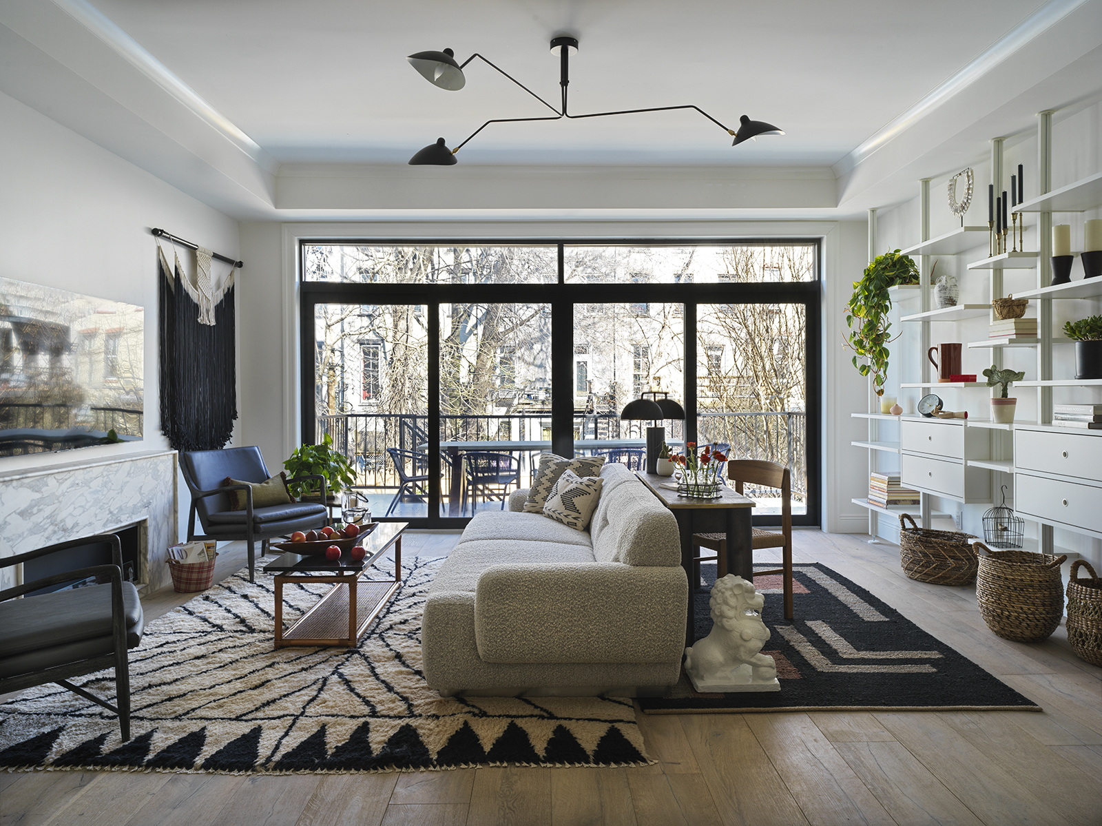
Nor is custom the de facto choice for high-end renovations. Kirschner points to IKEA as having "great modular systems that still look nice without costing a fortune," in particular she has used the ELVARLI system in numerous projects, including a townhouse on Morgan Street (above). What's not shown is how the unit was later reconfigured so that one part is a kid study zone with a desk. This sort of flexible, grow-with-your-child design is the goal.
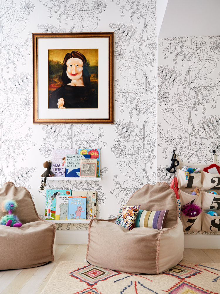
Kirschner also likes to create a reading nook by parking a couple beanbag chairs (these have handles on the back for portability) near slim picture rails where the kids can display their favorite picture books. It's an idea that works just as well in a playroom (above) as the corner of a living room or den.
Kids' bedrooms can be fun and functional—and even a focal point
These spaces have untapped design potential, allowing you to be a bit more whimsical. Even still, keeping them—and your little ones—organized is rule number one.
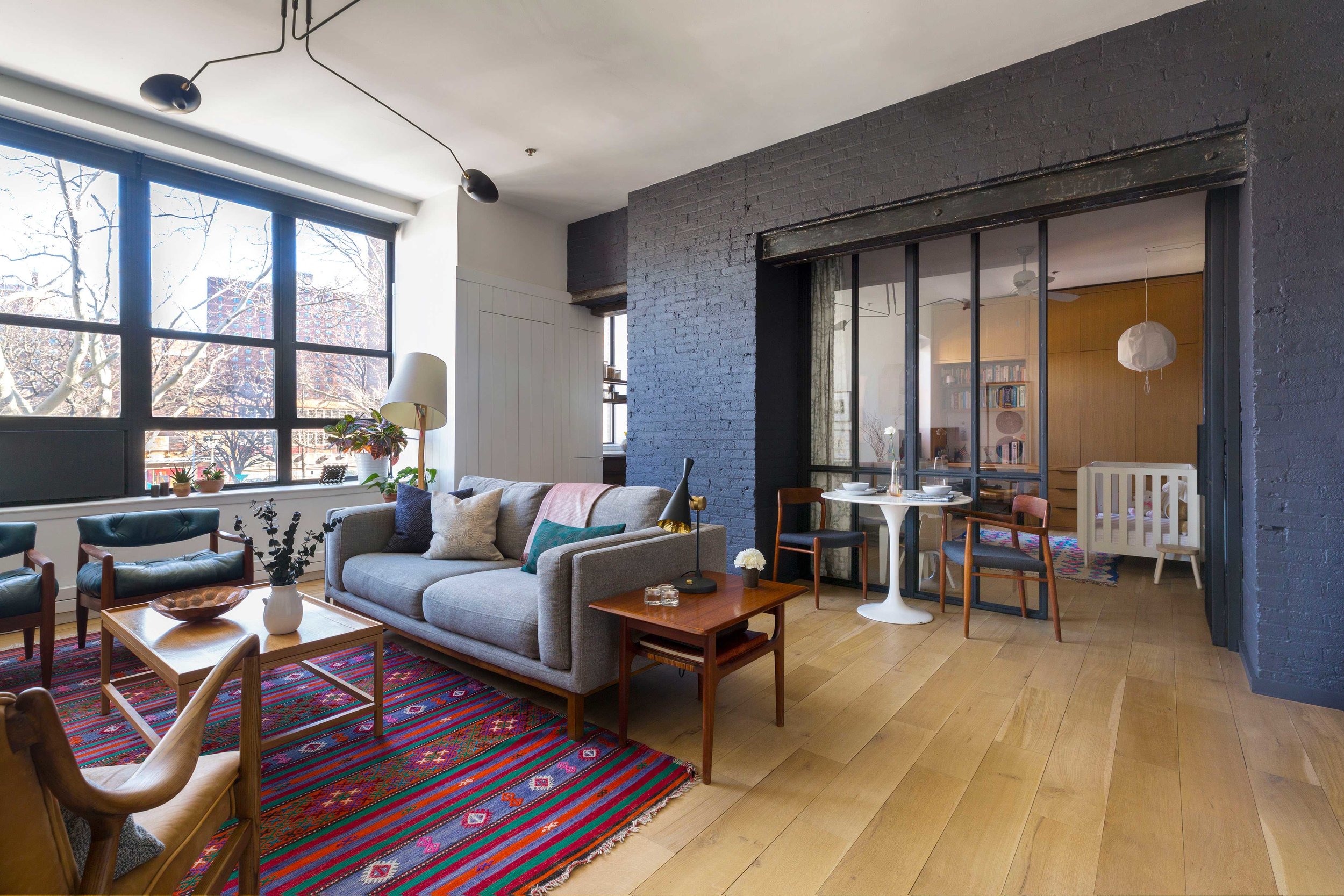
For an 1,100-square-foot Clinton Hill loft, Cuttle designed a second bedroom as a home office and guest room knowing it would ultimately be a nursery and kids' room (above), replacing a wall that housed a closet with paned glass to make the space feel larger. He also designed and built a floor-to-ceiling millwork piece that takes up the opposite wall, with a nook for the desk and shelving and lots of built-in storage. The painted brick frames the space and allows the white furniture and pendant to really pop, while the wood is almost a continuation of the flooring, again adding to the illusion of more space.
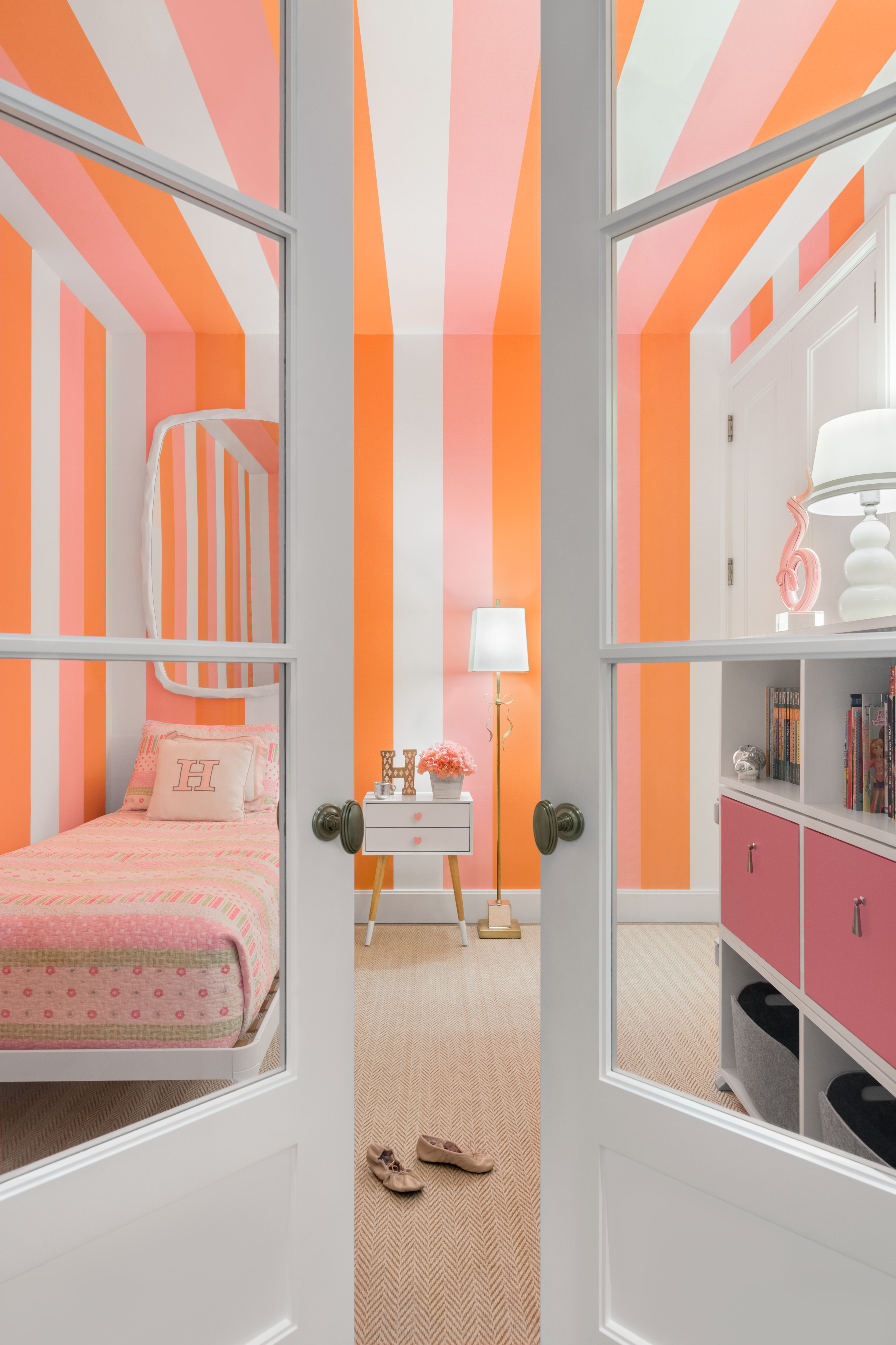
Pressly too converted what was a home office into a nursery, swapping out the doors so light could come in (with a pull-down shade to block it out). The walls and ceiling are covered with a "creamsicle" vertical wallpaper for a circus effect—and to create an interesting moment as people pass it by. "If you don't want traditional wallpaper, you can use the low- or no-VOC vinyls that are gorgeous and easy to wipe down," she says. Translate this to a basement rec room. Fun times.
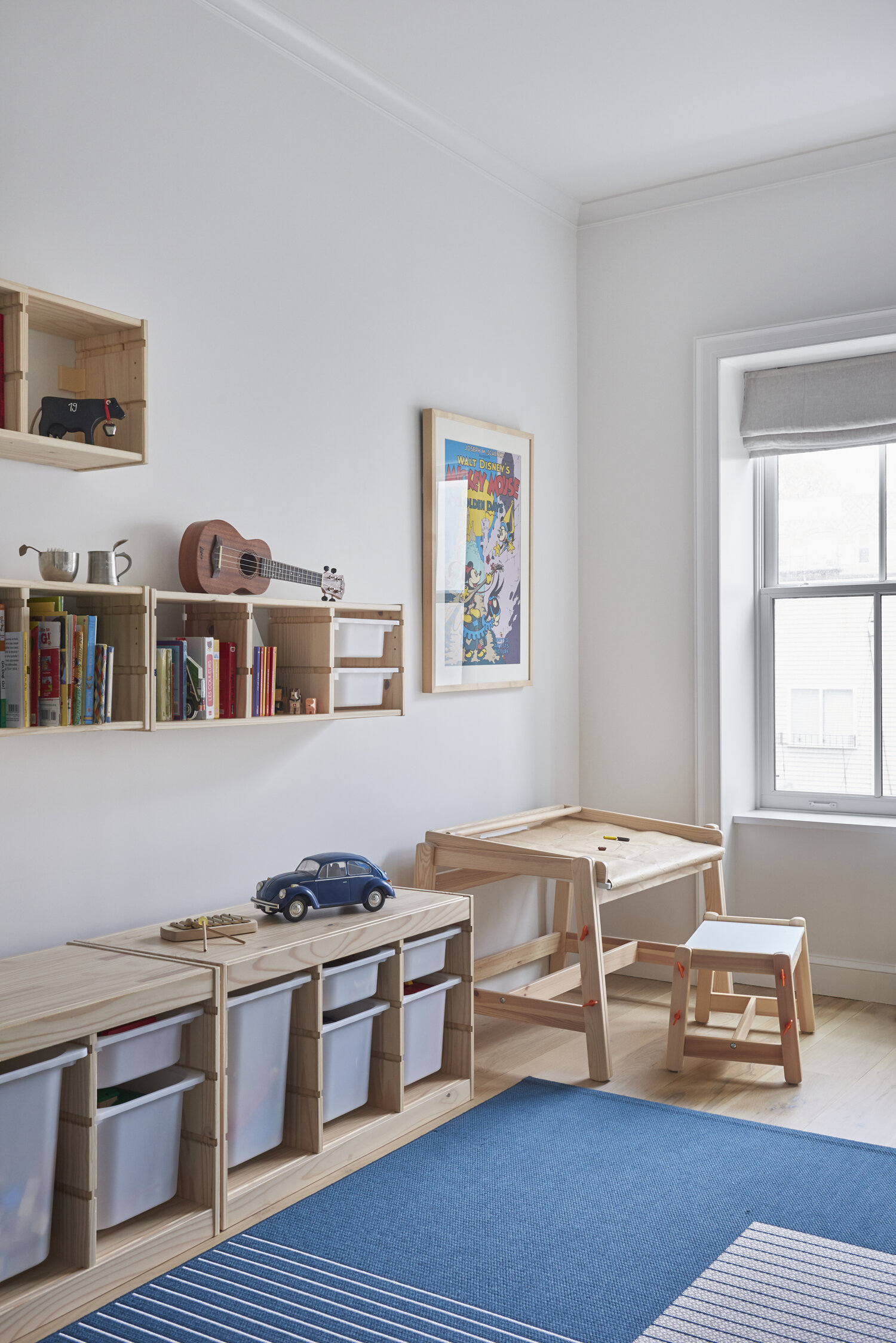
To tame all those toys, Cuttle looked to IKEA for the Bed-Stuy townhouse—the adjustable FLISAT drafting table has three different heights and the TROFAST storage units are modular, so you can mix and match them to suit your situation and have them evolve over time.
Kirschner used TROFAST in her own playroom. "It's very Montessori in that kids can remove the entire drawer, tip the contents onto the floor, then pack everything back up and slide it back in," she says. You can give it a look by organizing it by color or just having one color so it's more uniform.
Besides providing opportunities to instill a sense of orderliness, bedrooms can be a place where kids can pick one or two design elements that they have control over. This is something both Kirschner and Pressly did in their own homes in the spirit of boosting their kids' confidence and pride of place.
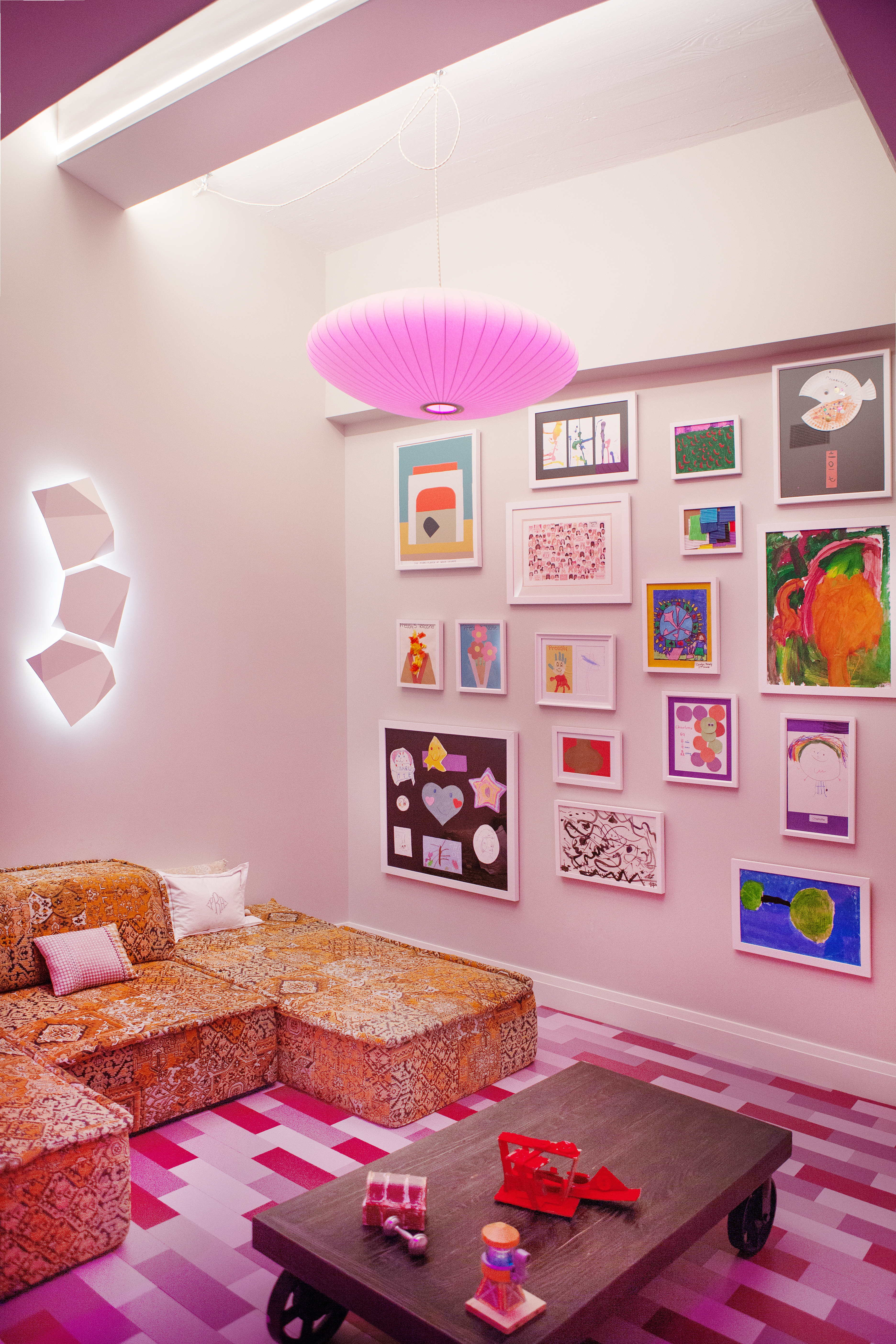
For example, Pressly's children wanted "purple!" so she custom-painted cork planks (from Aronson's Flooring) in various shades to mimic (purple) wood. She added LED bulbs by Ketra that mimic the circadian rhythm most of the time, but with the press of the "Play" button on the Lutron pad bathe the room in a fuscia glow. (This way you don't have to actually paint the walls that color.)
By the way, cork is sound insulating and has some cushion to it, making it a smart flooring option in kids' rooms.
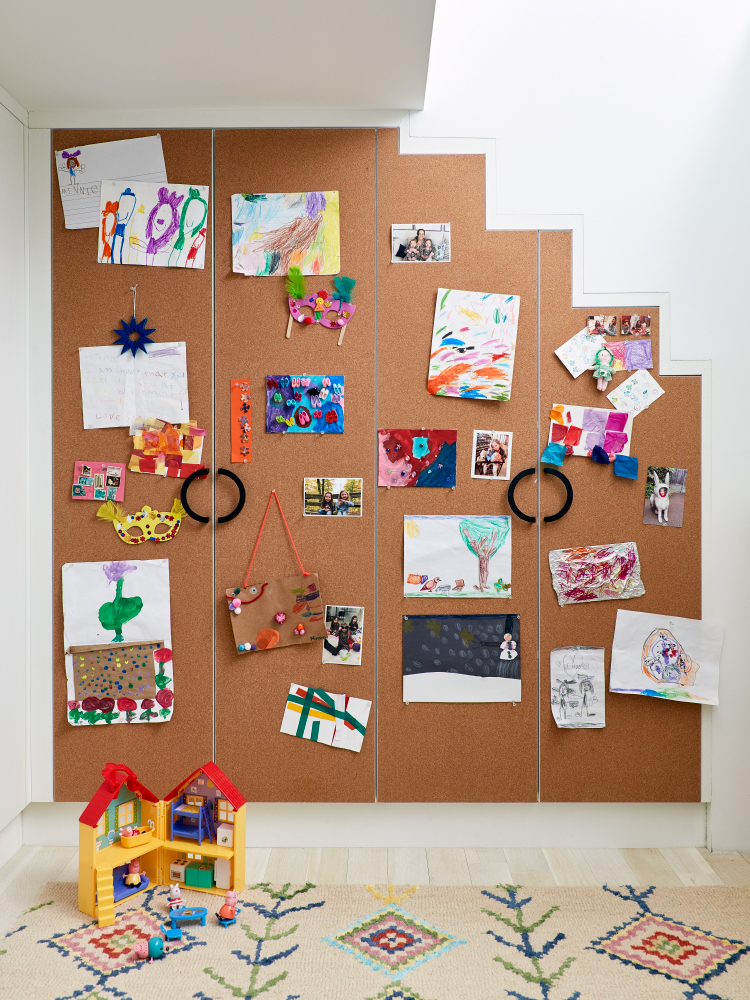
The eco-friendly material can also be used as cabinet door fronts in lieu of veneer or wood for posting artwork, which is what Kirschner did in her home (above). "It does get messy sometimes but at least it's contained to this one area," she says. You can replicate this idea in a kitchen too by covering just one portion of the new cabinetry with cork—and even post your own memorabilia and mementos.
Making a splash in the bath
Little kids like to take baths, so you'll want to consider having a tub—a must for resale purposes, especially if you have a shared family bathroom. You can always have it be dual purpose by fitting it out with a shower head in addition to a pull-down nozzle and traditional faucet.
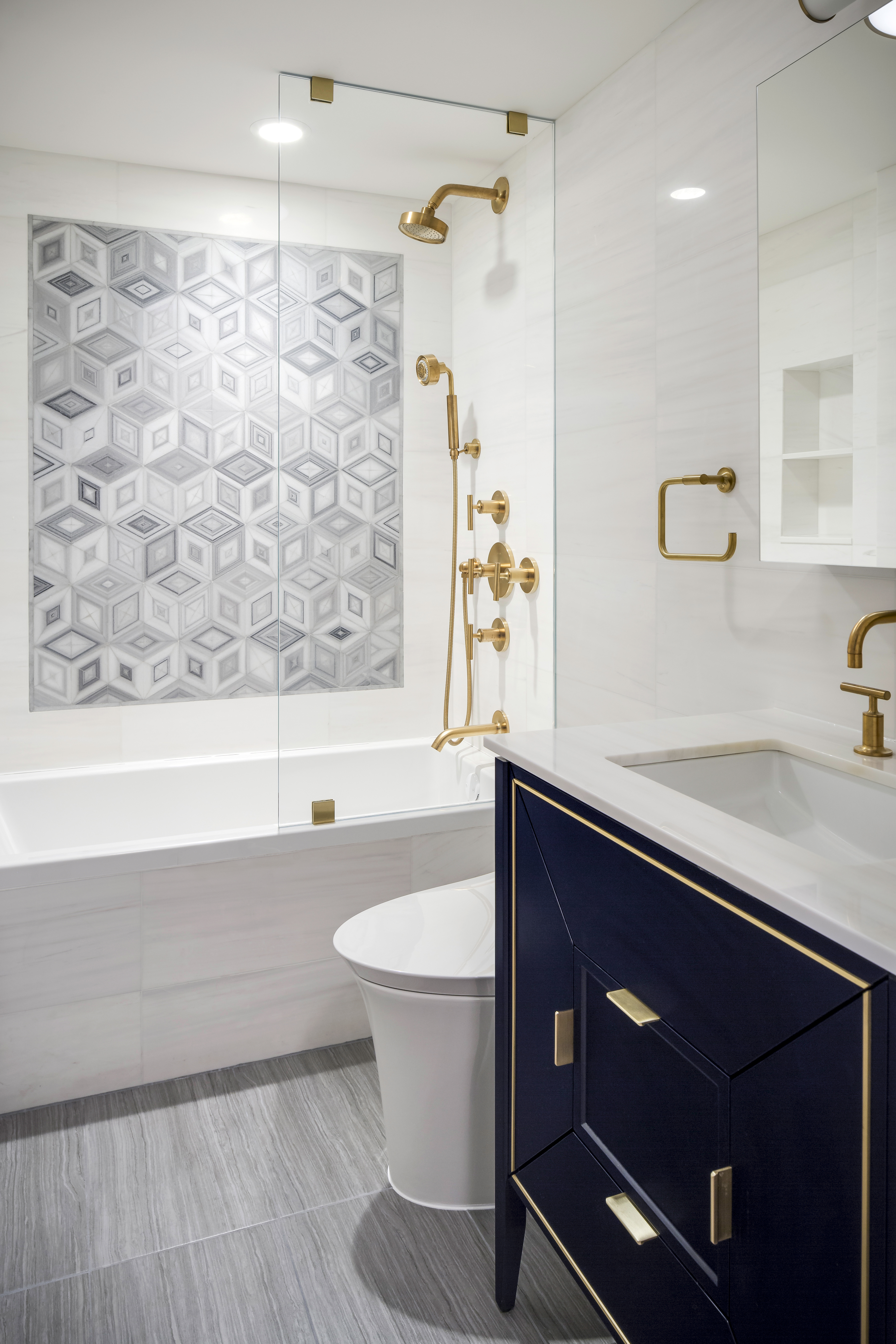
Berman puts in a tall soaker tub, such as in the West End Avenue apartment (above), when space prohibits a longer one. Just don't make it too tall or you can't lean over to bathe your kids.
Sliding doors are apparently passé, so he and the others mentioned here tend to use a single or double glass panel that is foldable or retractable.
And note the stylish surfaces: The flooring above is Marble Driftwood porcelain tile from Cancos Tile and Stone, the walls are Bianco Dolomiti Marble (such as by Artistic Tile and Stone), and the playful mosaic is made from Origami Large Setsumi Zebra marble tiles from AKDO. And why not go glam with brushed brass fixtures (these are from the Kohler Purist Collection) and a sleek Amora vanity by Ronbow, which features soft-closed drawers and doors to protect little fingers?
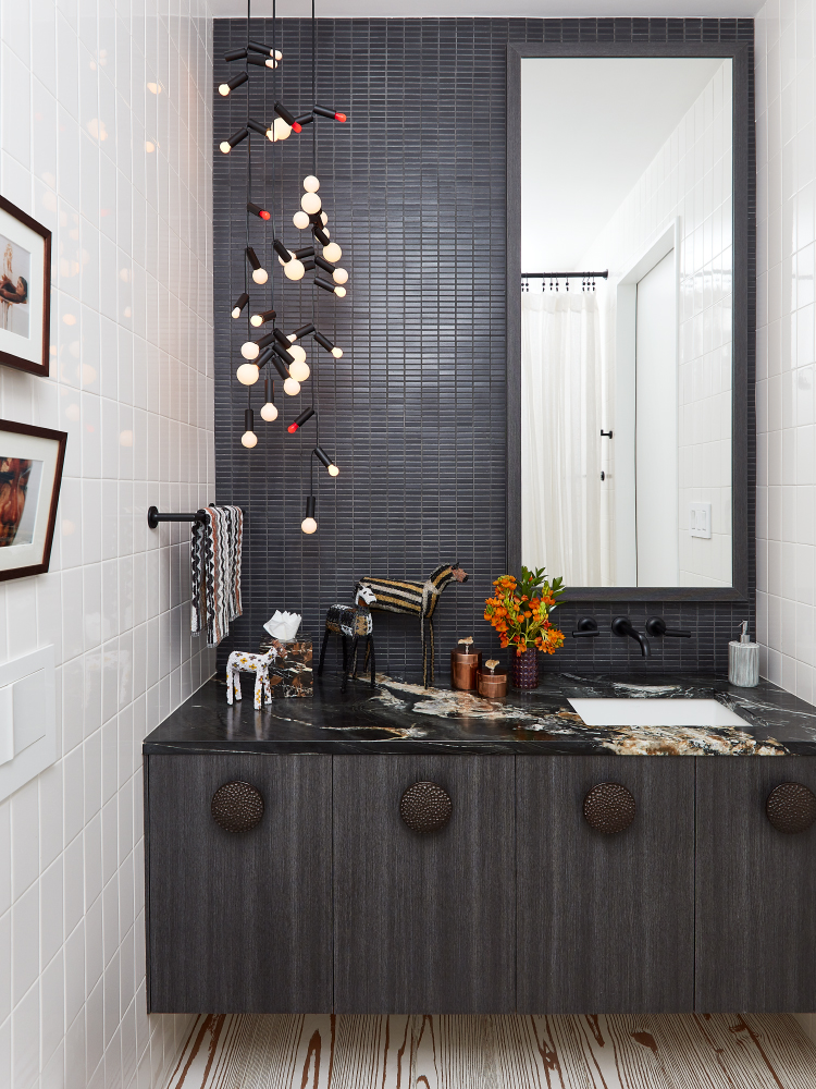
What about those essential (and unsightly) step stools? Kirschner likes to hang the vanity with a gap underneath for tucking the stool in when not in use (above).
Pressly goes one step further by converting a bottom drawer or the toe kick (cue the kitchen!) into a pull-out step for kids.
Both designer moms see this as promoting independence in allowing little ones to wash their hands and brush their teeth without having to ask for help—an invaluable aspect of any renovation.


