Before and After: How a pro stager whipped this Brooklyn home into shape— and sold it over asking

The family of five who owned this 3-bedroom apartment in Carroll Gardens was relocating to another city, so they needed a quick sale for the best price. While the home had good bones--a decent size, open layout and high quality finishes in the kitchen and bathrooms--it suffered from dark wall colors and window treatments that blocked the light, says Kyra Frankel, co-founder of White Space Staging, a Brooklyn-based staging company that helps sellers, agents and developers make spaces as bright and open as possible.
White Space did a few things to help out overall:
- painted the entire apartment a neutral off-white to open up the space and make sure the color fit with the floors and finishes
- took out heavy furniture and fixtures that made the space feel darker
- highlighted uses for each room that would appeal to as many buyers as possible
It worked: turnout at the first open house in mid-April was "overwhelming," and the home sold for $1.3 million--about $250,000 $25,000 above its asking price, Frankel says. By July, the sellers had closed and moved to their new city.
For a specific breakdown of what the stagers did, check out the photos below.
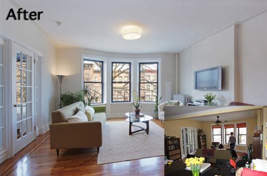
This Carroll Gardens 3-bedroom sold for $1.3 million--about $25,000 above its asking price.
BEFORE: The ceiling felt low in the living area thanks to a heavy-looking ceiling fan, and the layout of the furniture made the open space feel smaller and chopped up.
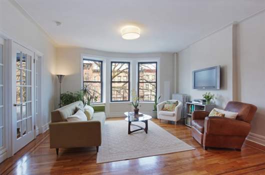
AFTER: White Space replaced the ceiling fan with a flush mount light, making the room feel taller and more open, and removed the window treatments which were cutting off the natural light flowing into the room. Finally, they edited and changed the furniture arrangement to create a more open and inviting living area.
BEFORE: The dining room had dark walls with a dark wood dining set and, given that it was a windowless space, felt uninviting.
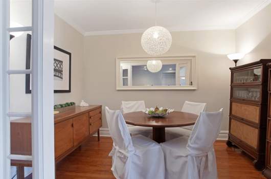
AFTER: White Space painted the walls off-white to brighten the space, and brought in a pendant light that added some glamour. They also incorporated the china cabinets that were previously crowding the living room.
BEFORE: The master bedroom was weighed down by heavy Shaker-style furniture and utilitarian elements, like a desk. The peachy color scheme was cozy but not for everyone.
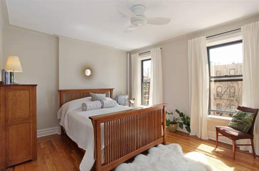
AFTER: To make the room feel more romantic, White Space removed the desk, bench and window treatments, opening up the space. They also installed window treatments which were visually elongating and romantic, and chose bedding and floor coverings that added a light and airy quality to the space.
BEFORE: This bedroom was originally sleeping twin girls and was located directly off the living room. The stagers' goal was to highlight the versatility of the space, letting buyers envision the room as a bedroom or an office, while making sure it was still functional for the owners.
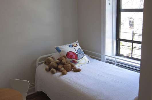
AFTER: White Space replaced the bunk beds with a trundle bed system, which still worked for the family, and got rid of much of the furniture and clutter. They also painted the walls the same color as the living area to connect the rooms. They chose a neutral floor covering and bedding so it wouldn't distract potential buyers.
Related posts:
How to stage a bathroom--with very little money
10 apartment staging mistakes that can cost you a sale
Here's what a feng shui-certified condo in Long Island City looks like
Before & After: 3 NYC apartments get a photo facelift
4 photo staging tips for serious sellers


