5 ways to create a stylish, functional open kitchen in your NYC apartment or brownstone
- Add counter seating for casual dining and doing homework
- Use marble-look surfaces like quartz and porcelain for durability
- Hide the fridge in an appliance 'garage' for a streamlined look
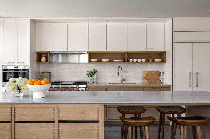
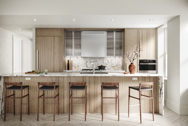
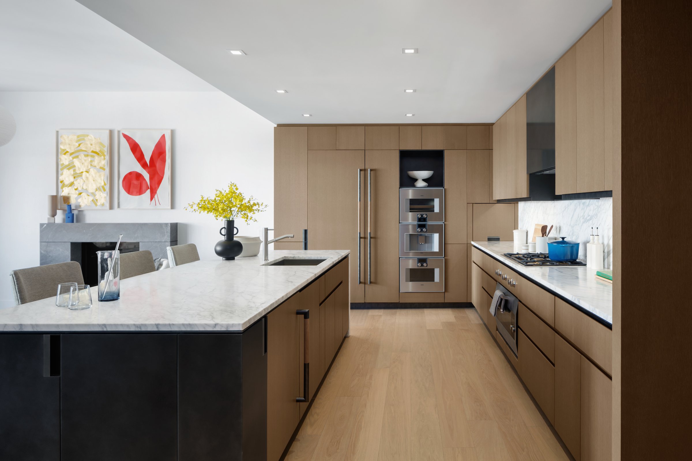
A two-tone kitchen, counter seating, quartzite countertops, appliance garage, and wall oven are on trend at 96+Broadway.
Evan Joseph
Despite murmurings that it was on its way out, the open kitchen layout has only gained traction in New York City apartments and townhouses of all eras, sizes, and price ranges. And as the heart—and hardest-working area—of the home, kitchens remain a top priority for renovations.
"Generally speaking, more people are cooking and entertaining at home more often, so kitchens are huge," says Peter Holtzman, principal architect and founder of Harlem-based Bespoke Architecture. "People still want the kitchens open to the living spaces and I don't see that changing anytime soon. This is just a real lifestyle switch between how people used to live and how they live now."
Only now that people are still spending more time (and eating more often) at home, an open kitchen has taken on even more importance as a multitasking space—for example, while prepping dinner you can keep an eye on the kids as they play in the living area or do their homework at the counter.
It also needs to be attractive. Take a cue from luxe new developments like 96+Broadway, where the kitchen cabinets from Stevali are made of exposed, dovetailed planks in solid oak (scoring big on style) and are paired with a quartzite island surface (for durability).
"Given the prominent placement of the kitchens, we seized the opportunity to highlight our commitment to elegant, timeless design hand-in-hand with full functionality," said Van Nguyen, partner at JVP Management, the real estate investment and development firm behind 96+Broadway.
"Whereas elsewhere in an apartment, one might be trying to close off private spaces, the kitchen and living spaces remain communal and are the easiest way to allow the home—and the kitchen itself—to feel larger," says Jennifer Tanner, an agent at Coldwell Banker Warburg. What's more, an open layout is a creative means of getting natural light into a kitchen with limited or no windows. "Unobstructed light from an adjacent living space can keep a home feeling light, bright, and happy—a welcome alternative to darker enclosed or galley kitchens."
So whether you are updating your existing open setup or starting from scratch (and knocking out some walls), the following five elements score big in style and substance—and can be adapted to suit any square footage.
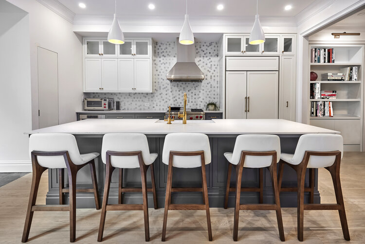
1. Include counter seating
Just try and find a photo of an open kitchen without at least some way to belly up to the bar, er, pull up a stool. Once a nicety, counter seating is now practically a must thanks to all the extra meals eaten at home. People don't always want to have to eat at the same table—and it gives guests a place to sit while hanging out in the kitchen.
Think of it as the evolution of the island beyond mere prep work to a multitasking space—homework station included.
Tanner sees this as an offshoot of another increasing trend: Double islands. "One for prep and wash and a parallel one for eating, serving, and gathering—providing the ultimate community space and anchor for the home," she says.
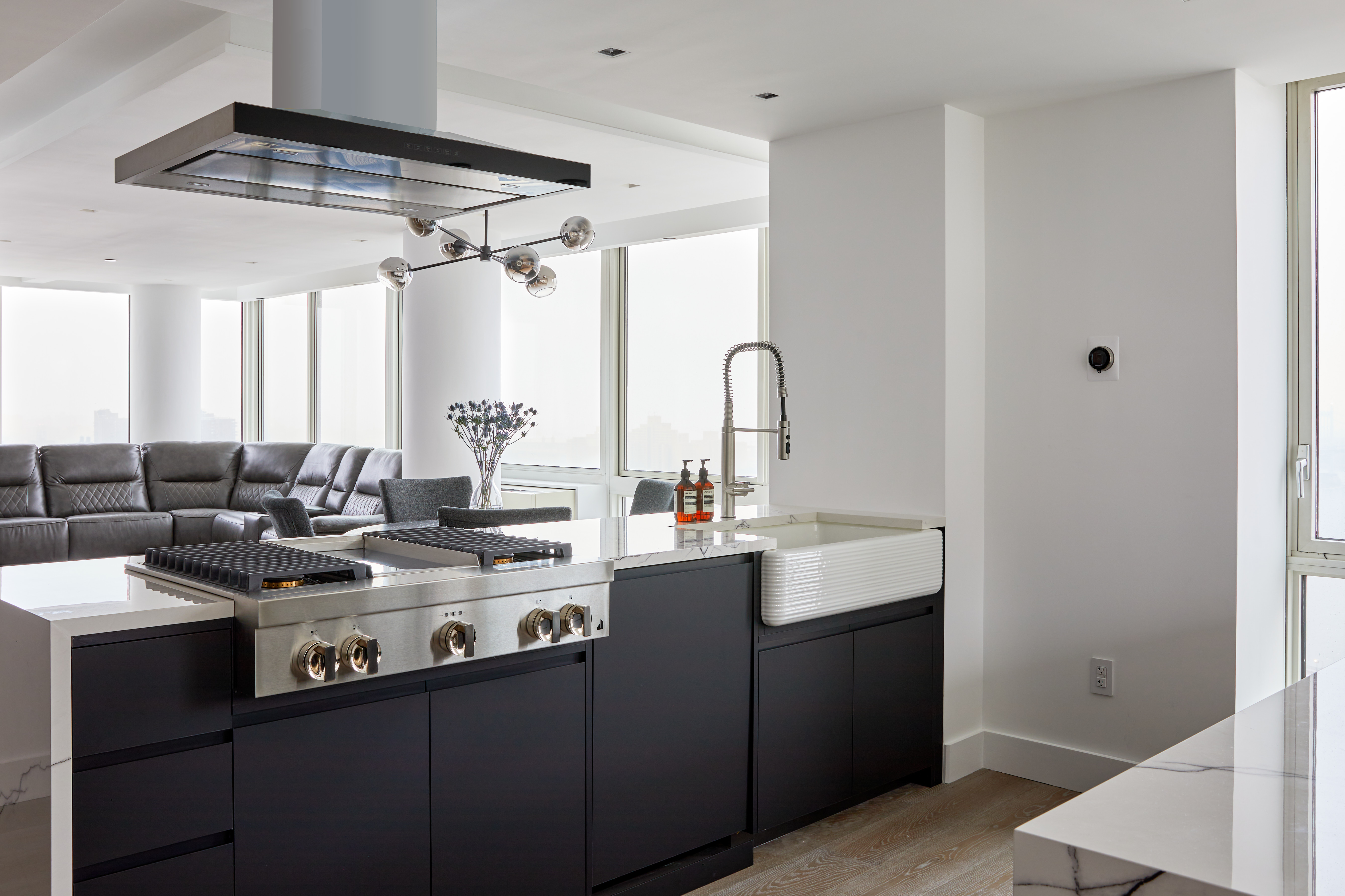
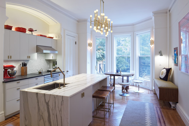
Jorge Fontan, founder of NYC-based Fontan Architecture, says a double-island sub-trend is having a big faucet in the island (or peninsula). "It's a great feature for an open kitchen to make a design statement," he says. The brass number that Bolster put in the Park Slope kitchen (shown above) certainly qualifies.
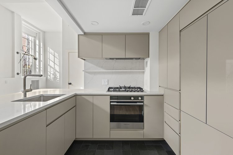
2. Add appliance 'garages'
Given the visibility of an open kitchen, there's been a movement toward having it be kept under wraps—and that includes hiding appliances for a seamless look. Who wants to see the refrigerator from all points? Bonus: You don't have to obsessively wipe down a stainless steel model to remove smudges and spills.
"While this was considered a luxury about five years ago, the current trend is to increasingly design cleaner-looking kitchens," says Anna Karp, co-founder and CEO of Bolster, a Manhattan-based design-build firm (and a sponsor, fyi).
The return of upper cabinets is trending for the same reason: It's hard to pull off open shelving day in and day out unless you are a certified neatnik and have a curated selection of display-worthy glasses and dishware. (Reality check.)
3. Install wall ovens
Credit Fontan with first proclaiming wall ovens as being in demand when interviewed for this post—a trend that is evidenced in (almost) all the projects shown here, including at some brand-new luxury developments. For example, at The Cortland, wall ovens are a key feature of the custom-designed kitchen (shown above); another oven is in the usual spot under the cooktop range.
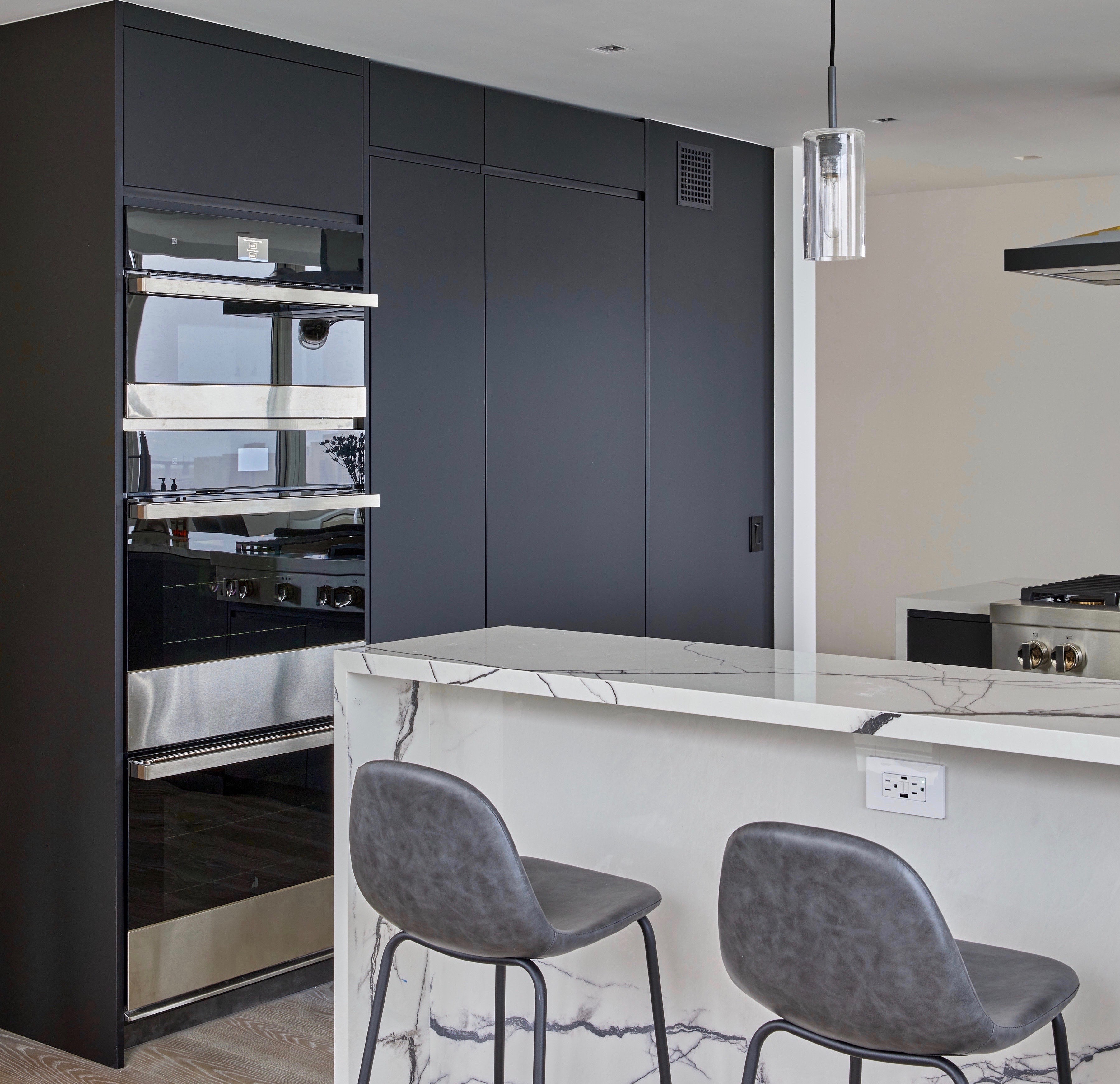
Fontan Architecture put two ovens plus a warming drawer (at top) in the same UES kitchen shown above; a cooktop is in one of the two islands.
What's the point of wall ovens? For starters, moving an oven to a wall frees up precious storage space in lower cabinets–and a cooktop better suits the island setup. Then there's the practical matter of not having to open a hot oven in the main traffic area, especially when little ones might be running to and fro. And when the wall oven is placed at eye level, it makes it that much easier to see what's happening inside and to put in/take out heavy pots and pans (without having to strain your back). So if you have three wall ovens, the middle one becomes the day-to-day default.
Finally, wall ovens typically come in pairs, increasing your overall cooking capacity for all the extra entertaining people are doing these days. Some developers are adding convection ovens and warming drawers in the same column.
4. Use durable surfaces like quartz and porcelain
No doubt marble will always be the end all, be all counter material for many people, but an increasing number are looking for more budget-friendly, practical options.
"There's been a shift in focus for home renovations as homeowners are now prioritizing spatial planning and practicality over elaborate 'jewelry' and ornamentation," Karp says.
And Holtzman has been "running into a lot of people with champagne tastes and beer budgets, particularly with kitchens, which is not new but is amplified a bit now."
He says he almost invariably counsels clients away from marble because as a soft stone, it is prone to etching and stains. (He knows first-hand: His own marble counters, which he got for a discounted price, have taken abuse and beatings and he's learned to live with it. "If I had to do it over again I would have opted for honed rather than polished, then at least you don't have to worry about the etching though staining is more of a concern.")
He also counsels clients to avoid granite, "which is out of style and empirically unattractive with one exception: absolute black when honed looks a lot like soapstone, which people like, but is still indestructible. It's a deep anthracite gray and a good, solid option."
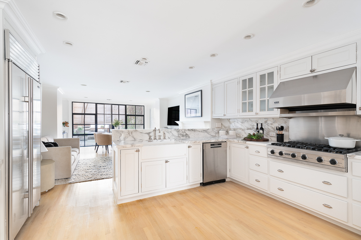
For people who want the heavily veined Calacatta Gold or Carrera marble but the durability of granite, he and others are leaning into quartz such as by Caesarstone, Silestone, and Cambria. "These materials are getting better all the time at being good fakes, especially for marble," he says. (Check out the UWS kitchen above.) They are also resistant to scratches and stains, making them ideal for high-traffic family kitchens.
Fontan is a longtime proponent of porcelain for countertops and backsplashes, including in the UES kitchen shown above (with the wall ovens). His go-to sources include Porcelanosa and Florim.
If you prefer a natural stone that can be as heat-tolerant as granite, Holtzman has been specifying quartzite recently. "It's kind of my new favorite because it is robust and comes in a wide variety of looks and you can finish it in a bunch of ways." Quartzite was also used at luxe condo development 96+Broadway shown at top.
(For more information, read Brick's guide to marble and granite alternatives.)
5. Opt for wood cabinet fronts—especially in two-tone schemes
According to Karp, white kitchens have started to make a comeback after years of gray or colorful palettes. "At Bolster, we have seen a trend of homeowners looking for a more restrained look, and while they still optimize for comfort (i.e. cooktops on islands), they also are seeking a more demure look, choosing to paint their kitchens white," she says. But instead of the gleaming white kitchens of the past, designers are now using wood to warm up the space.
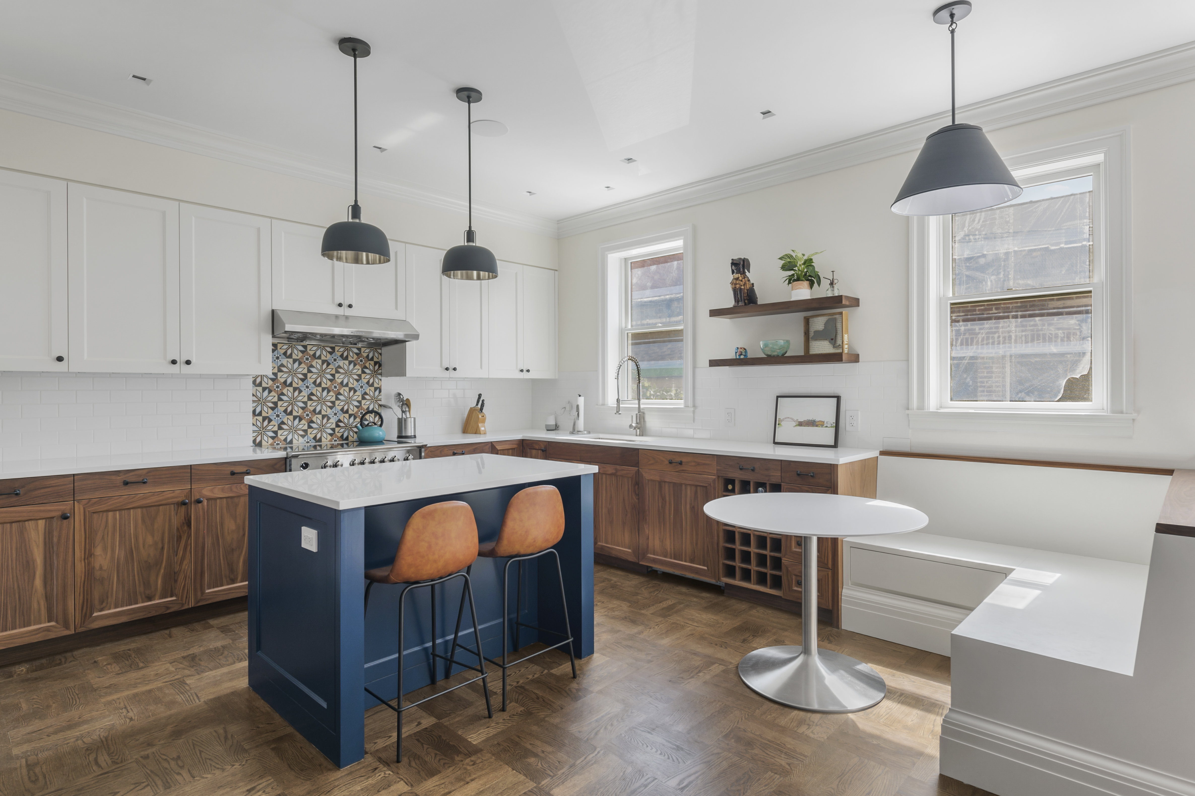
Not that color has gone away. Karp says blue remains a strong accent color. "It seems to be a relentless, peaceful color trend that is here to stay." So whereas once the cabinets might have all been painted the same color, Bolster only painted the small island a rich blue in the kitchen above, making it a focal point.
Holtzman is also seeing a resurgence in wood cabinets. "For about 10 years people have just been painting the fronts, probably because before that they went with cherry cabinets that didn't go with anything," he says.
Today "people are doing lovely things with wood by highlighting all the material's strengths and characteristics and creating a more considered look—like having a bank of cabinets where the grain flows horizontally across the whole wall." That also means choosing interesting woods, whether richly-grained walnut or really tight rift and quartered white oak.
Years ago, by the way, Holtzman used custom fronts for budget-friendly IKEA bases in his own kitchen redo, choosing "a nice, dark Wenge veneer plywood with a strong grain. It looks really rich and well-textured and the fronts have served me well and are now in fashion," he adds.

Exposed dovetail joints are another way to highlight wood's characteristics. For example, Maryana Grinshpun, principal of design-build firm Mammoth Projects, used richly grained wood cabinetry with "fingernail joints" to create texture in an otherwise minimalist kitchen—especially when paired with a deeply veined black soapstone for the countertop/backsplash. (Exposed dovetail joints are also seen in the wood cabinets in the photo at top.)
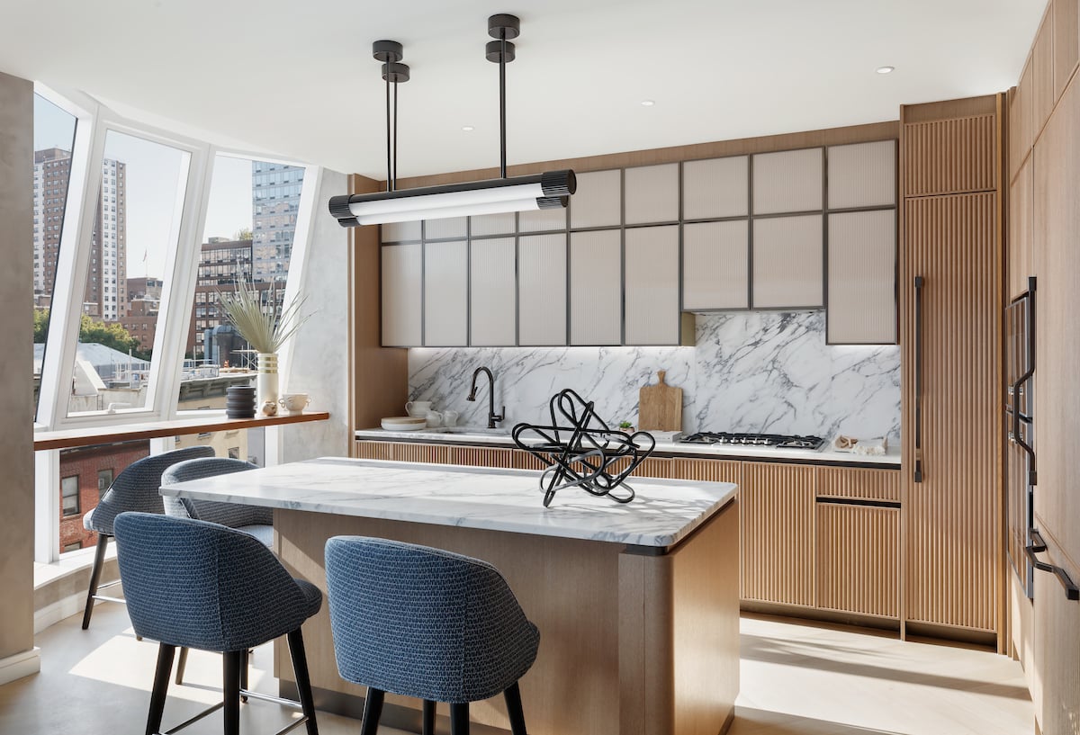
Ribbed millwork is a distinctive feature of the open kitchens by NYC design firm MAWD at Lantern House, a new development overlooking the High Line. According to a MAWD spokesperson, "the wood's fluting is complimented by the painted outline of the glass cabinetry and metal inlays throughout—which help to create dimension. The result is a layered richness that feels harmonious and cohesive."
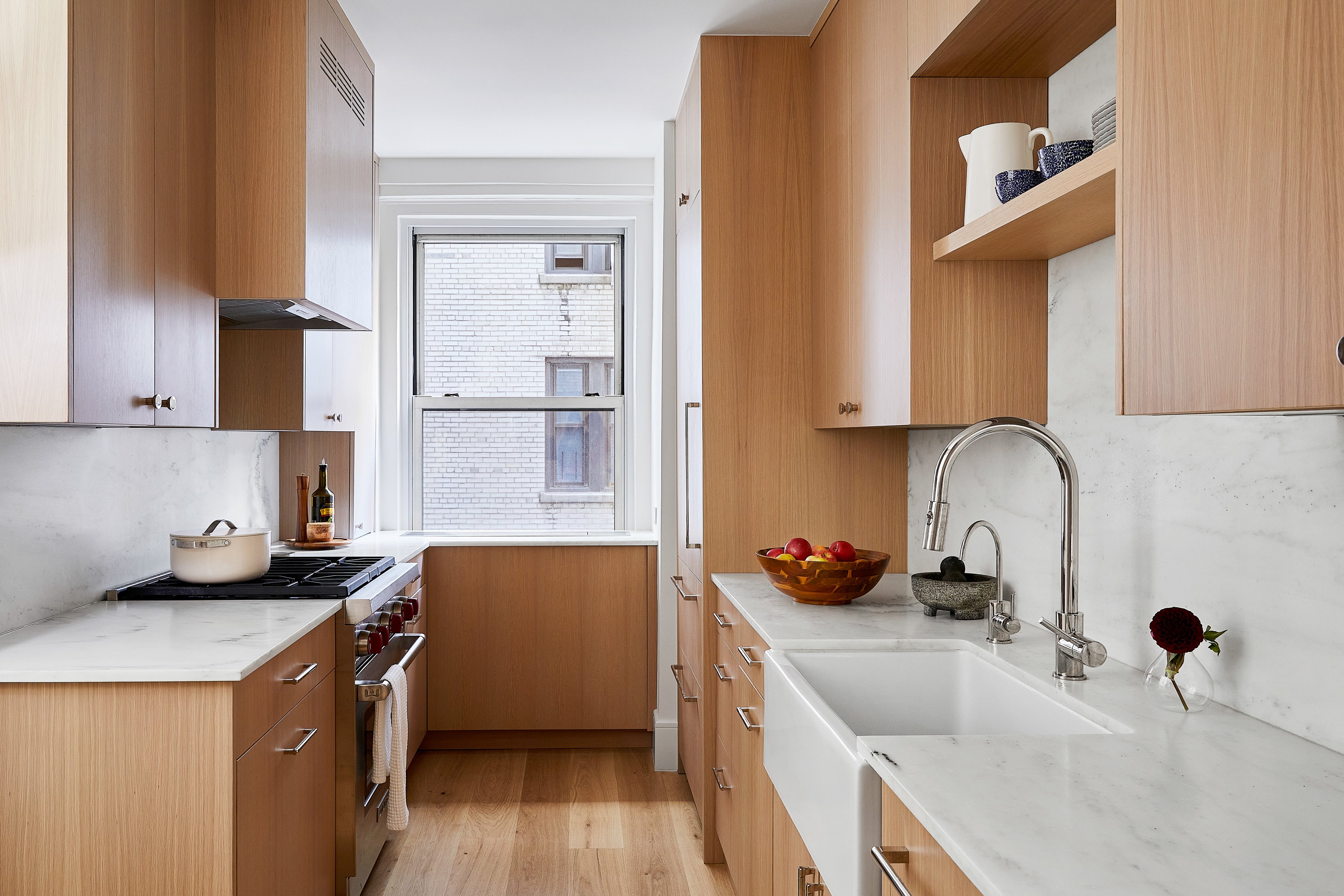
Even if you can't have an open kitchen, you can still use wood cabinets for an up-to-date, on-trend result, such as in the above galley kitchen by NYC interior design firm Ali Milch Interiors and Intrabuild construction firm (a Brick sponsor, fyi). Concealing the refrigerator, dishwasher, and even range hood (memo to self!) with matching wood panels—and a wood floor that blends right in—makes the tight space look and feel larger. Note, too, the quartz surfaces and statement faucet, other elements that work in any footprint.
You Might Also Like

