Here are 5 design trends for NYC apartment and townhouse renovations that will be big in 2023
- For bathrooms think curbless showers (or wet rooms) and adding natural, textural surfaces
- A home office built with custom cabinetry lets you hide a desk behind panels at the end of day
- Add a second kitchen island so you have one for prepping and the other for serving and eating
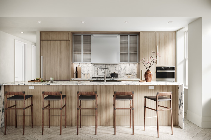
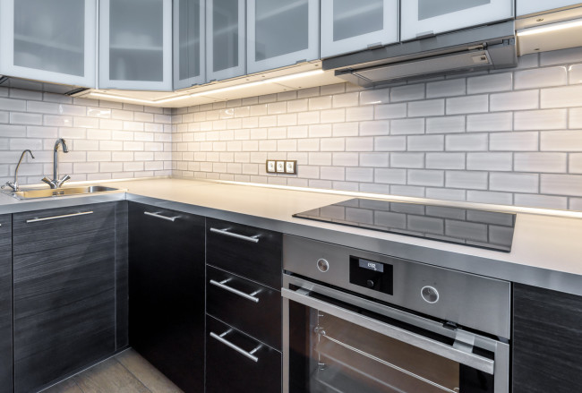
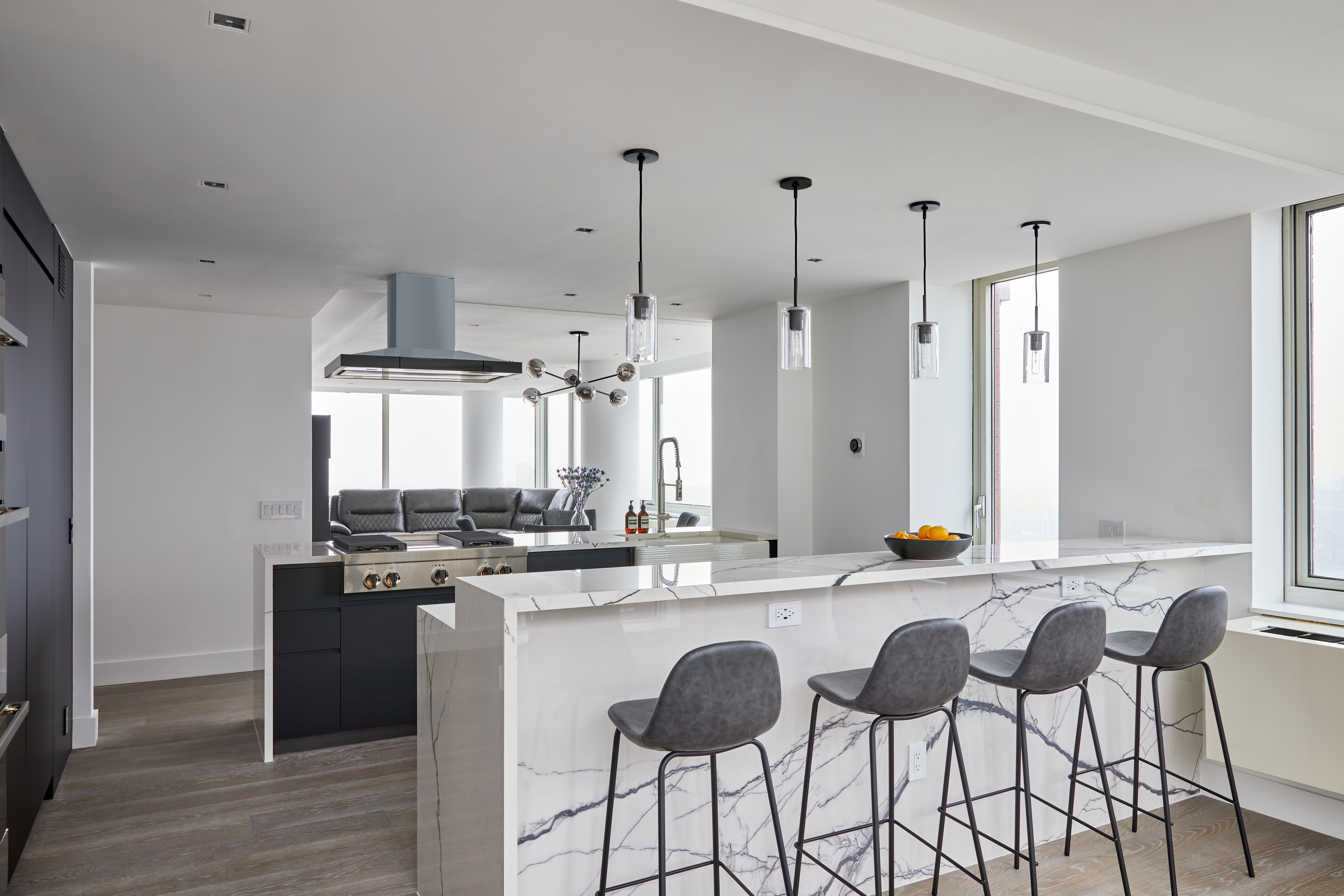
The kitchens at brand new 222 E. Broadway feature counter seating, wall ovens, and white oak flooring—all trending in 2023.
Binyan Studios
If an apartment or townhouse renovation is among your New Year's resolutions, knowing what's on trend can help you decide which project to invest in—even if selling is not in the picture anytime soon. (Reno tip #1: Always think about resale! You just never know)
For sure, the pandemic shift in New Yorkers' relationships with their homes is still reverberating, with comfort and functionality as top priorities. Plus, given sky-high costs for materials and a labor shortage (still! argh!), it's important to put your dollars where they matter most. (Reno tip #2: Set—and stick to—a budget to avoid cost creep.)
"People are still nesting," says Peter Holtzman, principal architect and founder of Harlem-based Bespoke Architecture. New Yorkers want to have a home that's "comfortable and commodious" and supports how they live now, he says.
Flash-in-the-pan trends leave you cold? Trust Brick to hone in on upgrades with lasting umph, straight from the mouths of reputable architects and brokers as well as reps from shiny new developments that have arguably done their research.
Some 2022 trends like spa bathrooms and multifunctional home offices are still going strong, in aptly evolved iterations. Same for designer musts like statement lighting, which is having a serious moment on Pinterest and Instagram. Others here are also less ta-da, more tried-and-true. What unifies all five is that they bring enjoyment and efficiency to everyday life—as well as comfort, connection, and form-plus-function style.
Read on and renovate with confidence.
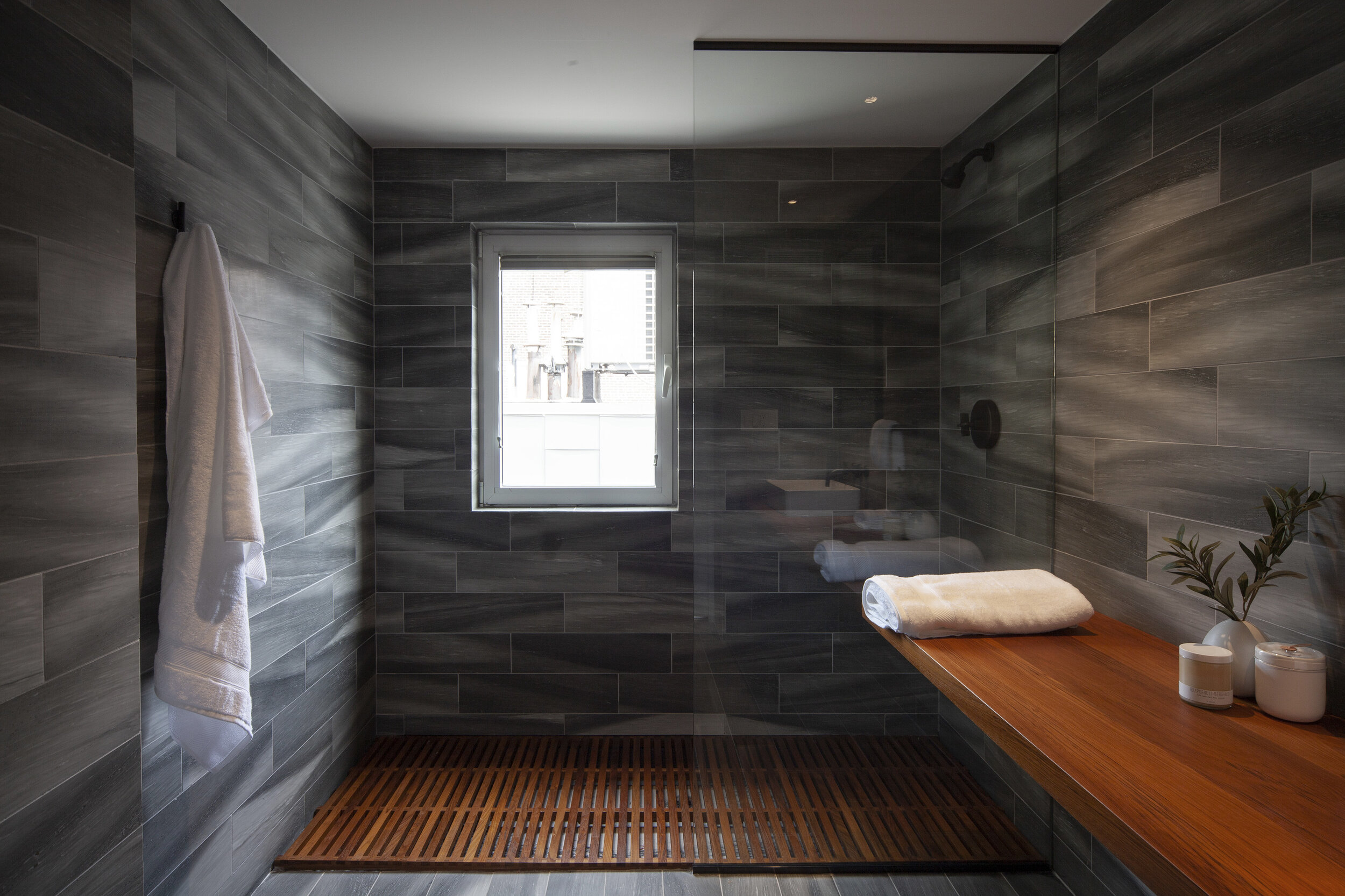
1. Spa (aka zen) bathrooms
This trend has been picking up steam and taking on new dimensions in the pandemic-era.
"People still want that calming effect," Holtzman says. "If I did scatter plots of word popularity on the internet, 'zen' with 'bathroom' would be shooting to the top of the list."
According to Anna Karp, CEO and co-founder of Bolster, a Manhattan-based design-build firm (and a sponsor, fyi), "Bathrooms have always been a place to relax, find solitude, and disconnect from the world and all of our devices. After the pandemic, these spaces have become even more important, so people are looking to personalize them and make them special."
So while 2022 ushered in the deep soaking tub, the focus now is on curbless showers (or wet rooms) and imbuing the space with texture, which Holtzman says is coming back into form and fashion. He sees slatted walls and honed stone with a lot of "tooth" increasingly being incorporated into zen experiences and evoking the naturalness of the materials. "The polished stuff is not very natural but a naturally cleft stone is very rustic and looks like it's been split right out of the quarry. And this pairs nicely with woods."
For example, Maryana Grinshpun, founder of Brooklyn-based design-build firm Mammoth Projects, used a natural stone from Ann Sacks in the above bathroom of a four-bathroom Park Ave residence.
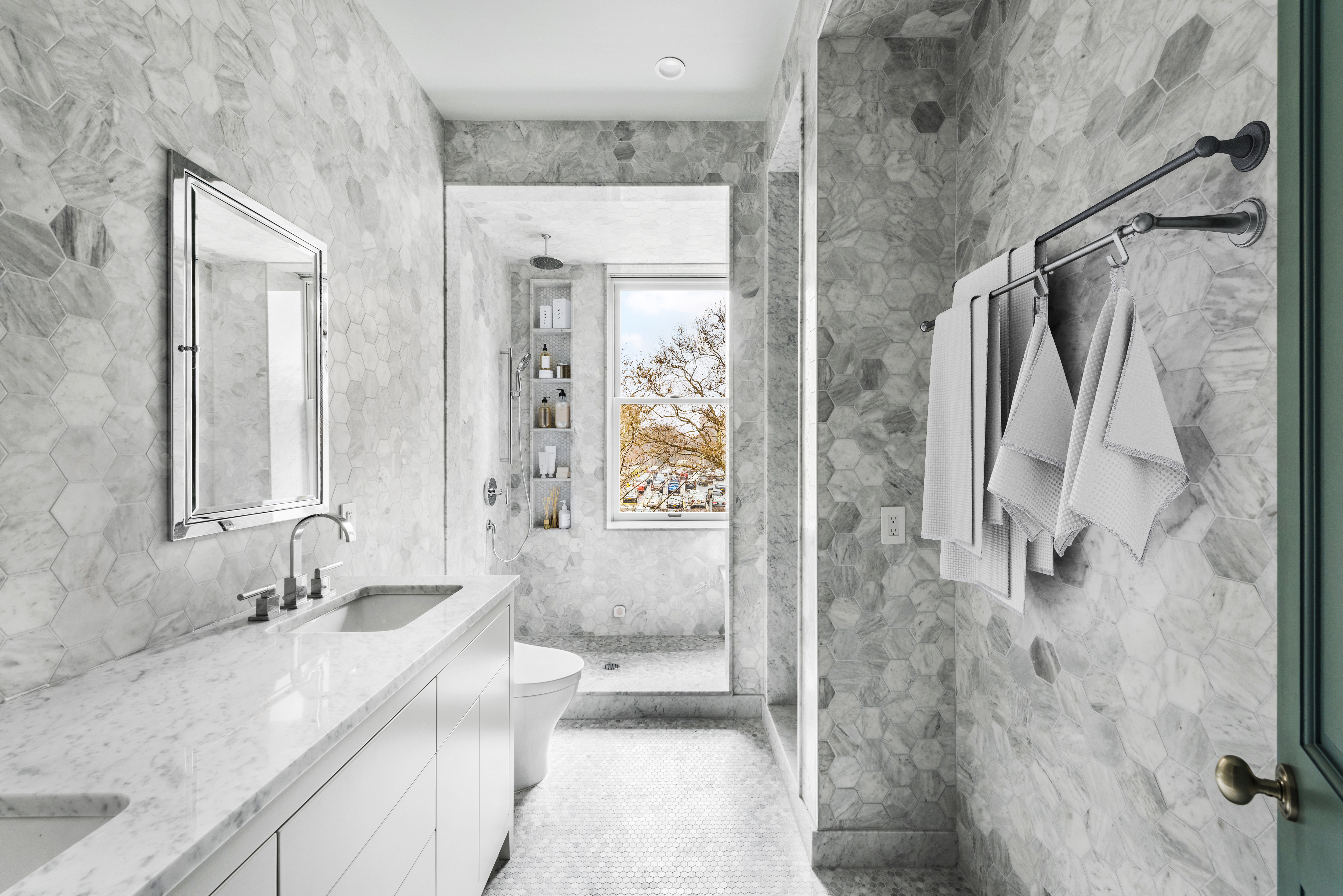
Per Karp, "One top trend that won’t be going away anytime soon is intricate tiling, Homeowners continue to have an ‘accent’ in their primary bathroom that makes tiling the center stage."
Not that the tub has lost its appeal. "People definitely want one, but it needs to be separate from the shower because if you combine the two it's a lesser experience for each," Holtzman says. Other pros agree; Fontan added jets to the tub in the UES bathroom (above; the separate shower stall is not shown).
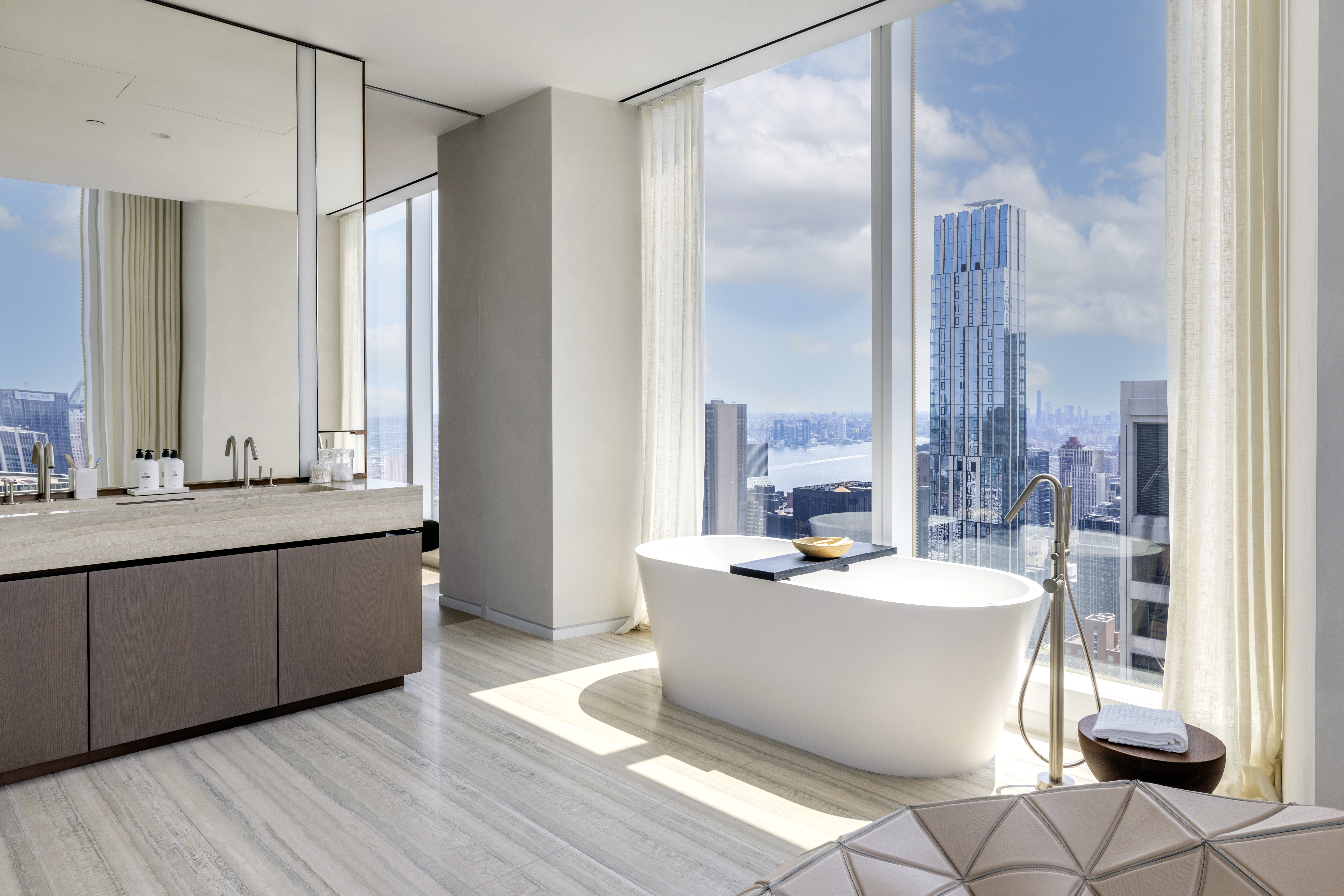
Freestanding tubs check boxes for being luxurious and a focal point, adding visual interest in an otherwise spare space. (Pretty much every new construction Brick researched has a separate tub in the primary bathroom, which is saying something.) Bonus points for parking it in front of a window with a killer view, such as at the newly launched Selene at 100 East 53rd St. where the spacious primary bathrooms also feature custom-designed oak vanities and radiant heated flooring—the latter another way to (literally) imbue the space with warmth.
2. Multifunctional home offices
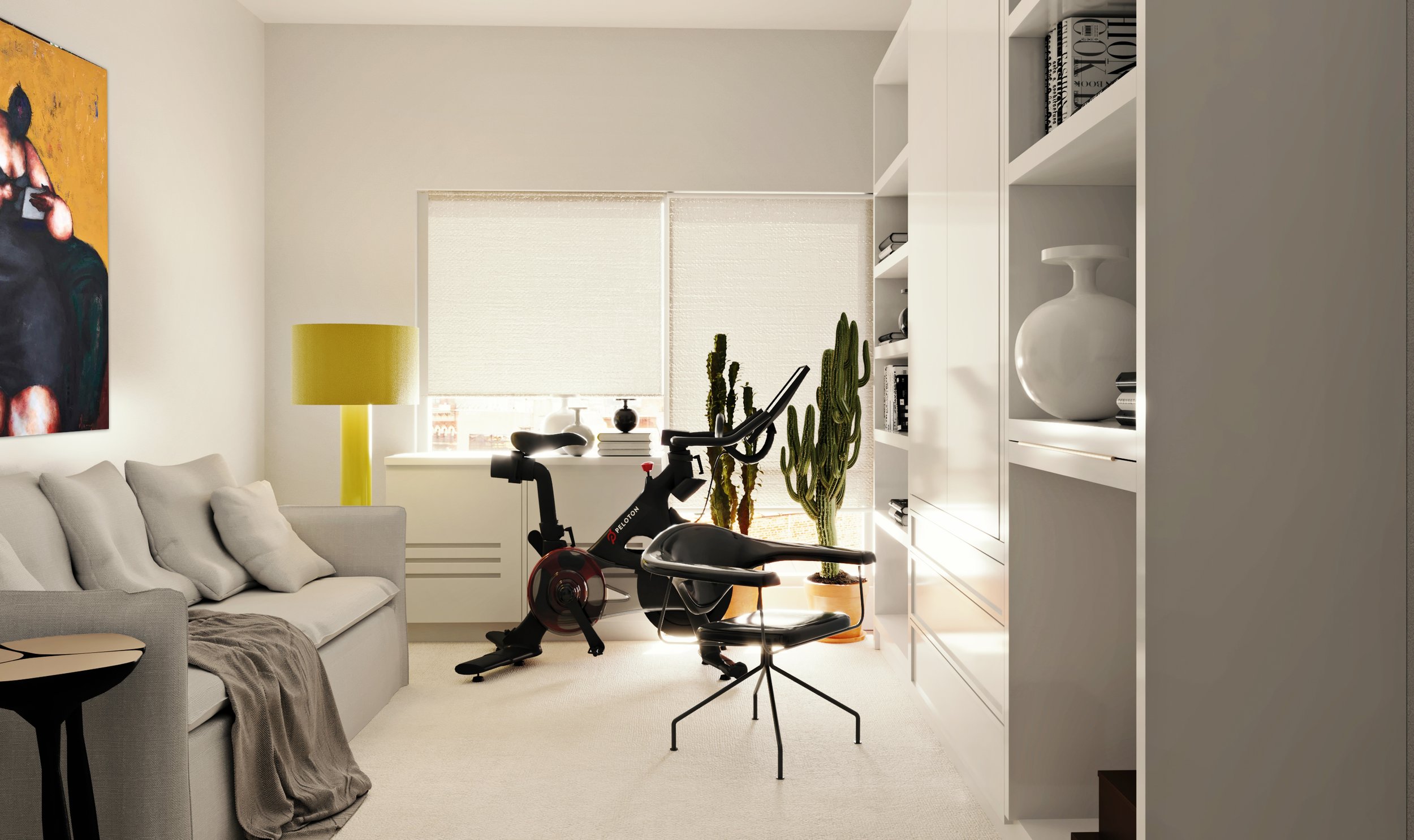
Working from home, at least on a hybrid basis, appears to be the new normal for a host of New Yorkers. But given always tight square footage, fitting a designated "office" into the footprint can be challenging. One solution is to have the space do double duty as the kids' playroom or family media room/hangout area.
Kimberly Jay, a broker at Compass, reports that since the pandemic started, buyers across the board have prioritized an extra room, alcove, or large walk-in closet to function as a dedicated office space. "First-time home buyers are forgoing studios and straight one-bedrooms unless they can reconfigure the floor plan to accommodate an extra room. Families are also prioritizing an office/play area, which can be closed off or opened into the main living area—converting dining alcoves, an extra bedroom, large walk-in closets, or a maid's room off the kitchen in a prewar home."
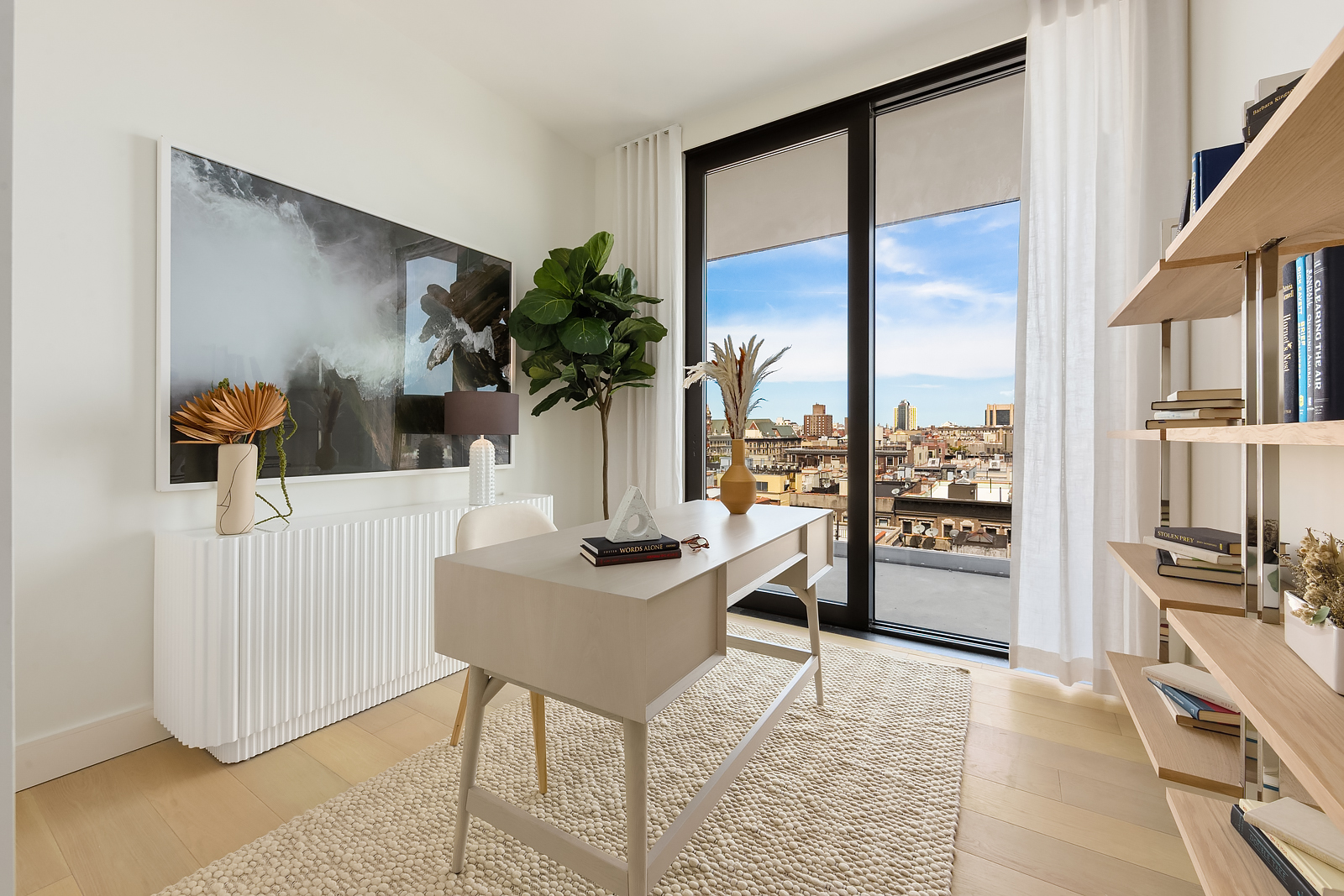
Mike Fabbri, a broker at NestSeekers who leads sales at 145 Central Park North, says they stage some three-bedroom units with a flexible home office that also works as a kids' playroom/homework space/home gym and entertaining space. "It also has access to the private outdoor terrace to make it feel extra special and function as an extension of the home versus just a third bedroom. As a result, buyers feel like they are getting the added bonus space without having to leave."
Holtzman's favorite solution is to build the office into custom cabinetry so everything exists behind the doors or panels. (Mammoth did something similar in the photo above.) "You can fold it all away at the end of the day and avoid wasted set up/take down time, plus you don't have to look at it. It just becomes a wall of cabinetry. People miss the natural boundary between work and home life, and this helps avoid eroding that boundary." Of course, custom millwork is expensive and not for everyone, but when possible it works well in NYC where space is a premium. But this enables the space to do double duty as a play area or media room.
3. Next-generation open kitchens
It's official: The open kitchen is here to stay. "Try keeping people out of the kitchen at a dinner party—this blurs that line and makes the kitchen more manageable," Holtzman says. "People are also fetishizing cooking, even more so than before the pandemic. And it's nice for a family to have this connection rather than being shuffled out of the room."
Jennifer Tanner, an agent at Coldwell Banker Warburg, says an open kitchen is especially practical for families by "offering a means to be productive with cooking and cleaning while being able to keep an eye on little ones in the living area. In the most luxurious and larger properties, the love for the open kitchen extends to a transitional moment with living spaces."
Only the open kitchen scheme has evolved to fit within even cramped quarters and offer ever greater functionality.
Case in point: Whereas an island used to be the bee's knees of open-kitchen design, now it's all about counter seating—check out the example at 222 East Broadway in the photo at top.
Tanner also points to "an increasing trend of double islands—one for prep and wash and another parallel for eating, serving, and gathering, providing the ultimate community space and anchor for the home.
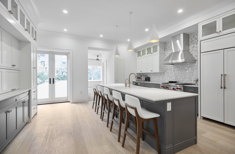
Indeed, Karp says, "Homeowners are much less focused on upscale finishes, and instead are focusing on the flow between rooms and allocating space for formal dining areas." She also says there has been a growing demand for full-paneled kitchens (aka appliance garages) that hide away all the appliances in one place. "While this was considered a luxury about five years ago, the current trend is to increasingly design cleaner-looking kitchens."
4. Statement lighting
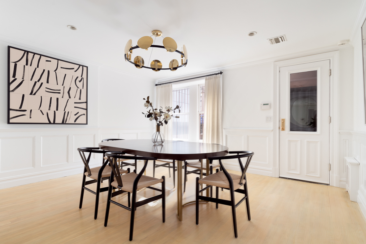
Minimalism in all its modern-day glory is pushing once-utilitarian fixtures into the forefront as a key part of the decor.
"People are paying more attention to statement fixtures than they used to—and in open floorplans, you have more opportunity to stand back and appreciate than," Holtzman says.
This is also true in outlying areas like Jersey City, where Diana Sutherlin, an agent at Compass, is seeing a preference for "over-the-top custom statement lights, especially in entry foyers and dining rooms. They tell a story about the home and the owner can tell a story about their creation!"
So whereas it used to be all about "cans" (recessed lighting) or simply hanging a chandelier over the dining table, now the idea is to fully integrate fixtures into the overall design. Same for using a striking pendant to visually anchor the eating area in an open-kitchen layout (see #3 photo above) and to elevate a mudroom (see below).
Designers are even using pendants, sconces, or floor lamps to enliven (and enlighten!) private spaces like bedrooms, primary bathrooms, and walk-in closets where they might never be seen by anyone other than yours truly.
Problem is, some clients, given free reign, opt for too many light switches and fixtures and Holtzman has to walk them back to a more considered lighting scheme. His advice? Lean into less.
5. White oak flooring
Long a designer favorite, white oak flooring has by now become commonplace in NYC renovations and new developments (see all the above kitchen photos!).
What makes it feel fresh and new is how this material is being favored not only for its aesthetic appeal but also its relative sustainability—it's harvested in the U.S., cutting down on carbon emissions from global transport, it is quick-growing and readily replenished. It's also relatively affordable as hardwood floors go.
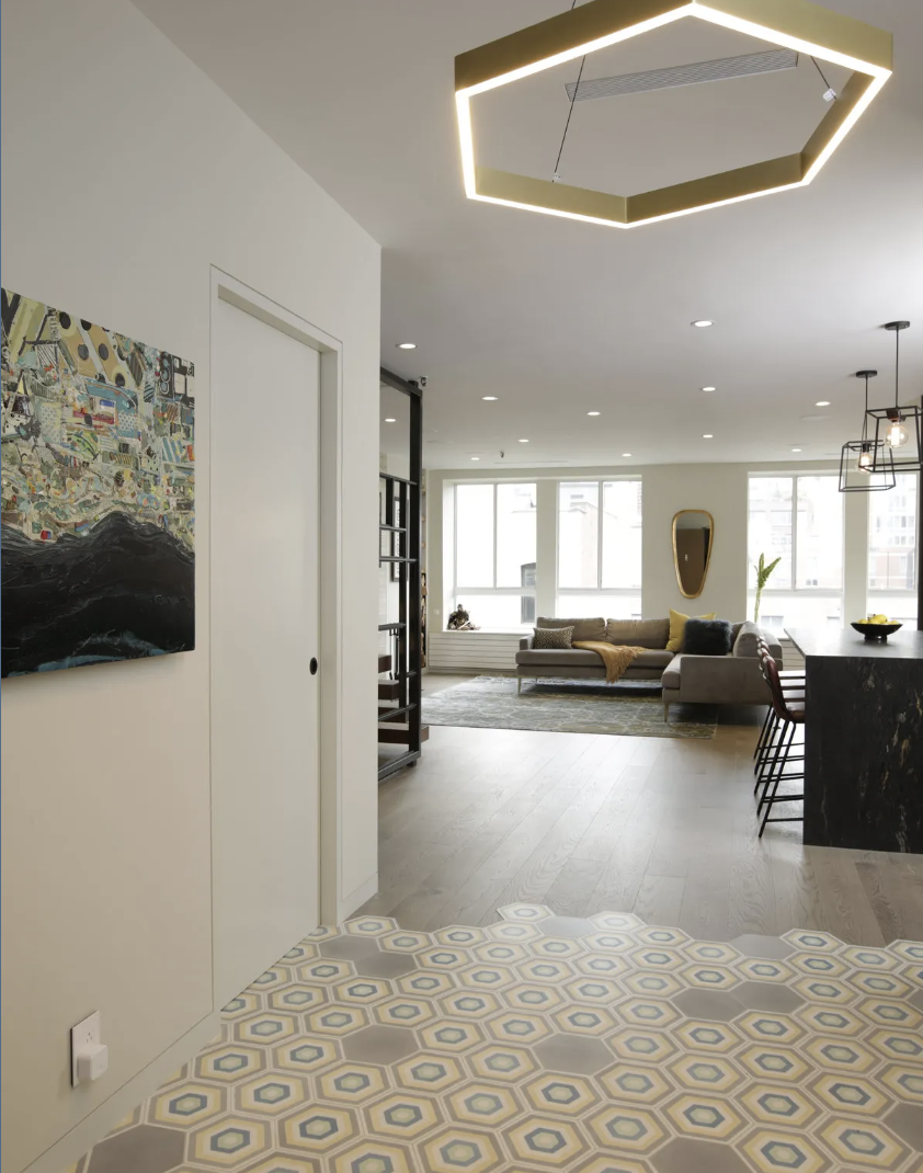
What's also new: Holtzman likes the rift-and-quartered or at least quarter-sawn white oak for its tighter, parallel grain. (Contrast this with plain sawn, which has telltale knots and ellipses and variable grain.) He prefers planks that are at least four or five inches wide (as in the photo for #4), adding that white oak is sturdy enough to go even wider.
Nowadays white oak is also being applied in throw-back patterns like herringbone (in the kitchen at top) and even parquet or mixed with tiles, as in the example above.
One final point: "White oak works great with lighter and natural stains, giving more of that light-and-bright Nordic look homeowners are looking for now," says Max Stokes, an agent at Compass. "Most older homes have two-and-a-quarter-inch red oak, which people stain dark to hide the pink/red/orange undertones."
Holtzman agrees—in his view, staining is the best way to deal with red oak floors. And dark floors can read more formal and provide a dramatic contrast with an all-white paint palette. It all depends on the look you are striving to create. You be you!
You Might Also Like


