Map: How at-risk is your neighborhood for gentrification?
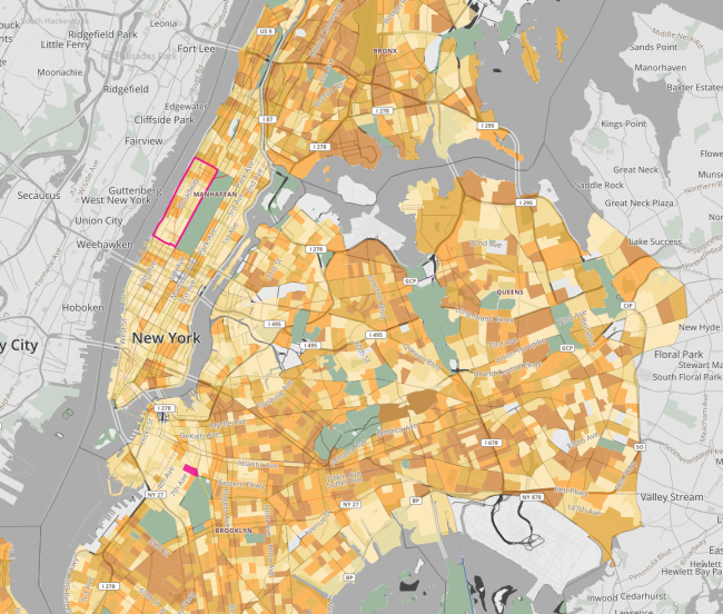
On the heels of the release of a Bushwick gentrification map comes another one from the Association for Neighborhood and Housing Development, which has released an interactive citywide map that rate your neighborhood's likelihood of gentrification.
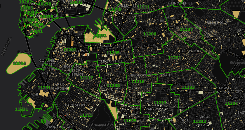
Dubbed the Displacement Alert Project Map (or "DAP Map"), the online tool has different layers to show your area's risk based on factors like loss of rent-regulated apartments, Department of Buildings permits (meaning likely construction), and speculation risk (based on price and recent sales). It can also be divided up by Community Board numbers as well as zip codes, the better to zoom in on data in your specific corner of the city:
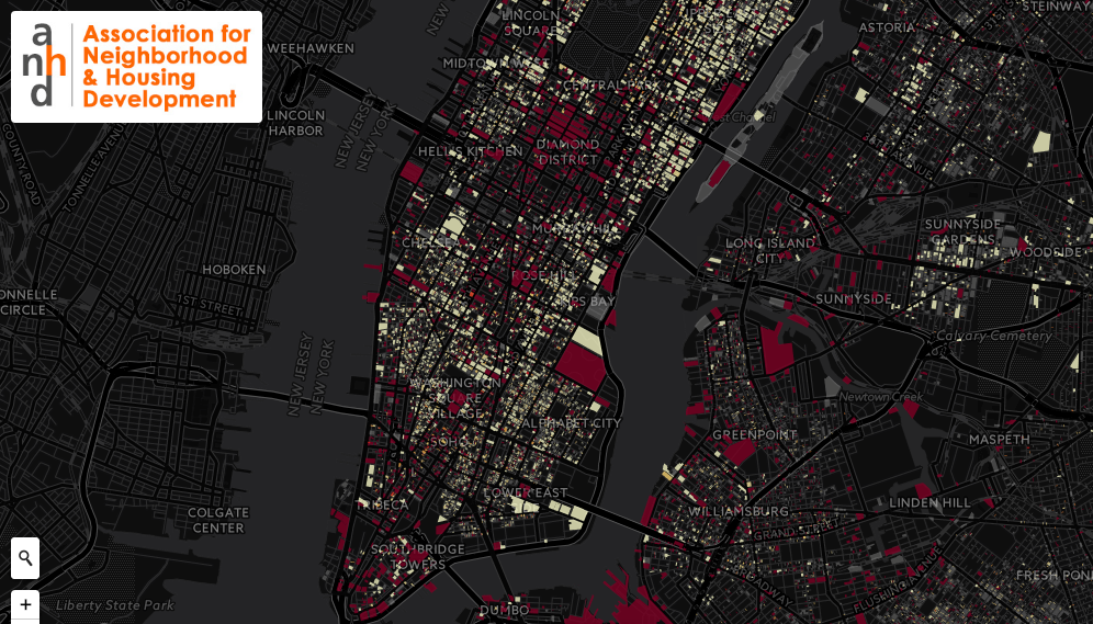
For instance, filter by DoB permits and you'll see that much of Midtown, as well as parts of North Brooklyn, the Brooklyn Navy Yard, and Industry City are particularly ripe for new development projects:
Besides providing a startling portrait of what's to come for different city neighborhoods, the DAP Map's creators write that the goal is to "be a strategic tool for tenant organizing and neighborhood and city-wide housing advocacy [...] [and demystify] the information used to target neighborhoods for gentrification, often at the expense of a community’s long-term residents."
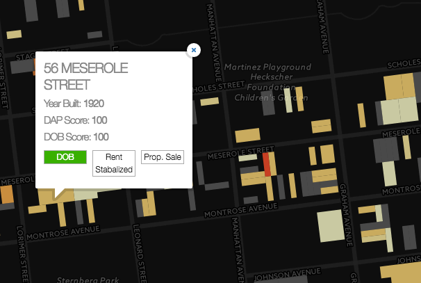
The data used to compile the map is pulled from a variety of city databases, including the Department of Buildings, and, per the New York Times, gives individual buildings risk scores based on how many rent regulated apartments they've lost since 2007; whether or not they've sought renovation permits; and if they've been sold recently.
Click through to find out how your building scores, but keep in mind that you might not like what you find out.
You Might Also Like

