What makes a perfect NYC apartment? Three architects weigh in
Ask any architect what he or she thinks is the ideal apartment and, modest as they are known to be, they more than likely would say it was one they designed. Modern if they design in steel and glass; prewar if that’s the period that informs what they do. Open kitchens? They’re all the rage. Outdoor space? Added benefit though rare in the scheme of things. Location? That’s a tough one. And then there’s the cost of just about anything decent in a real estate market dominated by deep-pocketed buyers and developers who seem to know no limits.
Brick Underground asked three residential architects what they see as the ideal apartment. Setting size and cost aside as much as one can when talking about New York City apartments, we asked about exposure, layout, views, materials, common areas, privacy, and other features. Whether in a skyscraper on 59th Street's Billionaires Row or a ground-up new construction in Greenpoint or a marvelous 1920s red-brick pile on the Upper West Side, there are common characteristics that make a perfect NYC apartment—or at least as close as your budget will allow.
Let there be light, and views (even a small one), and a reminder of the city's past
Matthew Baird, principal of Matthew Baird Architects, has designed apartments in the Beresford and the San Remo, as well as upstate barns, historic townhouses, beach houses and lofts, in addition to museums, exhibitions, office space, showrooms and other institutional projects. His take on the ideal New York apartment? “One you can afford,” he says, with just a little bit of irony.
An abundance of natural light tops Baird’s list no matter what the price range, and how that light is incorporated throughout the apartment. He recalls his first New York loft, a small 700 square feet but bathed in light from three double-hung windows that dated to 1865. “The apartment was north-facing so it was great light, constant light,” he says. For his current apartment, he is designing a 60-foot-long copper and glass skylight that will bring light into all corners of the duplex, “allowing it to bounce around and filter into all the spaces. Brand-new building or historic building, you can never over-estimate the importance of great natural light.”
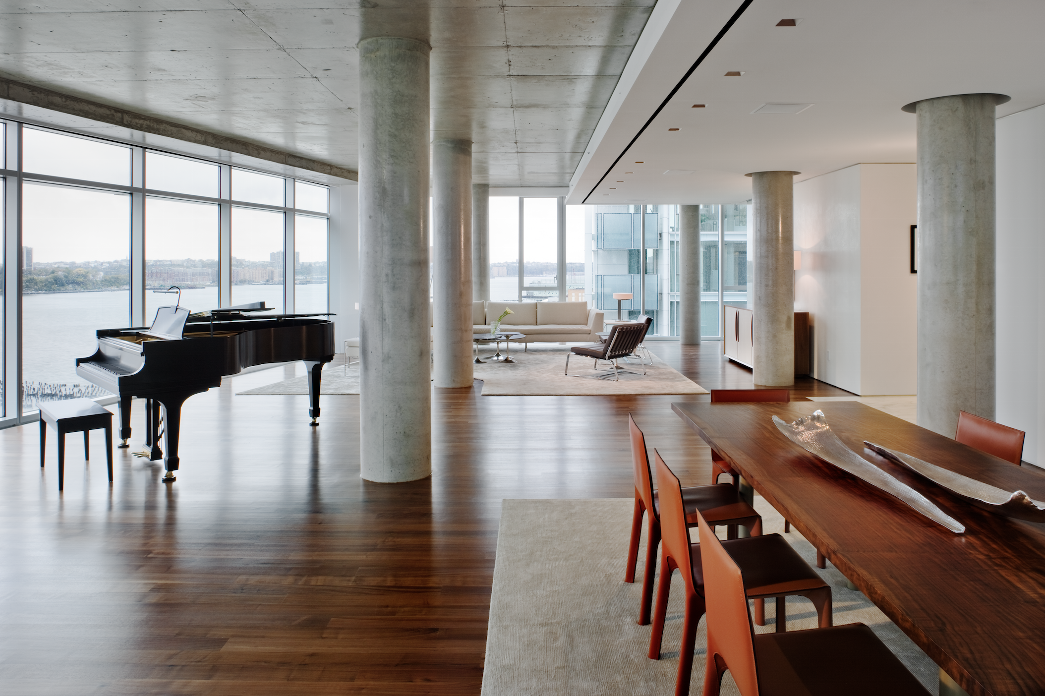
A view comes in second in importance, Baird says. “You can have the tiniest of apartments but a great view is transcendent.” The type of view is important, too. Sure, sweeping vistas of Central Park from a sky-high hermetically sealed apartment are breathtaking, but most think it’s better to be slightly closer to earth. “It’s great to have a view from high up but I would trade height for outdoor space,” the architect says. “You can grow things outdoors and create a little slice of Eden.”
Baird designs contemporary spaces and renovates historic ones, and has high praise for the state of what’s happening in design in New York at the moment. He has particular praise for the three Richard Meier buildings on the West Side Highway (for their glass shells, the light they admit, and how they're oriented to take advantage of the site and river views), and the new penthouses being created at the top of the Puck Building on Lafayette Street. When it comes to converting or renovating old spaces, Baird recommends keeping the history real. Savor the original details and incorporate them when you can, he says. “Some piece of remnant detail that is from another era,” he says. “Some fascinating relic of how it was made, like brick or cast-iron purlins.”
The ideal layout in a noisy city is a no-brainer: L-shaped is best, with bedrooms on side streets and the living room/dining room/kitchen along the avenue, “the classic Rosario Candela/Emery Roth design.” Mid-block, the living areas go on the street and the bedrooms are at the back or on a courtyard. “Separating bedrooms from entertaining rooms just makes sense,” he explains.
Privacy and flow are key
Alex Gorlin, principal in Alexander Gorlin Architects, designs for the 1 percent but also for nonprofits, and says the same sensibilities apply. “I treat all the apartments with the same generous feeling of space, creating apartments people feel dignified and welcome in,” he says. He has designed a great deal of public housing, a Manhattan apartment for S.I. and Victoria Newhouse and their art collection, a renovation in a landmarked Upper East Side building, townhouses, and numerous places of worship. His ideal apartment is a penthouse with a terrace and a view of Central Park, like that at 55 Central Park West, where the 1984 film Ghostbusters was shot. Terraces like that one, which measures 1,000 square feet, make spectacular outdoor rooms. “You can be outside and enjoy the city but also enjoy the sky and the view,” he says. “In this case, the park invites itself into the apartment.”
Feng shui dictates that Southern exposure is best, Gorlin says, and while there is some heat gain, you have light all day long. For an artist, north-facing is best. Gorlin likes a layout with rooms whose functions relate to each other. Kitchen, dining room, and living area should all flow together for a comfortable, open feeling. People like to congregate in kitchens, like in colonial times, he explains, “where life revolved around the fireplace as a source of warmth and there was a big pot cooking on the fire.”
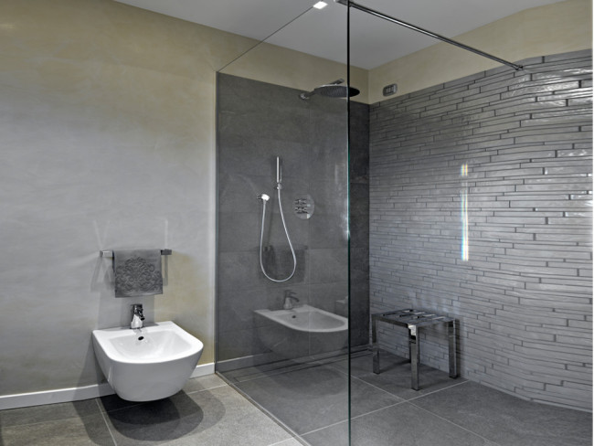
Communal space is key, but Gorlin likes lavish bathrooms for bathing, pampering and, a personal preference, a luxurious shower. “The only thing that should have its own separate space is the toilet,” he says. “Everything else should be open and connected.”
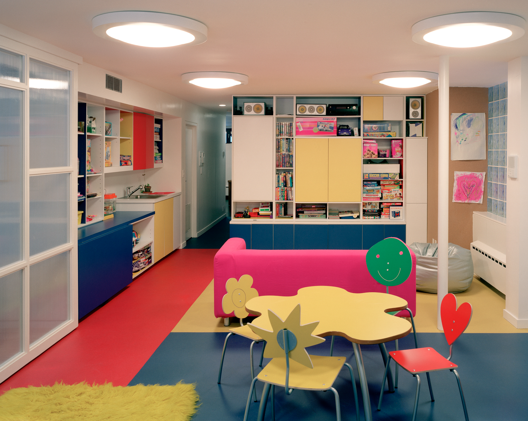
He advocates that each child have his or her own room (or, at the very least, their own personal space within a shared room), but shared space for work, play and study. “There have to be shared family goals and an effort to develop shared interests," says Gorlin, whose firm is renovating the Bell Labs headquarters in Holmdel, New Jersey.
Gorlin has a penthouse with an expansive terrace in his apartment in Miami Beach with views onto the Intercoastal Waterway. His New York apartment is a tidy 700 square-foot-studio on the 12th floor of a 1960s red brick building. It has views of a church, Jefferson Market and the Greenwich Village historic district. It has a small outdoor space. In his view, older buildings are better built. “They are much more substantial while newer buildings feel cheap,” he says. He designs with natural materials, including glass, and hates anything shiny, like marble, which “just seems superficial, shallow and insubstantial.”
Graceful proportions and clearly delineated rooms
Michael Jones is a partner with Robert A.M. Stern Architects, designers of 15 Central Park West and the brand new, $450 million, 31-unit 520 Park Avenue. For Jones, prewar flourishes and their traditional layouts are the hallmarks of an ideal apartment. “It has to have curb appeal and it must have great architecture,” he says. “I do not like glass buildings. They look like office buildings to me... I want to walk into a building that feels residential.” (The lobby at 520 Park delivers that in a decidedly prewar mold, according to Jones: It’s double height, all stone with a vaulted ceiling, carved relief all around and tracery grills.)
Jones’ idea of an ideal apartment takes its cues from Candela and Roth with rooms that are clearly defined squares and rectangles, not big amorphous spaces like L-shaped living rooms with a dining room coming off of it as if it were leftover space. “Prewar apartments have real rooms," he says, meaning distinct rooms devoted to one use, with individual doors or entrances. “The living room should be something wonderful to walk into, as the most important space. “
The architect lives in a 1931 building designed by Harvey Wiley Corbett, who also designed the former GE Building at the heart of Rockefeller Center, One Fifth Avenue, and the quirky row of apartments on Eighth Street between Fifth Avenue and University Place with its decorative eaves and brickwork set in stucco. His own living room is roughly 20 feet by 13 feet, which he deems the perfect size for him. “I would feel totally lost in a gigantic living room,” he says. “Intimate is better.”
He notes that a lot of clients who do have the grand kind of salons often have libraries located off the master bedroom for reading, television watching and family time. Distinct rooms provide an extra level of privacy, with no direct views into bedroom/sleeping areas to tantalize delivery people as you are paying for your order of Chinese food.
Combined living/dining/kitchen areas are also out for Jones personally, but many clients demand them. “I don’t want to be in my living room and look at the sink and the fridge,” he says. “If I don’t clean up, I don’t want to look at the stuff. It’s a big debate in the market.”
He notes that at 20 East End Avenue, kitchens open into the family rooms but are separate from the living rooms. Jones concedes that this is a good thing for families where parents want to be with children doing homework as the meal is being prepared and afterwards. One of the greatest appeals of a prewar building is the integrity of the materials, but they often have two exposures—something Jones loves about his own apartment whose living room is bathed in light. “I love the idea of having all that light in the morning,” he said. “It’s great.”
You Might Also Like


