Wallpaper is making a comeback: Here's a guide to the latest designs and patterns to transform your walls

The Lomasi line from Romo uses oxidized metals for a glamorous touch.
Romo
Craving some serious change to your living space but can't quite swing that kitchen or bath reno? A paint job can do wonders to freshen up your space, but if you want to make a more personal statement, consider wallpaper, an old favorite from a few decades back, now having a resurgence of sorts.
We're talking the real deal here: the kind you apply with paste. (Want something less permanent? Check out some temporary wallpaper ideas here.) And read on for more on the current trend, plus examples of fresh designs and how you (or, really, an experienced professional) go about hanging it.
Jennifer Morris of the Brooklyn-based J Morris Design says wallpaper has finally shaken off a rep of something that you would find in your grandmother's house as homeowners are increasingly willing to make an investment in projects that personalize their space.
"People feel comfortable enough to make these huge statements," she says. "It used to be that the first question you would ask about something was, 'Will I love it in 10 years?,' Now people have the courage to say, 'I may not love it in 10 years, but I'm going to love it for the five years I have it.'"
That said, Betsy Helmuth of Affordable Interior Design does advise, "Make sure it's something you're really excited about. Taking it down or changing it is a big deal."
Below, some examples of the current trends in wallpaper according to our experts.
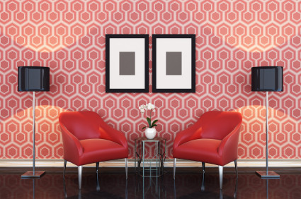
Metallic designs with geometric patterns

The popular ombre effect

Watercolor treatments with a single hue or a few shades


For a luxurious touch, go with hand-painted

David Bonk's Surfaces collection features hand-painted, vinyl and grasscloth wallcoverings, some with even tiny beading. "You see the depth over time," says Morris. "It's different in the morning than it is in the afternoon."
Super large-scale formats of natural designs

Think you’re ready to take the wallpaper plunge? Some crucial tips, from Morris and Helmuth.
1. Don’t go it alone
Do not attempt to hang the paper yourself, and find someone skilled to do the work. “Never do it on your own,” says Helmuth. “It’s a daunting task.”
“It’s a dying art,” says Morris, who says that even professionals who have been hanging paper for decades can still find some complex papers challenging. This is especially true if you’re investing in a premium (read: costly) wallpaper. “Don’t bother with $500 per-square-foot paper if you’re not going to double down and invest in the installation,” she says. Installation rates vary widely, depending on the vendor, the paper, the square-footage covered, and the complexity of the work. You could spend a few hundred dollars; it’s possible to spend thousands.
2. Use your resources
Once you have your installer, tap their expertise and advice. A key move? Ask them how much paper to order. They’ll likely have a better sense of how much you need for scrap, and how openings for doors and windows affect the quantity you’ll need. Key tip (that a pro installer will tell you): order more than you need, for the obvious reason of allowing for mistakes, but more importantly, because there are variations in dyes for each run of a paper, so if you run out and need to order again, it’s possible you won’t have an exact match.
3. Pick the right paper for your space
Some papers are more problematic than others, for various reasons. Live in an old building where everything’s not a perfect right angle? Strict geometric patterns may not play well with baseboards and moldings that are ever so slightly askew. "It has to align so perfectly and it becomes very challenging [in those situations]," says Helmuth. "If it's not perfect you'll see it from every angle." For a more forgiving choice Helmuth recommends something more organic like a floral, or a chinoiserie pattern. "Something that's not the same all the way across." Another option is a large-scale, abstract design. If you’re installing a more complex paper (many layers or finishes, textured) it will require even more skill to make it look good.
4. Pick the right space for your paper
Helmuth is in the "go big or go home" school of wallpapering, and jokingly refers to accent walls as "accident walls." She says, "Go the distance. You want to make a statement, make a statement." (She also points out that using wallpaper for an entire room is era-appropriate. "The way you do paper is you do a whole room.") If a whole room sounds overwhelming, Helmuth says that doorways and windows can go a long way in tempering a wallpaper's effect, preventing it from being too much. However, she suggests avoiding using wallpaper in a room with vents for heating and cooling systems, create awkward-looking interruptions in a design.
5. Prep your surface
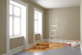
Make sure that whatever walls you are papering are smooth and primed. If they're not in good shape, you risk wasting your money on some nice paper for shabby-looking results.
For additional sources, with options ranging from affordable to extravagant, check out Burke Decor, Serena & Lily, Anthropologie, Cole & Son, Chasing Paper, and Spoonflower. If you're interested in a vintage look and want authenticity, Helmuth says check out eBay and Chairish, but be advised that quality can vary with older stock.
You Might Also Like


