5 things I learned redoing my NYC living room over the course of a year

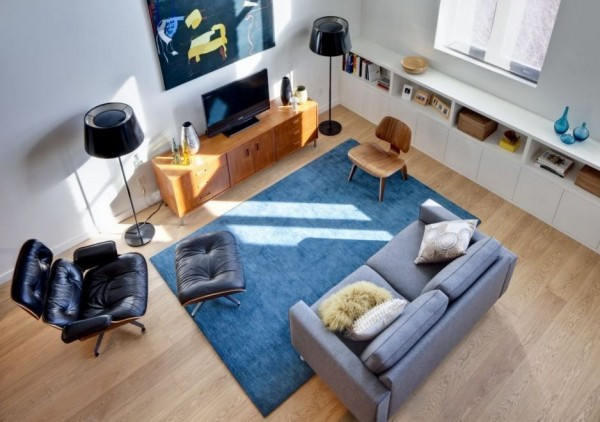
The finished room: It took some time—and eventually, professional help—but we did it.
Mimi O'Connor for Brick Underground
Over a year ago, my husband and I began, in earnest, the process of trying to furnish a space that had seemed, at least to us, very awkward.
It is our living room I'm talking about, the first space you encounter when you enter our house. But in our place, it also serves as a corridor to the back of the house and the stairway. It felt more like an undefined, pass-through space than a room, and we wanted to change that.
But we were overwhelmed with the calculus required to balance practical needs with an aesthetic that would make it “work.” What I mean is that we wanted substantial furniture, but didn’t want to make the space feel closed off. A diminutive couch like a loveseat seemed inevitable, but we wanted a couch two people could actually sit on and be comfortable.
It was also an end of an era for us—and the start of a new one: As veterans of curb finds and IKEA, with our youth firmly in the rearview, we were willing to finally spend some money on quality furniture. However, inexperience paralyzed us, until we called in some professional help.
So now, more than three years since we moved in, the space is (for the most part) furnished. The verdict: we love what we got and have zero buyer’s remorse. Admittedly, the couch—our grand, grown up purchase—has only been with us since October, but we’re optimistic.
Here’s what I learned through this somewhat drawn out, but very instructive process.

1) A digital design service helped visualize our new room
As I wrote about in depth here, I used a digital interior design service (in my case, Modsy) to help develop an overall look and layout. Initially, I was mostly interested in the neat-o factor of having someone design my living room for me, but it turned out to be extremely helpful to have designs and individual pieces to react to and help me refine my preferences and needs. (Light-colored sofa? Not realistic with a seven-year-old running around. Spare and chic with a single chair and boho ottoman with tray as a coffee table? No way.)
Additionally, it was useful to see configurations of furniture we never would have thought of, in layouts that used our room dimensions.
2) Shopping with an interior designer was a game-changer
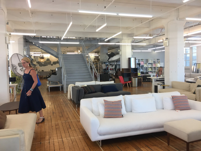
I’ve always been a DIY kind of gal when it comes to designing my space. Hiring an interior designer or consultant is not something I would do, or ever thought I could afford. So when I had the opportunity to shop the designer furniture outlets at Brooklyn’s Industry City with an interior designer, I was really out of my element, at first.
While this service is a luxury, I found out the benefits of getting the input and guidance of a professional was a game-changer for us. (Jamie Alexander, founder of interior design firm Design Bite, provided me with her expertise. Her rate for this type of work is $150 an hour.)
If, like me, you tend to get overwhelmed and distracted by lots of choices; have trouble with spatial relationships; are a sucker for a bargain and vulnerable to foolish purchases; and don’t really know much about quality furniture, working with an interior design consultant could be for you!
In addition to helping me navigate all these consumer handicaps and issues, Alexander brought a fresh eye to our space, suggested pieces that felt aligned with our aesthetic while also injecting a contemporary sensibility (i.e., keeping our living room in the 21st century).
And while by the time I went shopping with her, I was ready to pull the trigger, she definitely help bring a focus and efficiency to the process that randomly pinning photos from interior design blogs, magazines, and company websites over a glass of wine at 10 p.m. did not. The experience made me reconsider the idea of a personal consultant, revising it from "bougie luxury" to arguably a smart and efficient use of funds.
3) Go for higher-end furniture at outlet prices
I have also never been one to go high-style or price when it came to furniture. I'm guilty of rolling my eyes at the cachet of “Italian design” this, or “hand-knotted that." And I'm also cheap as hell.
Fueled by our desire to finally have some real furniture that would last, we were ready to spend some cash, and Alexander explained to me why, at least in theory, these pricier pieces cost more, pointing out how factors like filling, construction, materials, and country of origin all affected comfort and durability.
Shopping at the outlets at Industry City is a perfect place if you're looking for higher quality furniture and have trouble swallowing full retail prices. The discounts at each store varies, and is relative (60 percent off $5,000 is still a $2,000 price tag), but you can still find good deals, and sales and clearance events do happen.
4) Everything at ABC Carpet & Home is not stratospherically expensive
I personally feel like it’s a rite of passage for New York City residents shopping for furniture to pay a visit to ABC Carpet & Home. Once there, they admire a chair, see that it costs $15,000 and run away, never to return.
Which is why I never expected to find something at the store, and was shocked when, in fact, we did. Did you know ABC has its own private line, “Cobble Hill,” which it manufactures? And the custom design area at the Industry City store is impressive with large fabric swatches in all colors and textures displayed for easy review.
Is the couch, which we bought at ABC, with a matching ottoman, more expensive than the made-to-order Eddy Sofa we almost bought at West Elm? Yes. But not that much more, and maybe I’ve drunk the Kool-Aid, but it feels and looks more solid. And yes, it's extremely comfortable.
5) The unconscious is a powerful thing
Finally, looking back at that original design I selected on Modsy, it seems clear to me that I am embarrassingly vulnerable to suggestion and have no actual original or inspired design sense. There are striking similarities between the initial digital rendering of my living room, and what I ended up with, despite the fact that I was not intentionally attempting to recreate it. (One small detail in my defense—I had the brass arc lamp to begin with.)
But the gray chair, the rug...those choices were made “independently." If I'm honest, I'm not even sure I started out considering a deep blue sofa.
Still: I love it and I wouldn’t change a thing.
You Might Also Like


