8 design trends for NYC apartment and brownstone renovations for 2024
- A cream-colored palette is a hallmark of the current 'quiet luxury' movement
- Natural stone, organic (curvy) shapes, and mixed metals are also popular
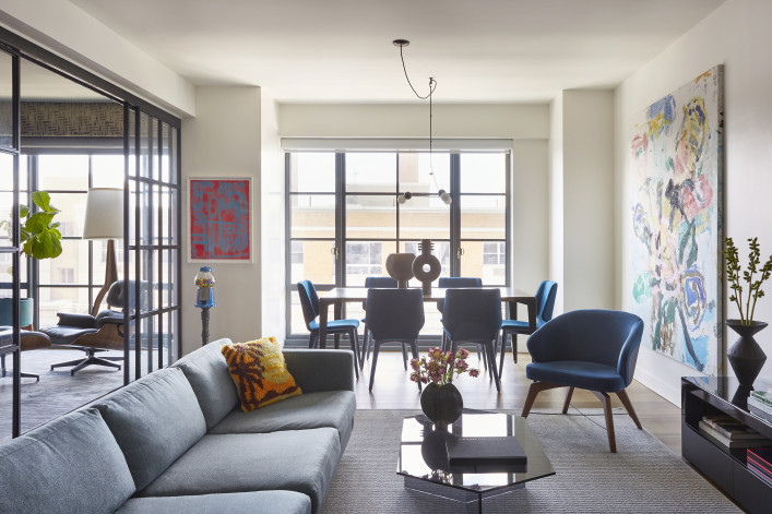
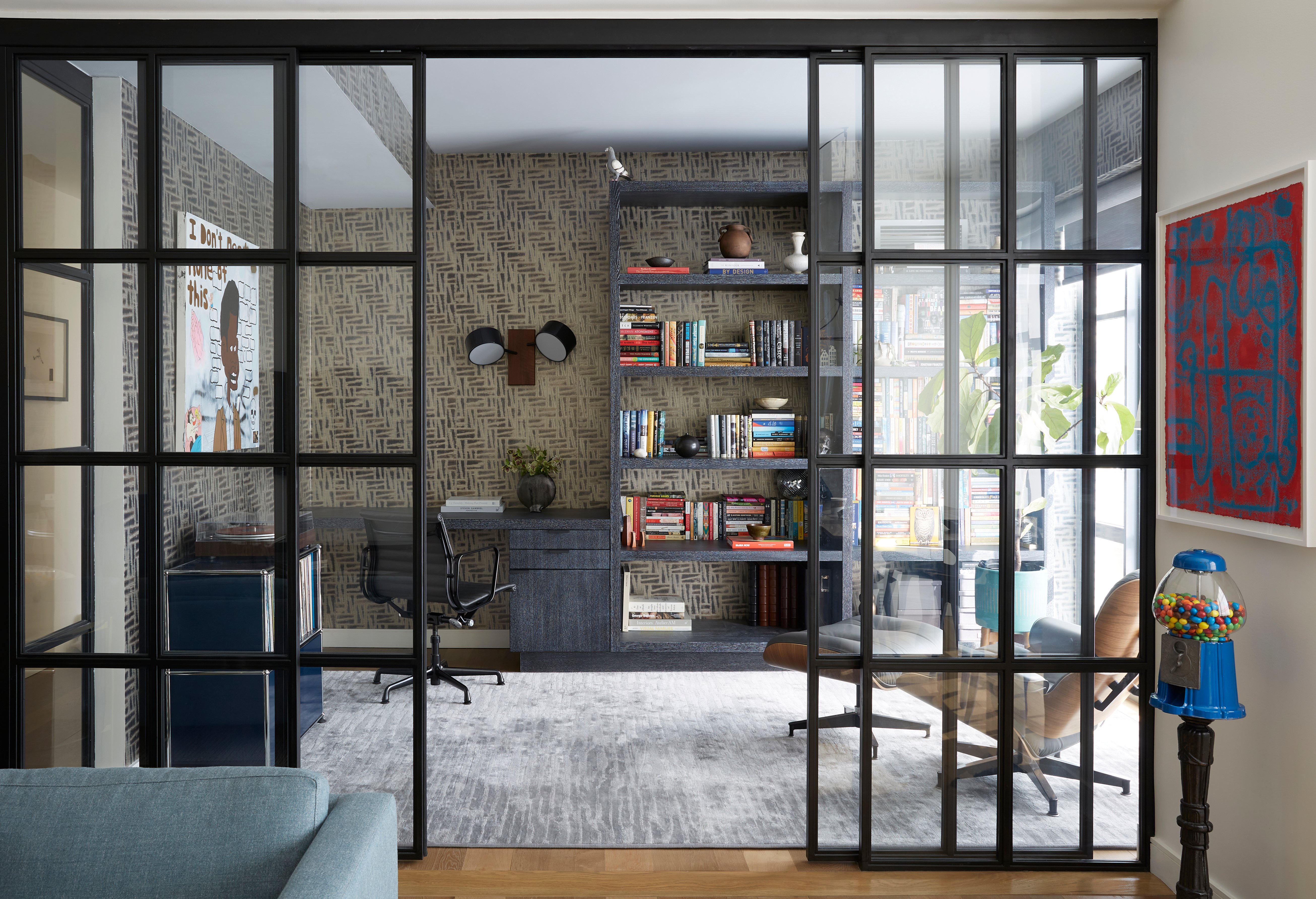
Flexible layouts are in demand, like this Boerum Hill apartment's living area, which can be partitioned off from the home office as needed. Design by Tina Ramchandani Creative.
Jacob Snavely
Renovating an apartment or brownstone in New York City always involves a tug-of-war between indulging your own style and being more practical and resale-minded. The winning side often depends on how long you plan to stay post-renovation. If your plan is to remain two or three years, you may be more restrained, while if this is your dream home, you're free to express your personality.
Of course, much depends on what kind of a premium you put on being surrounded by what you love, day in and day out.
"That's my own philosophy, so I always appreciate it when clients say something like, 'I love color, let's do it!'" says Tina Ramchandani, principal interior designer for full-service design firm Tina Ramchandani Creative.
It's helpful to frame the trend conversation with a few overarching factors. Namely, people are still clocking more hours at home—remote-working, cooking, entertaining, streaming favorite shows, what have you.
That reality coincides with the burgeoning "quiet luxury" movement—something also cited by Maryana Grinshpun, founder of Mammoth, a full-service design-build firm (and a Brick sponsor).
"The quiet-luxury trend in fashion is definitely seeping into interiors, and I am leaning more into classic color palettes, luxurious materials, and texture (and how light works with it) to create spaces that will last a lifetime," Grinshpun says. "Overall, I think there's a move toward spaces that feel lived in, aged, comfortable, and warm."
Finally, a qualifier: When considering adopting a trend, you want to look at popular design elements with staying power. So the idea is to screen out all the noise around what's "in" or "out" and hone in on those that speak to you the most.
Because ultimately, there's no right or wrong way to style your home. It does, however, pay to know what's popular with other New Yorkers to make informed decisions and maximize your ROI—whether that means your own enjoyment, potential resale value, or landing somewhere in the middle.
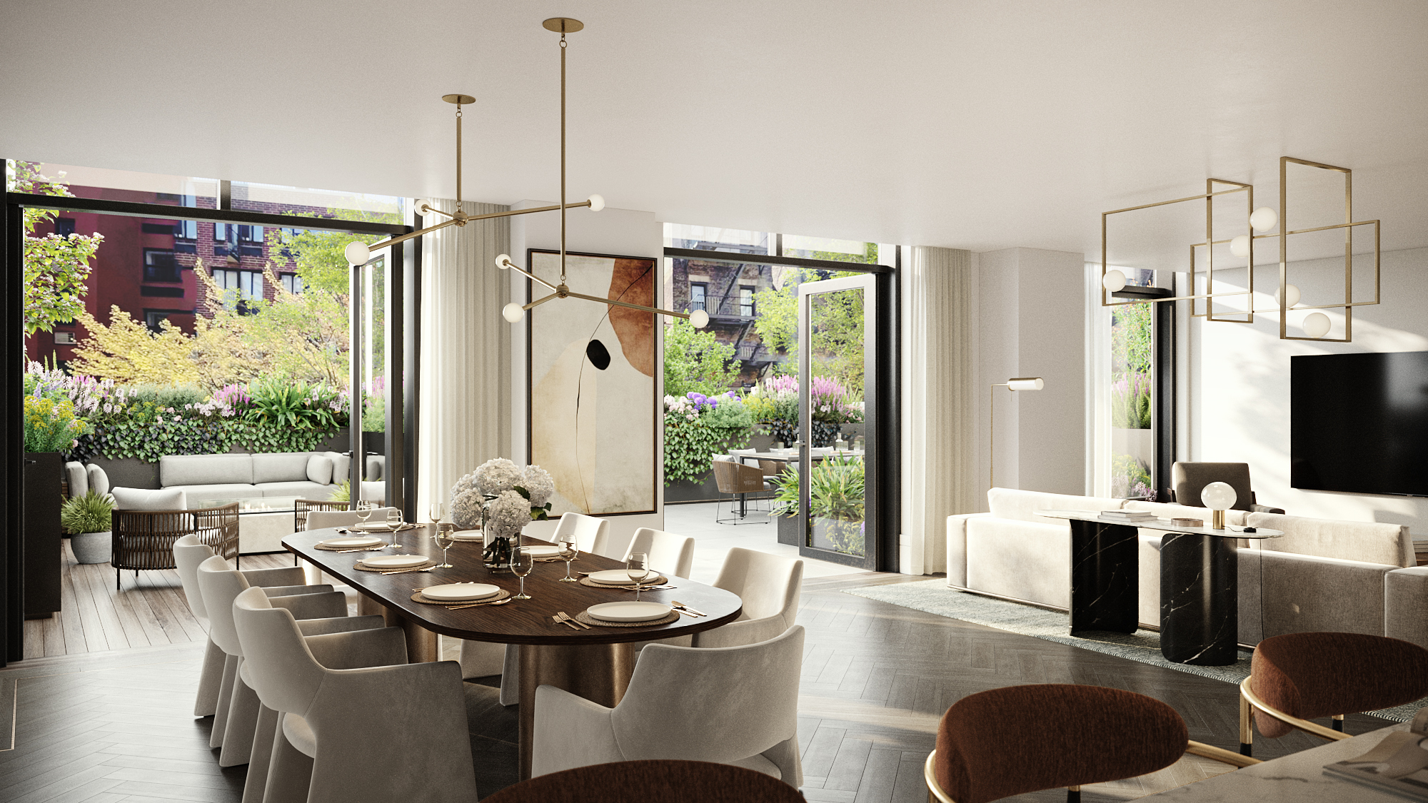
1. Cream is the new white
This is the hallmark of the whole quiet luxury movement, Ramchandani says, emphasizing that cream is not white. "It's warmer and more inviting, and people want to feel comfortable." It's also richer than cool greys, which have had a lengthy moment.
Grinshpun agrees: "Creams are going strong and often paired with accent tones in black, metals, and rich browns. The overall vibe skews toward warmth, texture, and quiet elegance and extravagance."
New developments are jumping on the cream-hued bandwagon. For the model residences at 222 East Broadway on the Lower East Side, designer and featured stager Xandro Aventajado of studio D says he was inspired by the project's mix of the city's present and past (it combines a brand-new tower and a renovated landmarked loft building).
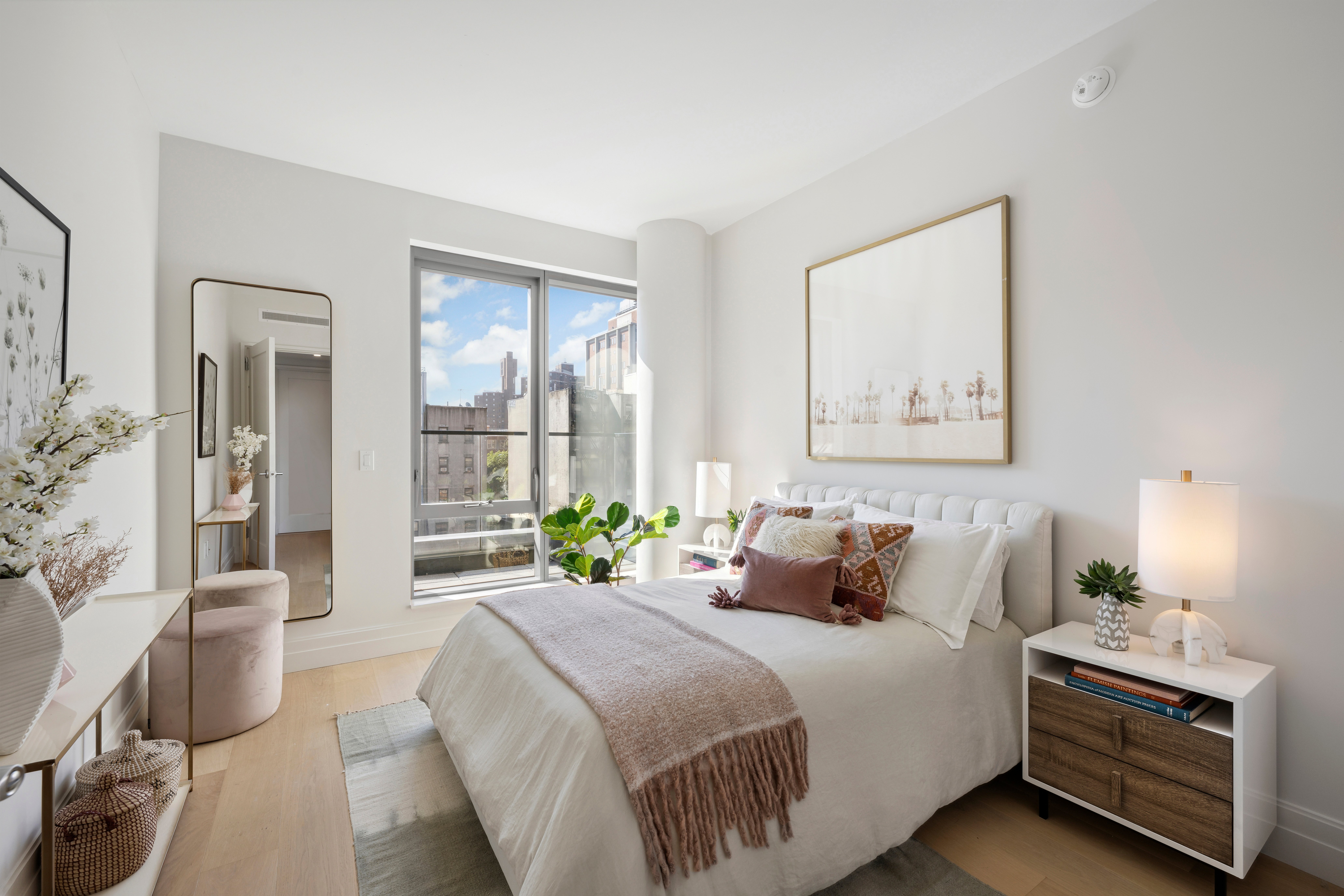
"Opting for cream instead of stark white can create a cozier and more inviting atmosphere," Aventajado says. "It's gentler on the eyes and tends to be better received overall, as it imparts a warmer and more comfortable feel to the space. Creamier whites often have subtle undertones and textures, which can add depth and visual interest to a property.”
According to Sharon Blaustein, founder and principal designer of B interior for The Harper, a new condo building on the Upper East Side (shown above): "The soft cream color palette creates a juxtaposition to the surrounding busy city. It can be contemporary but at the same time warm and welcoming as opposed to cold whites." Blaustein also “picked furnishings that are light-colored, textured, and soft—the emphasis was to create an oasis within the city ‘jungle.'”

2. There's room for color, too
In Ramchandani's experience, people who thought they were "supposed to" stick with white or other neutrals are realizing they are ready to get off the fence and embrace it.
The idea is not to bathe your entire apartment or brownstone in bold hues, but to use color strategically—such as to create a welcome pause from an otherwise creamy palette.
For example, at The Astor, a luxe new condo in a historic building on the Upper West Side designed by architecture firm Ash NYC, dark paint was limited to the hallways of a model unit.
"Hallways are often overlooked, but we thought of this entry foyer as a defining characteristic, the artery that connects every room in the home," says Andrew Bowen, partner and head of staging for Ash NYC. "We elevated this hallway by painting it a luxurious, near-black color—Midnight Oil by Benjamin Moore—which adds drama and mystery, creating a moody yet incredibly elegant experience balanced by the lightness in the rest of the home."
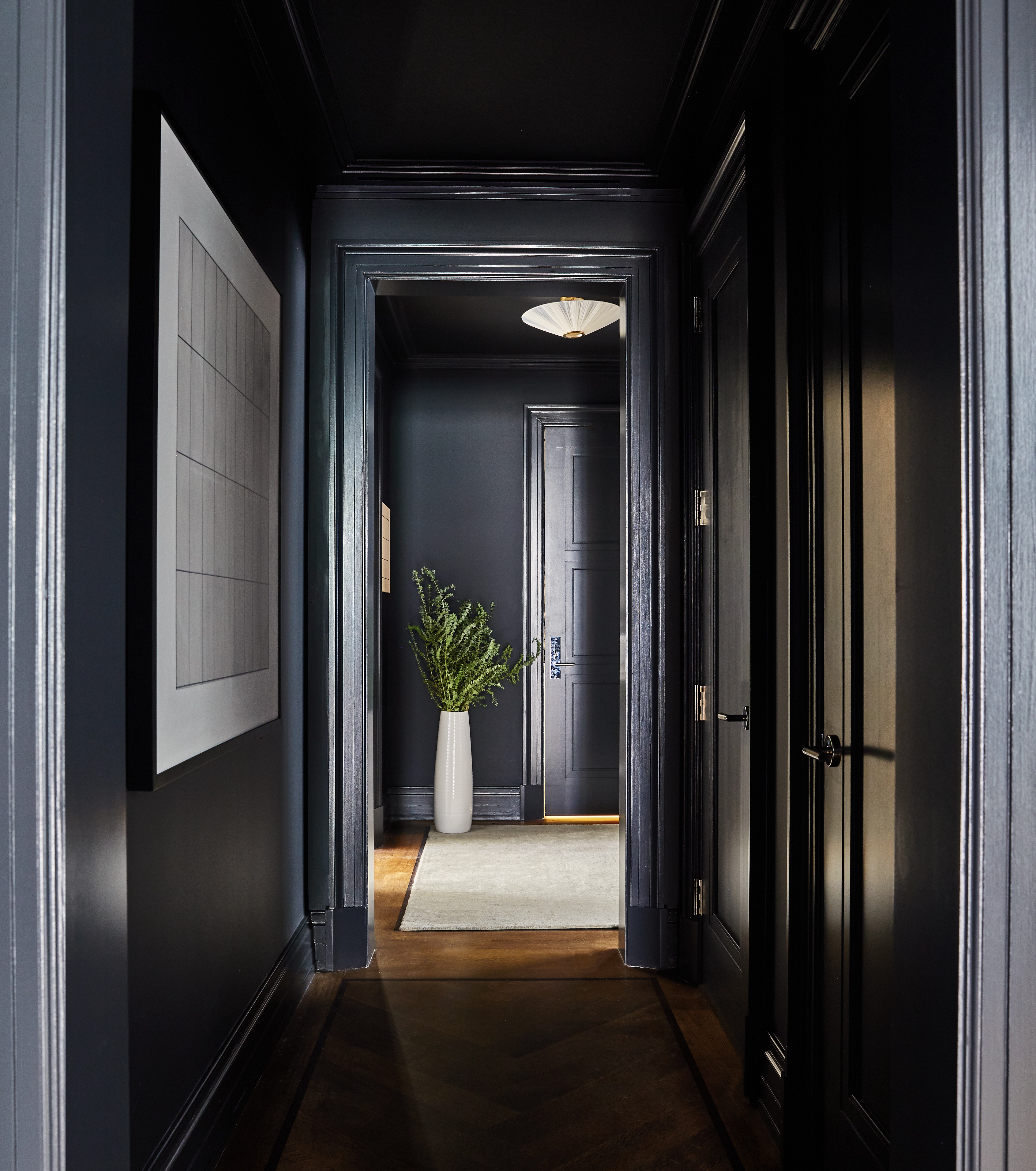
Ramchandani created a similarly moody space in the Showhouse (shown above) and a Park Slope brownstone (below). Her advice is: Don't just do an accent wall—instead, embrace bold color fully within a room. Use it on all the walls (no accent walls!), as well as in the wallpaper, furniture, and rugs. "We did a purple sofa in a recent project and the owners were so happy," she says.
She is a big proponent of continuing the same color onto the ceiling, especially if you have eight-foot ceilings (as in her own place). "If you have dark walls and a white ceiling, the whole room just stops" whereas a monochromatic approach can make smaller places feel bigger (true fact: dark colors recede).
If that idea makes you squeamish, consider using a lighter shade of the wall color on the ceiling—or go for it. "The beauty of paint is that you can easily redo it," she says.
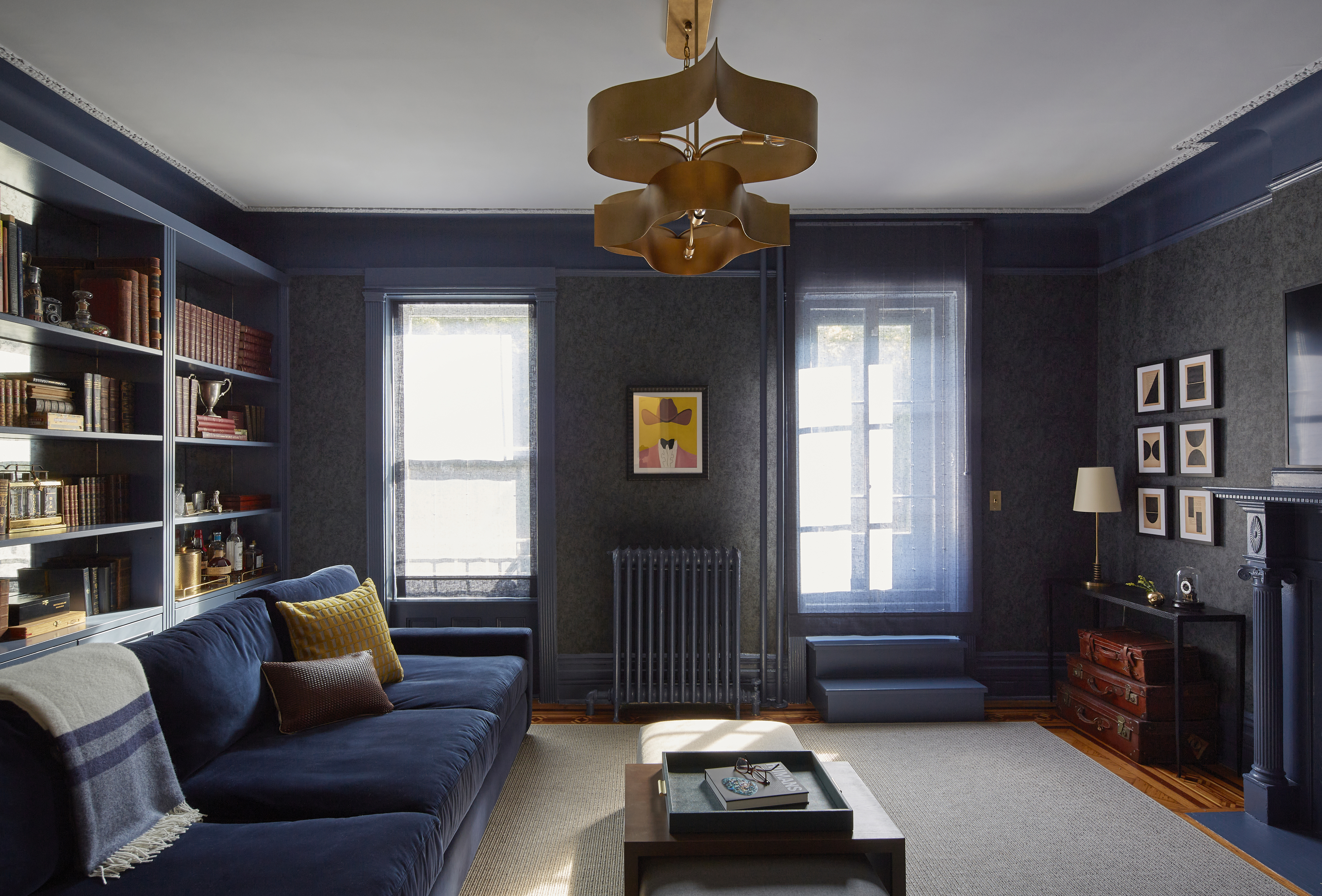
3. Wallpaper is one way to layer on texture
Ramchandani says she uses wallpaper in 99 percent of her projects—some clients want every room papered, others only half. "There's only been one project in the last 10 years where we didn't use wallpaper, and that was for a client who could not understand how much it would add to the all-white, minimal space."
She points to all the great temporary wallpapers as low-commitment options, especially for a kids' room that might need to evolve over time. "Even in rentals, we are doing wallpaper."
The wallpaper need not be graphic or colorful. For example, Grinshpun installed a wood veneer wallpaper in an East Village apartment, saying it adds dimension and texture but in an earthy, natural hue.
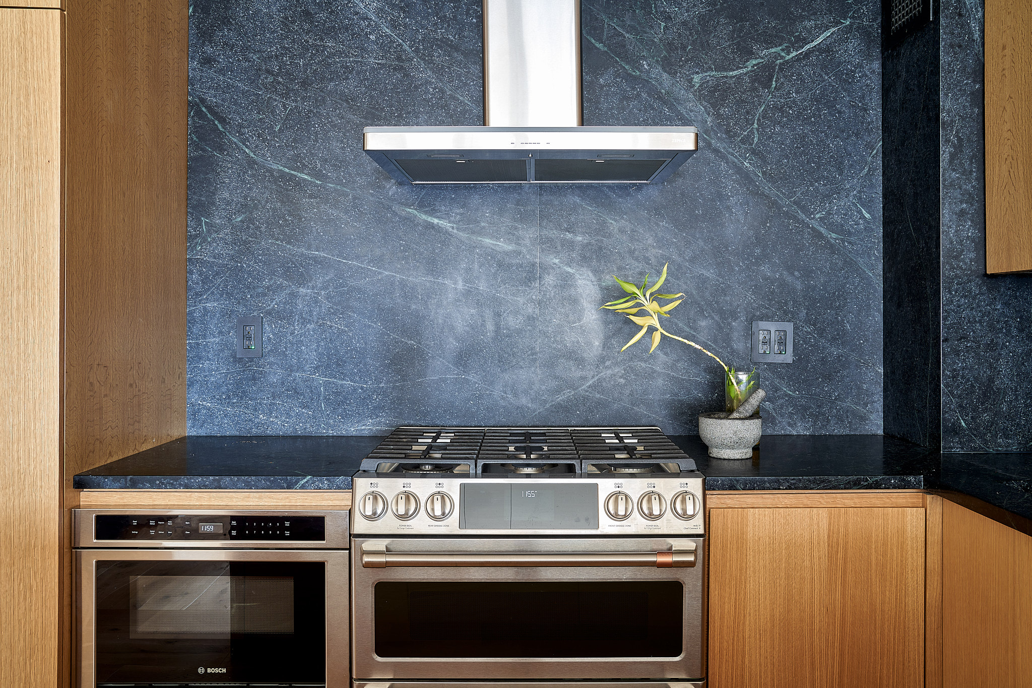
4. Natural stone is back in demand
Quartz and other man-made surfaces have been the default for many people because they were seen as more durable, and porcelain or ceramic tiles have been favorites because they were cheaper. But Grinshpun and Ramchandani say people are gravitating toward natural materials for a few reasons.
First, people are rediscovering the beauty of marble and quartzite and how each piece is unique. "You might get a piece of Statuario marble and your best friend might get a piece of Statuario, and they will look completely different," Ramchandani says.
Or as Grinshpun puts it: "I am more than ever embracing the aging of natural materials and designing for that."
Second, thanks to HGTV and Instagram, people are enjoying the process as much as the outcome—especially the younger "experience" generation. "The marble becomes a talking point, so when friends come over, you can tell the story of going to the stone house," Ramchandani says.
And perhaps most importantly, "the products for protecting stone have gotten better, so it's easier to maintain porous materials like marble," Grinshpun says.
Instead of applying every year or two, now the sealant can last up to 10 years
What about granite? "We still use Absolute Black in a fireplace or on the hearth. Just not the speckled brown granite," Ramchandani says.
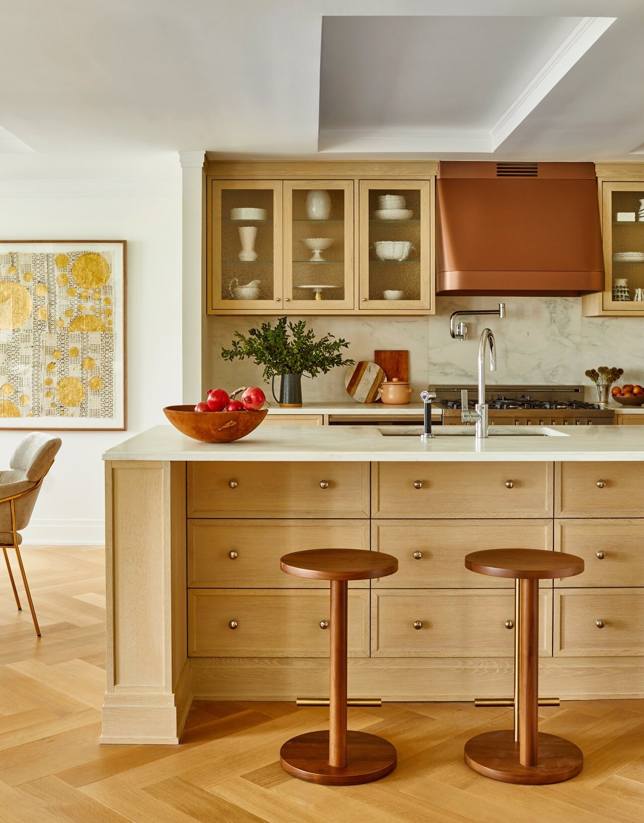
5. Mixed metals lend a relaxed vibe
There was a time when all the hardware would be matchy-match. These days, mixed metals are in—say, having the hinges on the doors in one finish and the handles on the millwork in another.
Grinshpun sees this as another example of a move away from perfection and toward a more relaxed aesthetic. "For example, unlaquered brass for plumbing fixtures and hardware has long been popular in other places such as France and Japan but has only recently become popular in the U.S."
Ramchandani says another metal mini-trend is the resurgence of nickel after a couple of years. "I was all about chrome and then brass and firmly believed I would never like nickel, but now I love it. It's a beautiful finish."
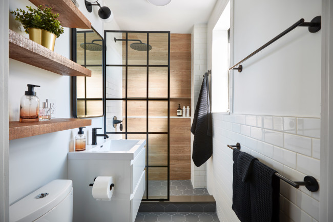
For a current project on the Upper East Side, she installed polished nickel fixtures in the primary bathroom, mixing it with a brass light fixture; the vanity hardware is going to be either brass or oil-rubbed bronze, which she says "offers a black appearance but with more character than matte black."
6. Flexible spaces are gaining ground
For some people, the open concept is still huge. But Ramchandani says others find having everyone in one room all day frustrating and want dedicated living spaces for specific uses.
For example, rather than having a desk in the kitchen because you are only going to be using it for an hour each day, people today need a separate work area. "Or they want a designated playroom so the majority of toys are not in the living room," she says.
Not that people are willing to give up the open space entirely; instead, it's about having the option of closing it off as needed. "There are innovative ways to do it that allow you to use all your space without just plopping furniture down in an open plan," Ramchandani says.
That includes using pocket doors that can be hidden when not in use. In one case, she designed a full sliding glass partition "that completely closes off the big, sweeping living area during the day when one part is used as a home office or as a guest room when people stay over" (with draperies that can be drawn for privacy).
In the Boerum Hill residence shown at top and above, she used a sliding partition to close off the den/office from the living room.
"We are doing so many industrial-style metal-and-glass partitions, which besides letting light pass through, add another layer of graphic lines and make it look like you've done architectural work," Ramchandani says. "It's not new for us, but whenever people see a project with one of these partitions, they want it for their project too."
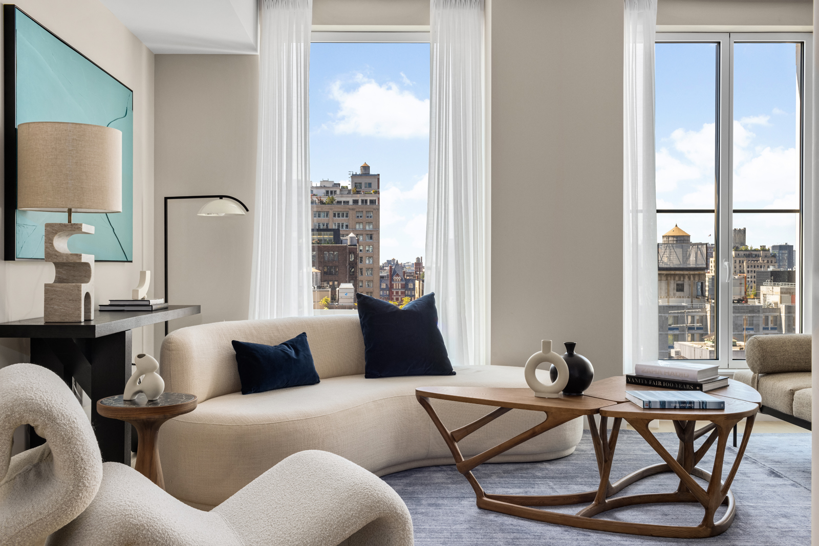
7. Curvy furniture still has legs
Curves are a trend that emerged a few years ago with no sign of letting up—at least according to design magazines and social media feeds.
They are also cropping up at new developments such as the Maverick in Chelsea. "Being situated in the floral district, it is only fitting to incorporate elements and shapes that mimic the natural outdoor environment," says Sara McCarthy, a designer at full-service studio Vesta, who adds that bringing in natural forms, textures, tones, and materials is a driving force in the design. "Curved pieces are taking over the design scene, and their impact on a space is sophisticated, versatile, and easy to incorporate into any home."
Grinshpun, however, says she is moving away from curves in architectural statements. "I am drawing more rectilinear (door) casings, for example, and leaving curves to things that are smaller in scale, like furniture as well as baseboard and trim profiles."
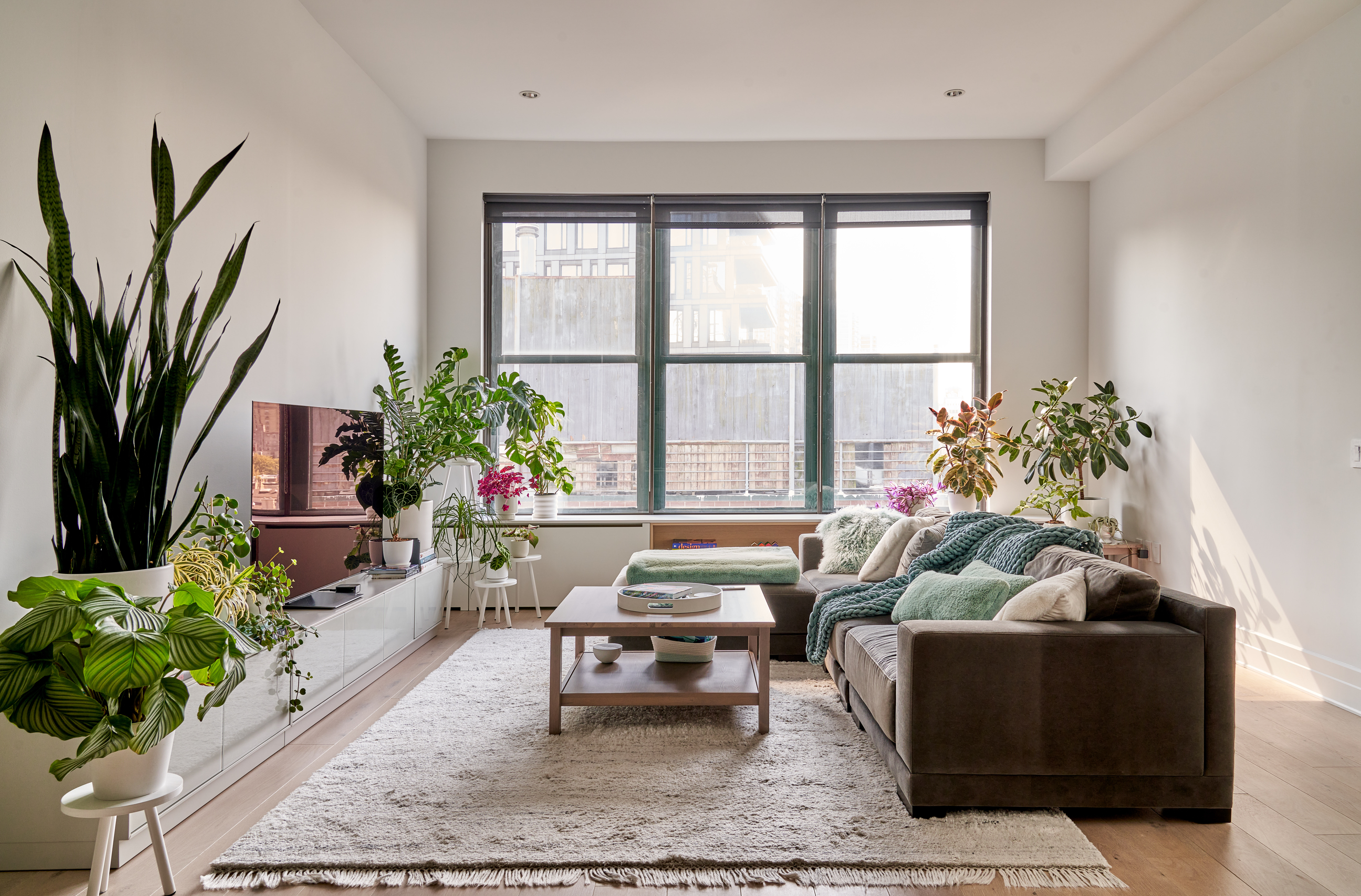
8. Plants are more intentional
Ramchandani says clients have been requesting that she designate where the plants will go in the design phase. "So we might have a plant corner near the sofa or a deeper windowsill that can accompany a rotating herb garden." She sees this as part of the ongoing wellness trend: "greenery is beautiful and good for the soul."
Grinshpun is also integrating plants into her designs, though she thinks green (living) walls are a bit played out. "People developed a green thumb during the pandemic and are working this passion for plants into their reno projects." And you don't need private outdoor space to do this, either—GTK for most New Yorkers.


