A real estate photographer tells you how to spot staging tricks in listing photos

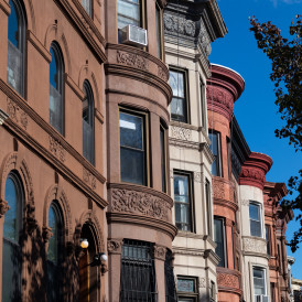
New York-based real estate photographer Leon Cato, who shot this photo in Brooklyn, steers clear of using a flash, relying on a space's natural light. It's easy to spot the difference between the two in listing photos, he says.
Part of the daunting experience of finding your next NYC apartment is looking at endless real estate listing photos. Along with price and location, images are what entice you to check out what could be your next apartment.
Some photos, though, can be so bad you immediately say, “Next!” while others seem too good to be true (spoiler: they probably are), especially when the seller hires a real estate photographer who can skillfully manipulate a photo. With a glut of brand new condos on the market, buyers will be seeing lots of digitally enhanced photos accompanying listings, and it pays to know what you are looking at.
Brick Underground is here to help with tips from photographer Leon Cato, who has shot more than 2,000 properties here and in London since 2012, and previously was a photographer for Airbnb. His clients often include new developments, as well as individual owners who have renovated properties to make them more competitive.
Too much of anything is a bad sign
“If a photo is overly bright, over contrasted, or almost too perfect or synthetic, that should be a red flag,” Cato says.
Another is if the photo has the same level of lighting everywhere. “It’s weird,” he says. “If the brightness is the same throughout, that is just not natural. You have to show where natural light falls.”
Beware the wide-angle
New York may be one of the biggest cities in the world, but its abundance of tiny apartments has long been a punchline—and something many sellers or landlords get very creative trying to hide in a listing photo.
To that end, be wary of wide-angle shots, Cato says. “If you go too wide, you’re giving a distorted view of the space, and it can look unrealistic,” he adds. “I had a potential client who wanted me to shoot ‘wide wide wide,’ and his space was, like, four square feet. How big can I actually make that look before it becomes cartoonish?”
Look out the windows
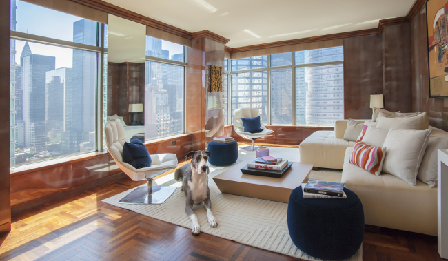
While browsing listings, be sure to take note of what's outside apartment windows to get a sense of their view. If it’s really good, those windows will likely be a focal point; if it’s not, it won’t be, or curtains might be closed, for example.
“There’s always going to be a couple units in a building that has really bad views, and you have to be conscious of that,” Cato says.
Digital vs. reality
The use of digital renderings and digitally staged photos are on the rise and should be looked at with a grain of salt, warns Cato.
Most listings will indicate somewhere that the image has been digitally staged, so take that to heart. If a photo seems too perfect and you don't see any indication that it is a rendering or digitally staged, consider that it may be and don't get your hopes too high.
“People can come and see it and immediately say, ‘This is not what you showed me,’” he says. “You can almost guarantee that room’s going to be smaller when you show up.”
Let’s practice looking at listings
Brick presented Cato with the following four listing photos to see if he can spot any apartment flaws being camouflaged.
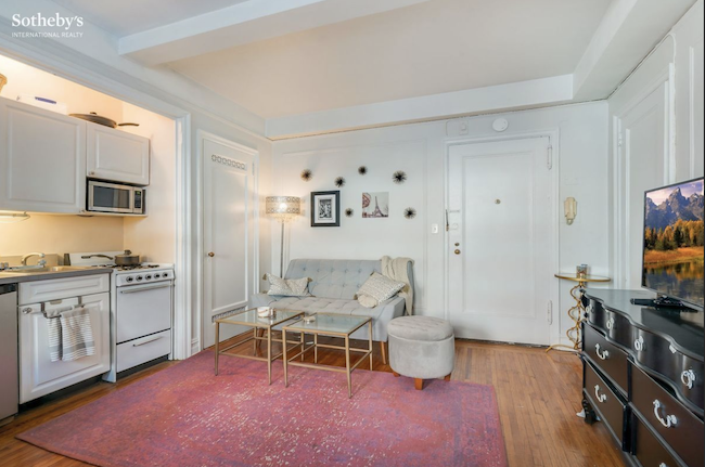
The couch in front of the closet door and table and stool near the entry door of this Hell’s Kitchen studio “says ‘fire hazard’ all over the place,” Cato says.
“The attempt to stage it doesn’t fit into what’s realistic," he adds. "You can tell immediately that they’re trying to have things that make it look bigger, but it doesn’t fit logically.”
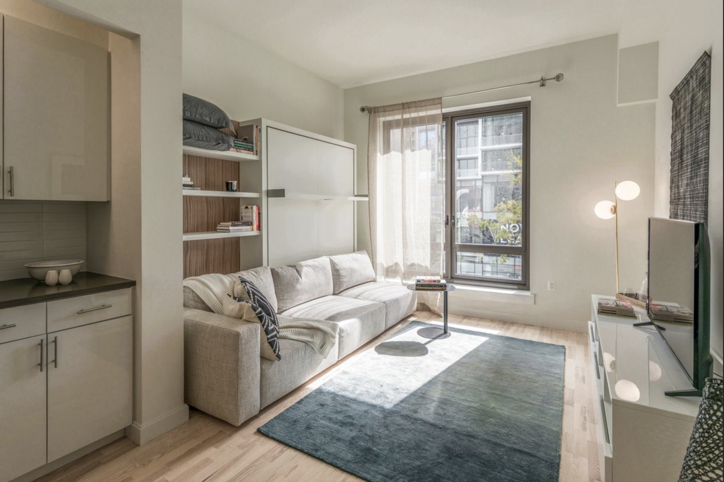
This Brooklyn studio has a Murphy bed, which is shown stored behind the sofa, but at first glance, “there’s just this white box that looks like it has a shelf in the middle,” says Cato.
The two curtains off to one side of the window also raises questions. “Is there something they’re trying to hide in the view they don’t want you to see? Why would you not put the curtains on both sides?” Cato says.
Seeing the building and storefront through the unobstructed side of the window, however, is realistic. Plus, “it’s good that they left the reflection of the lamp on the right because that’s natural and what would happen,” he adds.
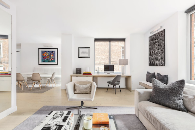
Cato immediately found the lighting in this Chelsea condo genuinely natural, noticing the highlights above the painting in the dining room and near the books on the coffee table in the foreground.
“That tells me there’s a lot of natural light coming into this space, and this is an accurate representation of this space, which makes me think higher of the seller,” he says.
That brick wall seen through the window behind the computer might be something you'll want to see in person “because it might be further away in reality,” Cato says.
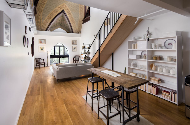
This photo of an apartment in a converted church in Brooklyn is an example of what can happen with a wide-angle lens.
“The couch looks miniature, and the window looks small,” Cato explains. “It’s likely not that small in that space, and it looks distorted.”
You Might Also Like

