How to renovate a brownstone or apartment to get more natural light
- Knock down an interior wall to bring light into the darkest middle section
- Replace windows with sleeker casement models when enlarging is not an option
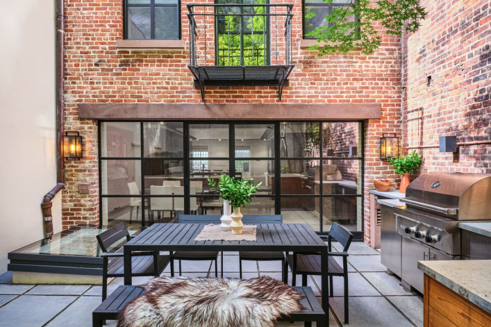
This historic West Village townhouse was renovated by Abelow Sherman Architects to open up the garden-level kitchen and replace all windows. (See the before picture below.) Interior design by Rena Cherny Studio.
Simon Lewis
Tired of living in the dark? As lovely as they are, unless they're situated on a corner lot, turn-of-the-century brownstones tend to have windows only on the facade and the back, creating a swath of dark rooms in the middle. With narrow brownstones, the challenge is even steeper, because there's less window area to bring light to interior spaces. Mid-block prewar apartments can be equally problematic—maybe only one or two rooms have windows, or at least windows that don't look out on another wall.
A well-thought-out renovation is the light at the end of your tunnel. And not just so your home is bathed in an idyllic (and 'grammable) glow. The science is pretty clear: Access to sunlight is good for your health and well-being. The more natural light you get, the more energy-efficient your home can be too.
[Editor’s note: An earlier version of this article was published in October 2021. We are presenting it again with updated information for February 2023.]
"Like plants, humans need light and it is crucial to consider how to brighten an apartment or brownstone at the earliest stage of design," says Anna Karp, co-founder of renovation firm Bolster (a Brick sponsor, fyi). For her, it's about making the most of whatever light you get to determine your optimum layout and materials, as these can impact the perception of light. And if you give careful consideration to the interplay of natural and artificial lighting at the outset, the upshot is you can do more with less of the latter. (Check out Brick's advice on how to pick the right lighting.)
Besides ambiance, natural light can also be used for dramatic effect, such as with a skylight shaft that brightens and spotlights a statement staircase.
Read on for the different ways you can ramp up the rays in your own brownstone or apartment, in ascending order of time, expense, and ultimate pay-off.
What you can and can't do with windows
Odds are you will not be able to enlarge the windows in a co-op and you are limited as well in a landmarked brownstone. (Read more about renovating in a historic district.) On the bright side, there are a lot of precedents to draw from and build upon—you just have to know your options. "More often than not clients come to their renovations with less of an idea of what's possible," says Peter Holtzman, founding principal at Bespoke Architecture.
Hence the importance of incorporating a natural light solution into any renovation plan.
Open up the interior walls
Reconfiguring the layout can often allow natural light to reach further into the space—especially if you are unable or unwilling to enlarge the windows due to budget or physical constraints.
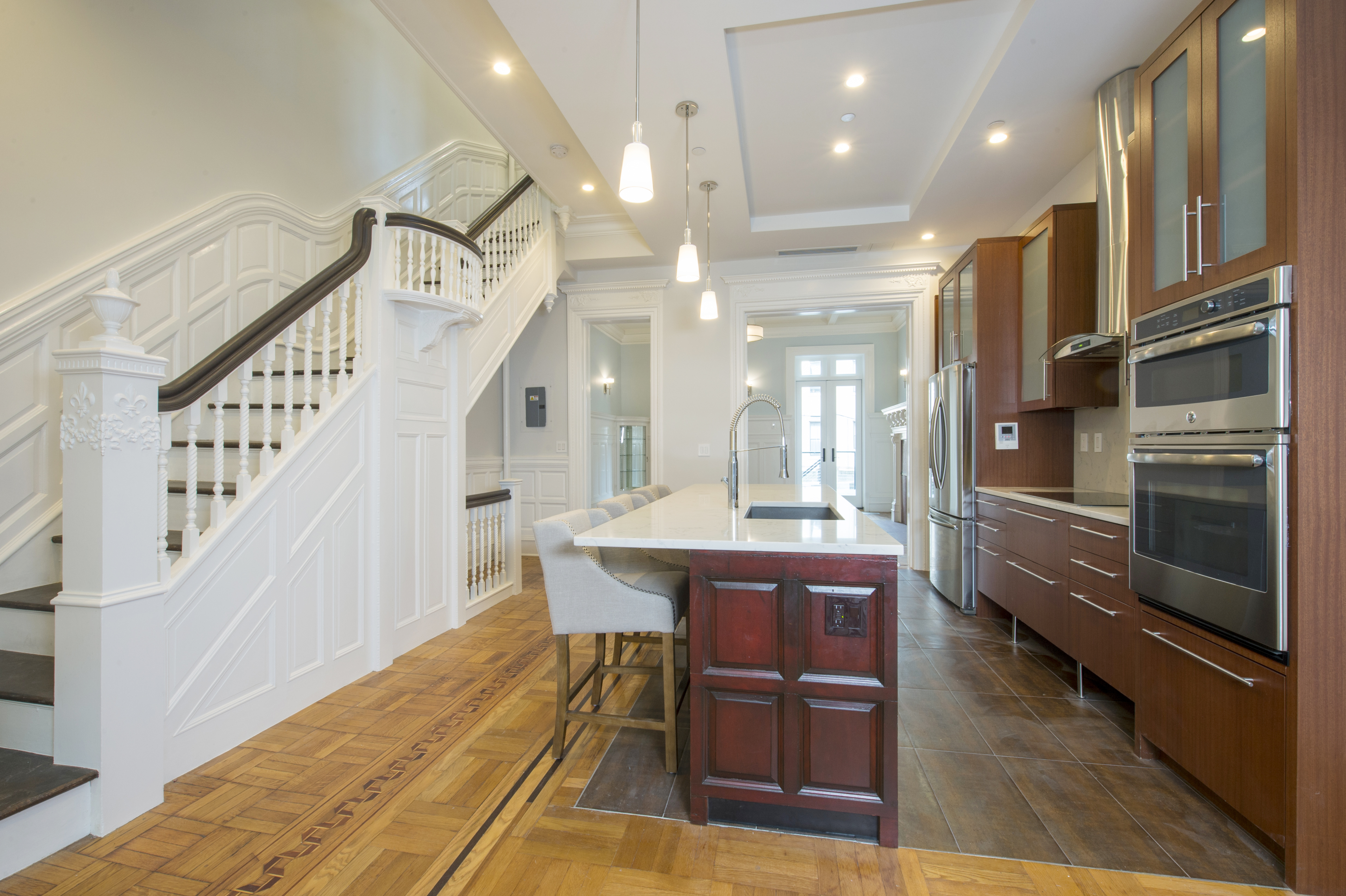
Such was the case in the renovation of a two-family Harlem brownstone by Holtzman, where the owners wanted to leave much of the original details intact while making the home more conducive to modern living. "It had that typical rabbit warren of halls and rooms, which contributes to it feeling dark," he says.
So he opened up a dark narrow hallway into an expansive kitchen that receives light from both ends (shown above; note the wainscotting from a former wall was repurposed to wrap around the new island). "This was the least expensive way to bring in more light while preserving the fabric of the building the most."
He also painted the walls (and its original millwork) white to dramatically brighten the space. "Dark wood sucks up a lot of photons," he says. Another pro tip from him: "Paint brick or at least pickle it so you keep the texture but allow the light to bounce around more."
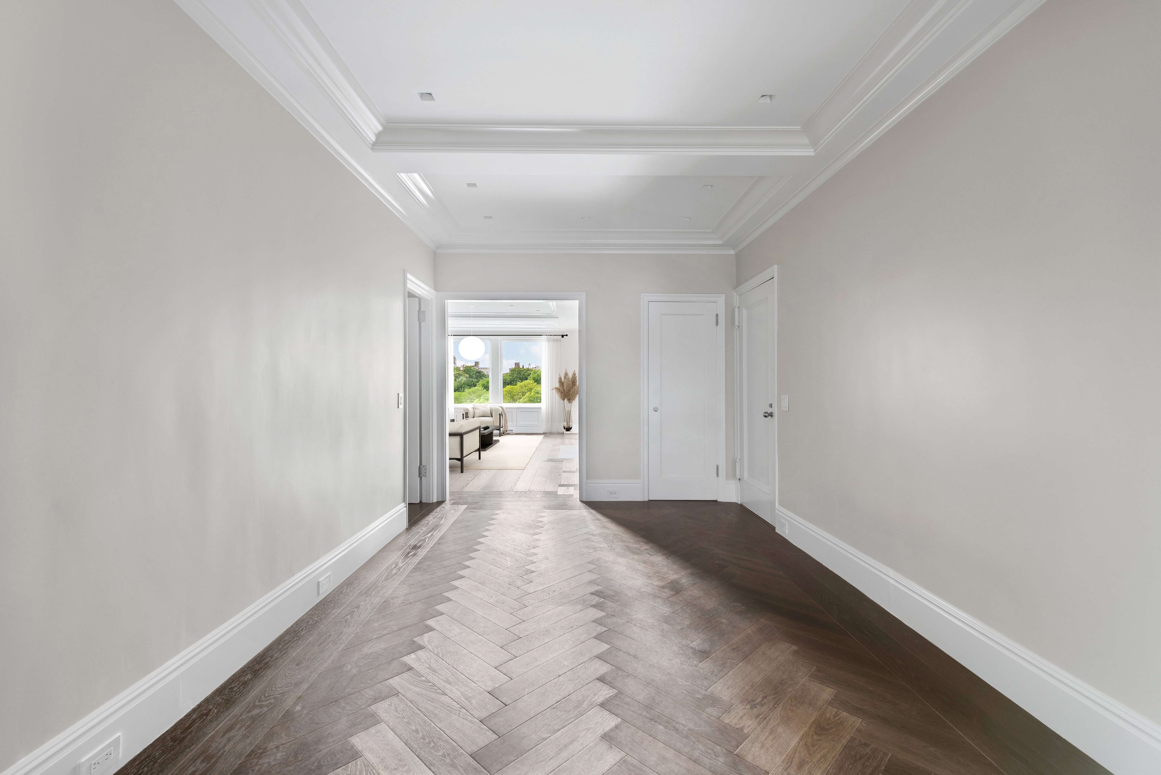
A similar approach was applied in opening up a classic-six apartment overlooking the Metropolitan Museum of Art, which had one room with windows in the front and a series of dark rooms leading from that. There Bolster worked with Michael J. Fasulo, partner at Rodman Paul Architects, in gutting the apartment to maximize the premium views.
Rather than having one continual bright space, the owners wanted the foyer to be deliberately darker in terms of paint and other surfaces and then the apartment to gradually become lighter and brighter, so you get the feeling of being pulled to that visual point. And even though they weren't allowed to enlarge the windows, they replaced them with European-style models that allow for unobstructed views and multiple ways of opening.
"This apartment has literally a million-plus-dollar view, but it's more about the psychological positive effect of having the light and seeing the trees outside that makes the apartment so bright and feel so nice," Karp says.
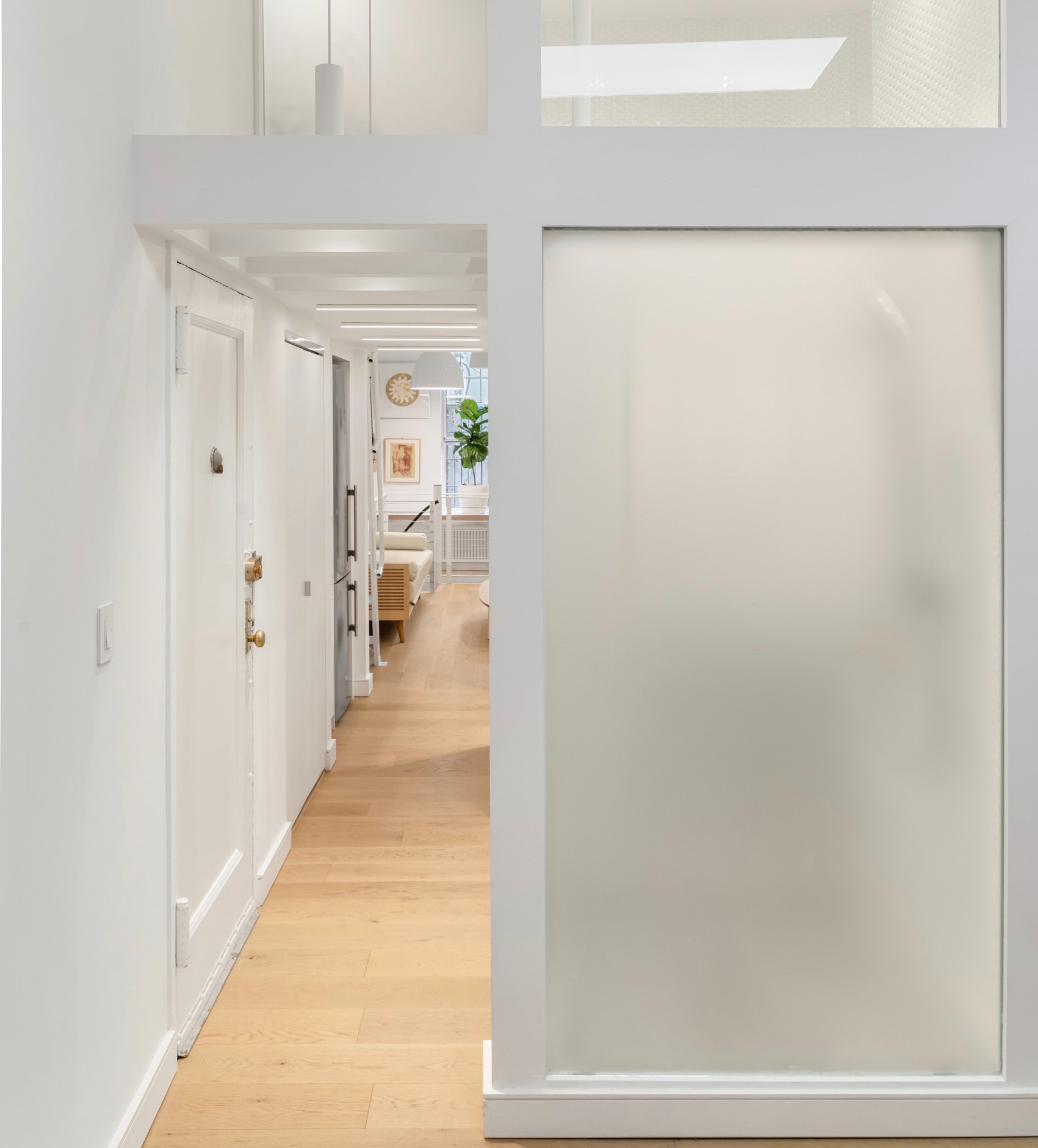
Lacking a stellar view? You can at least "borrow" light from the exposures in the living area to brighten the rest of your space. Niv Ben-Adi, founder of full-service design and architecture firm Atelier036, replaced most of the interior walls in a ground-level Greenwich Village (shown above) with translucent and clear glass to allow both natural and artificial light to migrate between spaces; this also emphasized the 12-foot ceilings. Feedback from the clients: "I feel healthy in my new apartment!"
Enlarge and/or repurpose the windows
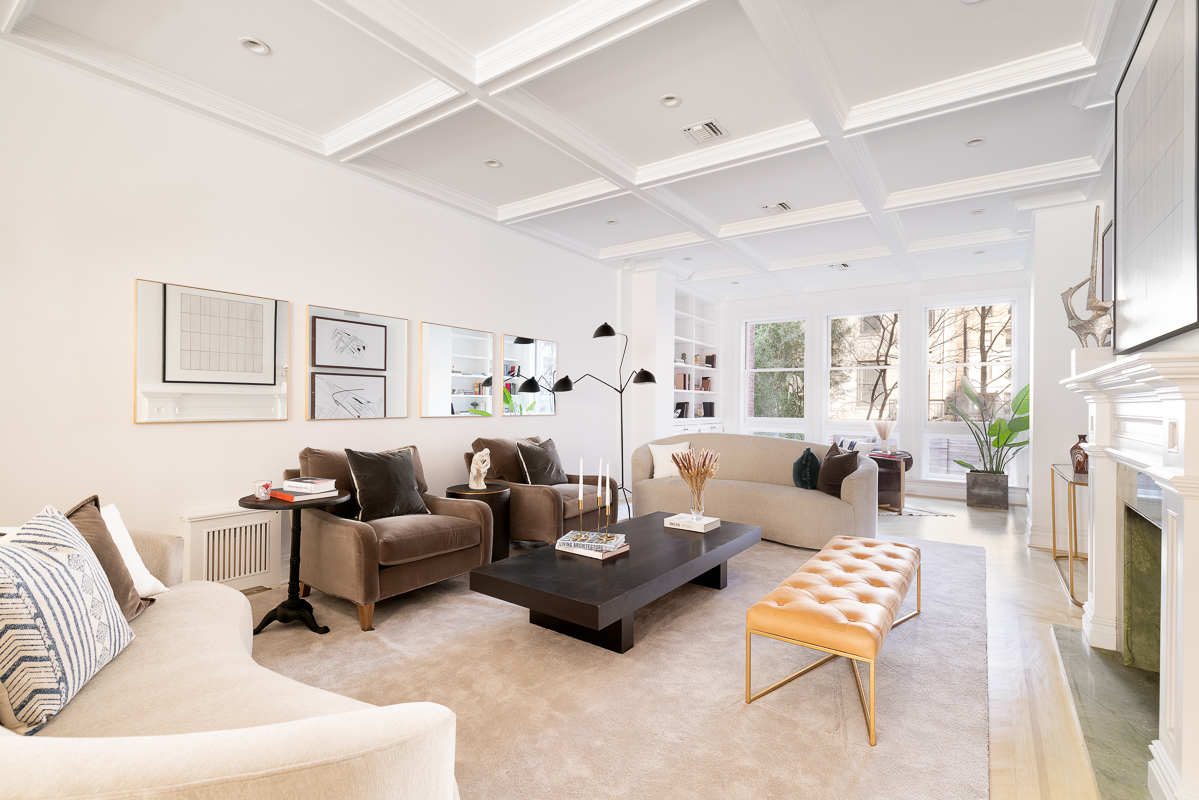
If you are in a position to enlarge at least some of your windows, it's a good idea to prioritize the ones that will improve your space the most. For example, Bespoke Architecture worked on an UWS brownstone in which the windows on the parlor floor had been expanded to allow more light to flood into the deep living area (above), replacing the millwork around those (and all other) windows with something more appropriate to the classic residence's lineage. (The custom built-in bookcase helps tie that area together.)
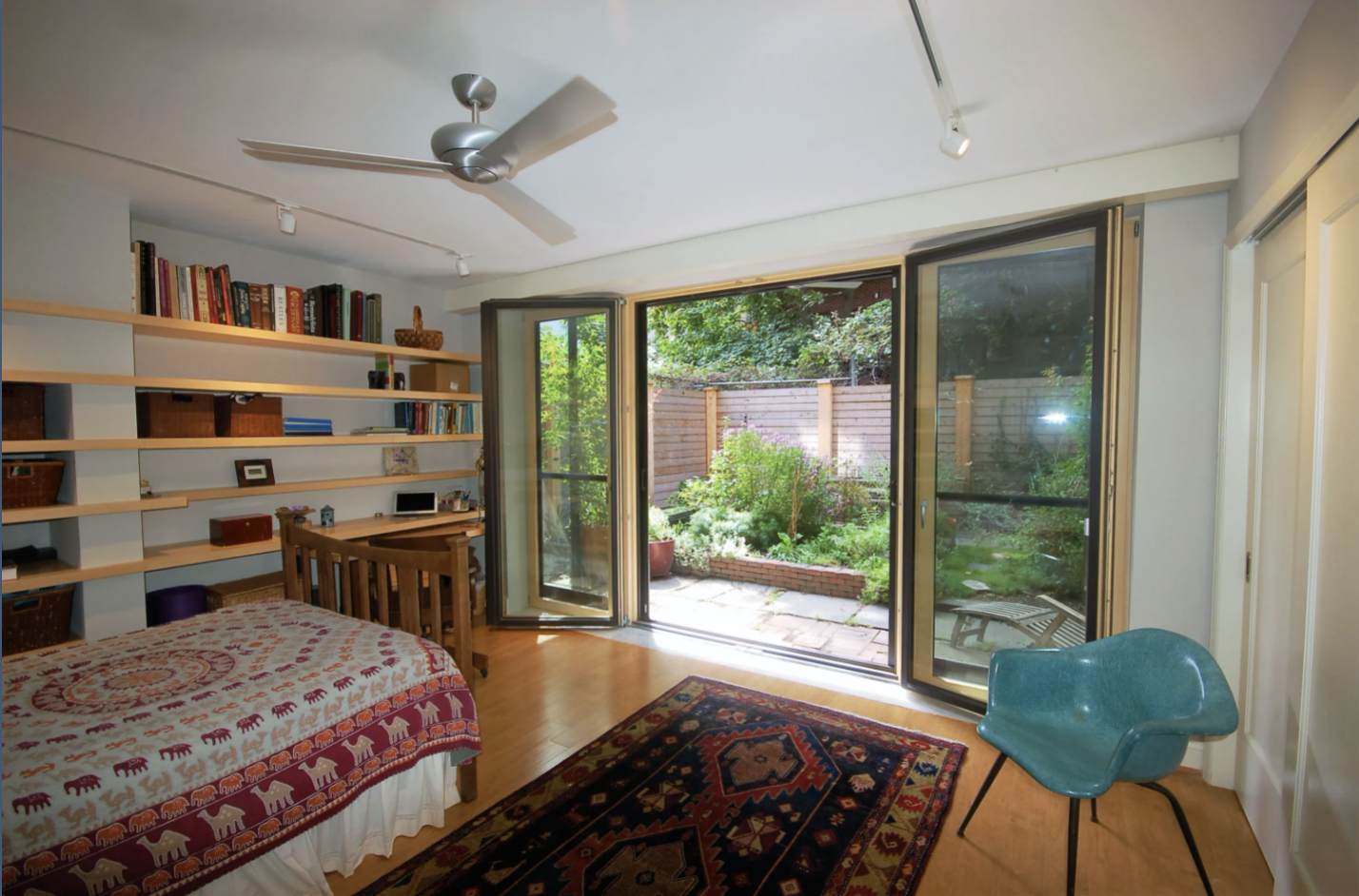
And Bespoke collaborated with Bolster on the renovation of a landmarked Harlem townhouse duplex, updating a dark and awkward primary bedroom suite—and improving the connection between indoors and out—by opening up almost the entire exterior wall at the garden level and installing Passive House-grade wood-and-glass tilt/turn doors (above).
"This was much less expensive than a full rear facade replacement and puts the dollars where they have the greatest impact," Karp says.
Not that such work comes cheaply—you still have to hold up the existing facade while you remove that brick and put in the steel, but it is not as expensive as blowing out the back (more on that below).
Another takeaway from the same project (and a common recommendation by Holtzman): They converted the two windows on the parlor level into doors that open onto a new deck by knocking out the sills, taking the opening to the floor, and adding a transom above the new doors. This is easy work so long as you are not changing the opening size and using the existing lintels—all the structural stuff happens at the top.
Note these changes were made in a historic district. "As long as it is an appropriate and sensitive modification of the building, especially when not visible from a public thoroughfare, it's pretty easy to get these things done," Holtzman says.
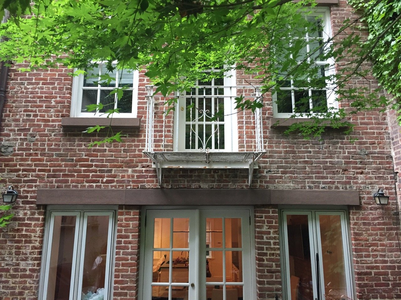
David Sherman, principal of Abelow Sherman Architects, is also a fan of expanding windows to the floor and usually keeping them as windows—especially when working on landmarked townhouses, such as in the finished photo at top (and the before photo above).
Blow out the back of your brownstone
This popular update is still "a no brainer" (per Karp), even more so now that you may be spending more time at home. (Read Brick's deep dive into blowing out the back of a brownstone for ample ideas and inspiration.)
Just be sure to factor in the ongoing pandemic-related increases in the cost and lead time for the structural elements (namely steel), particularly if you plan to add an extension—or if you intend to replace the entire rear facade from top to bottom, such as in the renovation of a blown-out brownstone shell in Harlem by Holtzman, whose clients wanted a super modern look inside and out.
For sure, removing the back wall requires significant structural support. Holtzman likens it to a cardboard box—pull back the flap (aka rear facade) and it flattens right out. So expect to pay for additional oversight in the way of an engineer and DOB approvals, though those costs tend to get folded into the total project figure.
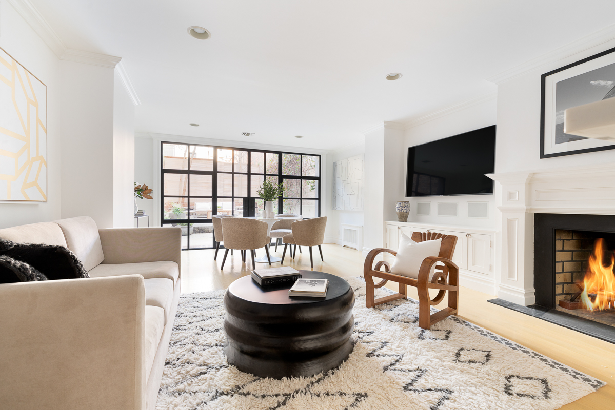
The end result, however, is worth the extra time and money. Take a gander at the garden-level beauties above and at top for inspiration.
Add skylights—or design around existing ones
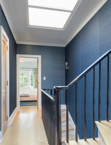
Many brownstones retain the original skylights over the stairs, so you can start by replacing them with modern mechanisms—and then designing around those to bring even more light into the lower floors. It's a fairly straightforward process of adding new skylights too, either by installing them into the roofline (as shown above) or creating a bulkhead on the roof
Sherman has long used skylights to bring light to the parlor floors of townhouses—and is fond of designing a skylight "shaft" that streams down the center of the townhouse (the darkest spot), with floor-through stairs that wrap around that shaft—most lavishly in a grand neo-Georgian townhouse on the Upper East Side (yep—even those manses suffer from a lack of light in the middle) but also in much more modest homes and iterations—including in the example above.
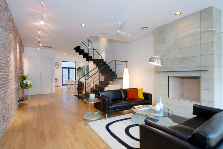
Holtzman is another advocate of the skylit shaft, including for a historic townhouse with four bulkhead skylights that lit up a switchback staircase in the center of an 18-foot-wide brownstone.
And if you are looking to finish a basement (or have already done so)—a common request lately—Sherman has devised a simple, cost-saving solution: Take advantage of the old coal chute by putting a skylight on the chute in the back of the house, paint the structure white, and you get "a lot of natural light pouring into the basement without doing any extra structural work—and you've added another floor of living space."
That's the kind of investment that pays off now and when it's time to sell.
You Might Also Like

