How to design an Upper West Side apartment for a family of five

The homeowners worked with Bolster architecture and design director Jessica Wetters to design a functional and contemporary home.
The homeowners of this 1,650-square-foot, prewar co-op building on the Upper West Side sought to update the layout and design of their apartment to better suit their young family.
The homeowners partnered with Bolster architecture and design director Jessica Wetters to create a fully-customized space that was clean and contemporary. The homeowners knew straightaway what their priorities were.
“They really wanted to add a fourth bedroom and a powder room,” said Jessica. “Once we accomplished that, we switched our focus to their options for the kitchen area.”
The result is a four-bedroom, two-and-a-half bathroom apartment featuring an open kitchen, dining, and living area that accommodates the family while allowing them to grow into the space.
Whether you're renovating a two-bedroom prewar co-op or a 4,000-square-foot brownstone, Bolster guarantees a beautifully designed home renovation risk-free and on-budget. "Expect flawless communication, white-glove service, and absolutely no surprise costs," says Bolster's CEO and co-founder Anna Karp. Ready to start your renovation? Learn more >>
A more efficient layout
The most significant layout changes were made in the back of the apartment and in the kitchen. According to Jessica, the homeowners debated the most about the layout for the kitchen and the fourth bedroom, going back and forth until they decided what worked best for them.
In the end, the layout in the rear of the apartment was altered to make more efficient use of the master suite while adding a fourth bedroom.
“They’re a family of five,” said Jessica. “They have three kids, and it was really important to them to add a fourth bedroom.”
Decision-making in the design phase is critical to the Bolster process, as it empowers homeowners to make confident decisions upfront to save time and money during the build phase of the renovation.
“The homeowners had a very specific vision,” said Jessica. “They did so much work in the design phase—sourcing images and hand-selecting everything.”
Choosing finishes for the bathroom
For the master bedroom, the homeowners committed to a neutral palette that was enhanced by a Moooi pendant light and matte white wall sconces from Houseology & Tradition Passepartout.
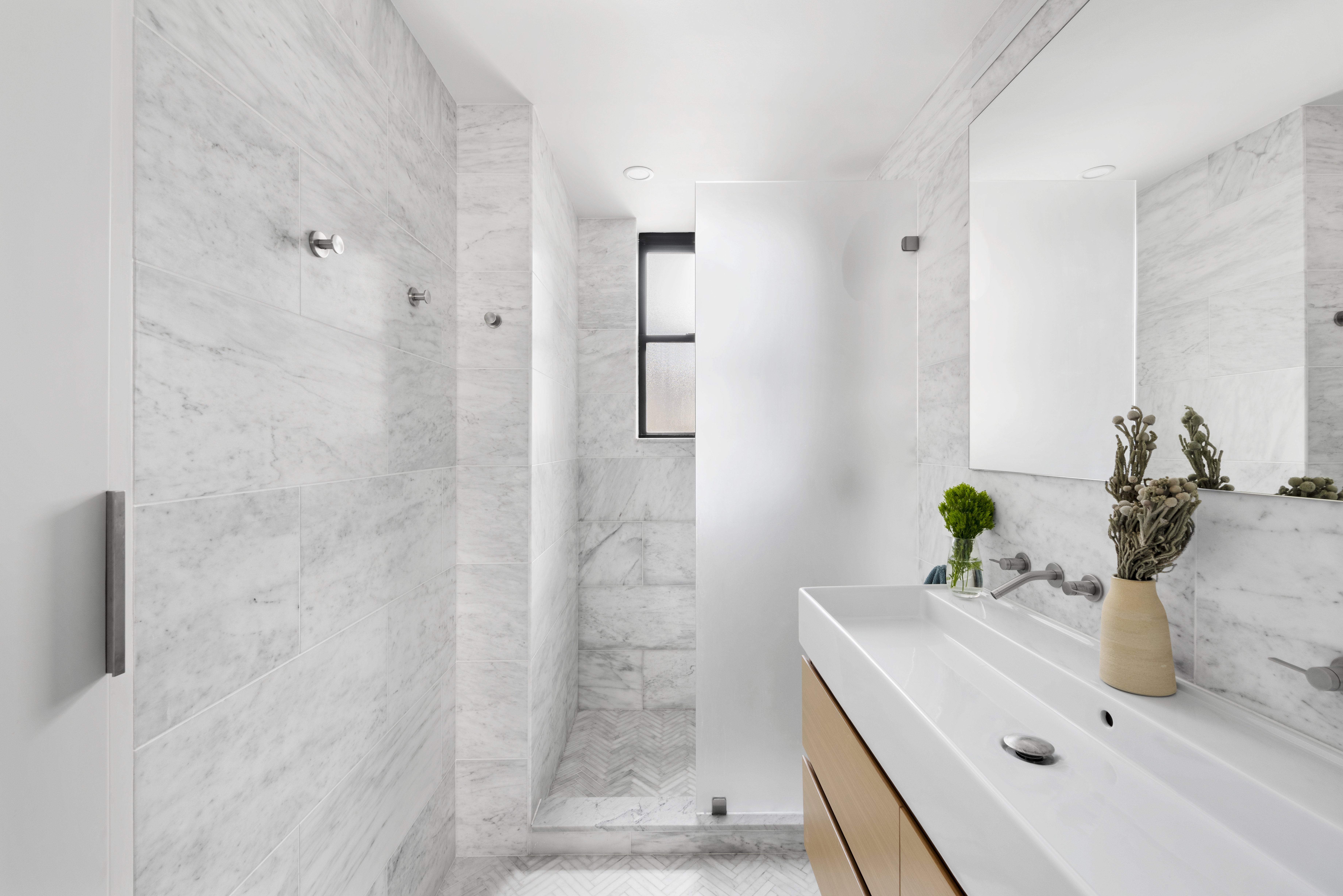
In the master bathroom, the custom-made vanity box is a focal point. It features a marble slab top from Carrara Marble and a Nameek's sink from the brand’s Teorema collection. The vanity blends beautifully with the rest of the master bathroom, outfitted with mosaic marble floor tile and marble wall tile (also from Carrara Marble), as well as a Kohler shower kit and Toto plumbing fixtures.
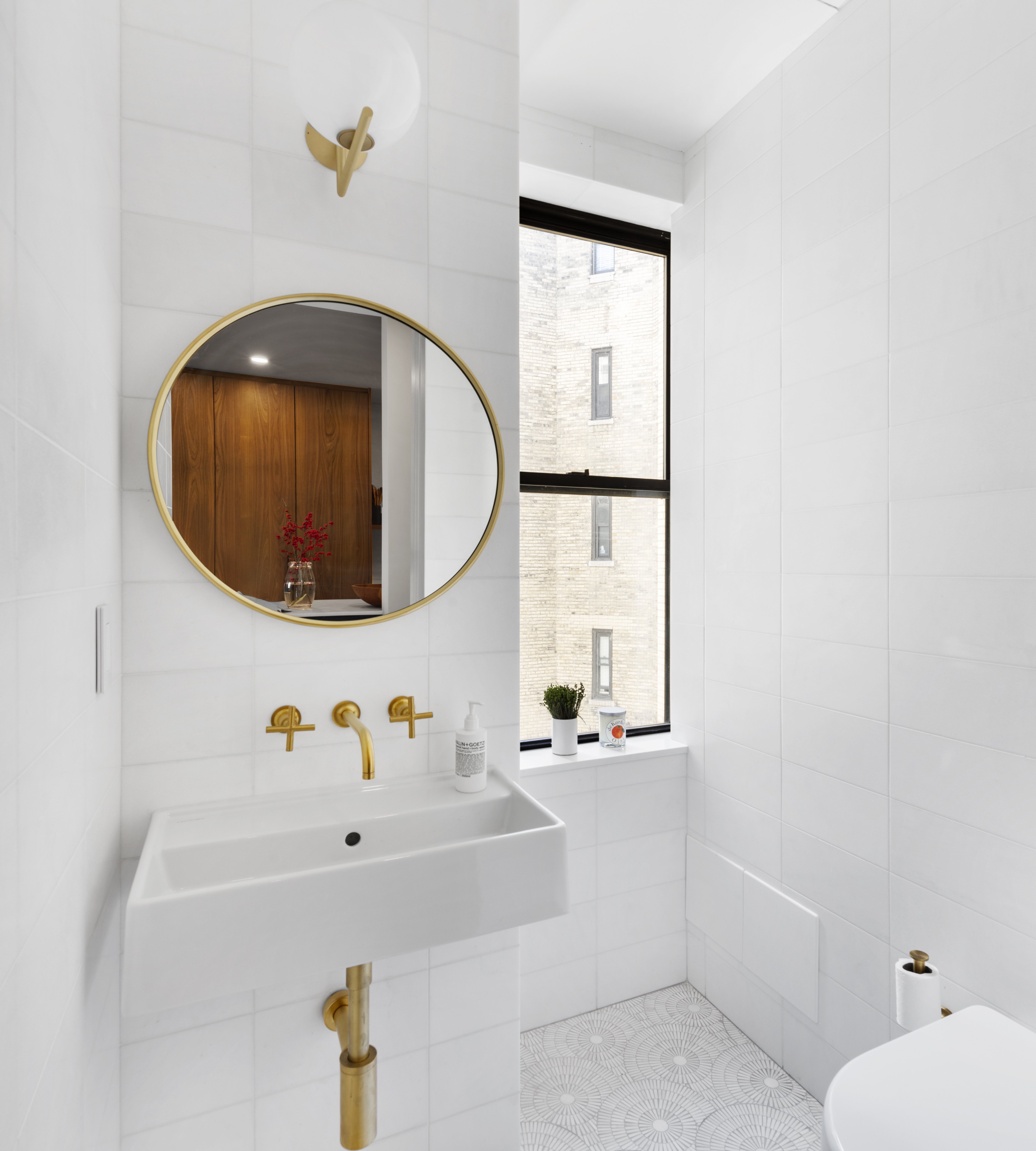
Upon entrance to the apartment, the floor plan was opened up to create a powder room, which features another Nameek's wall-mounted sink, Delta faucet and fixtures in champagne-bronze, and a CB2 Infinity 24-inch round wall mirror in brass. Coupled with glazed ceramic floor and wall tiles from Artistic Tile and Stone Center, the result is a small room with big impact.
Compromises in the kitchen
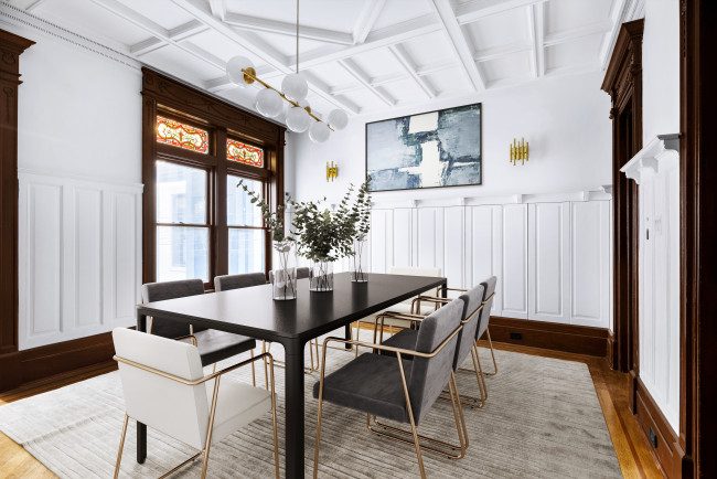
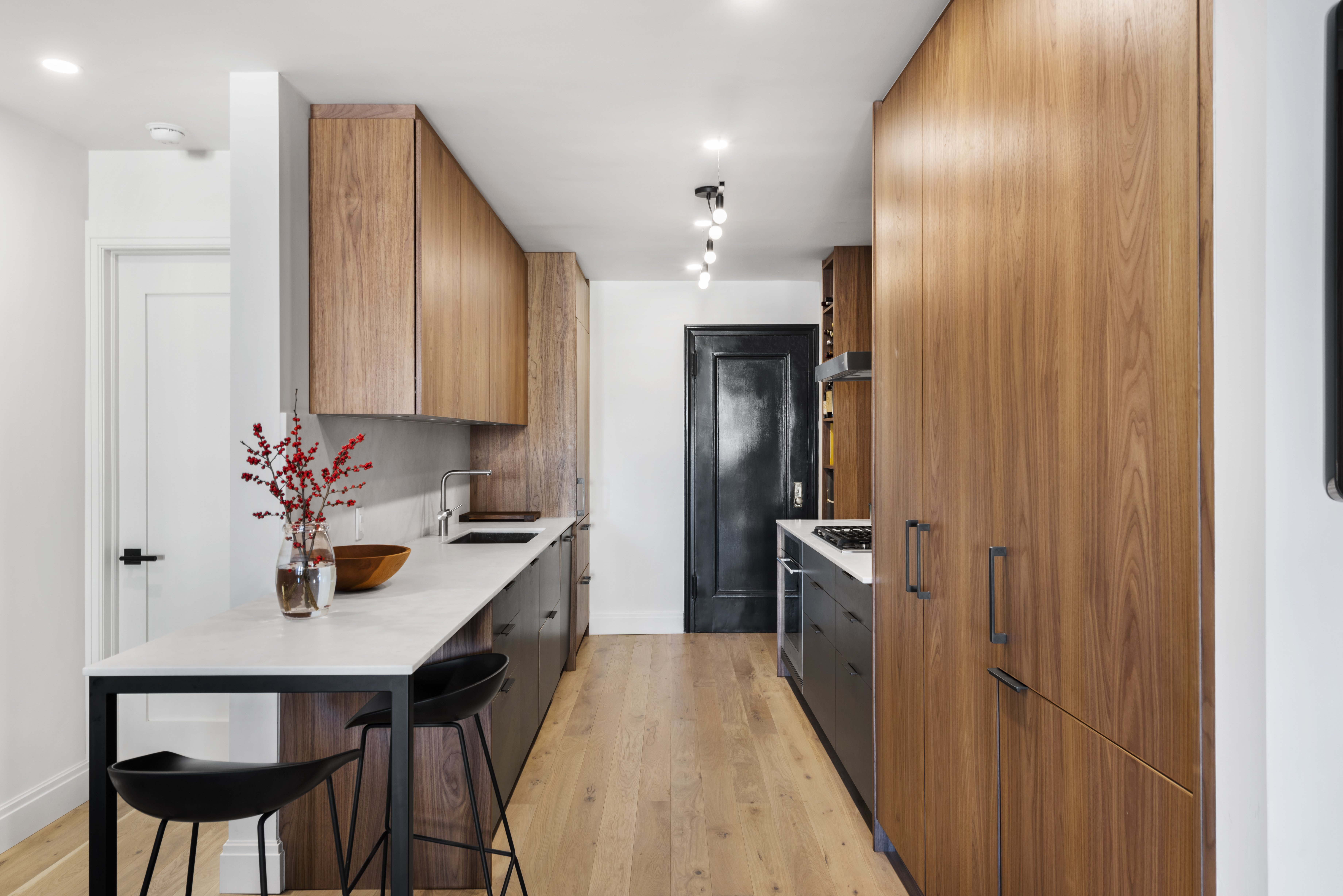
The open floor plan also allowed the homeowners to accommodate a Henrybuilt kitchen with a countertop extension that flows into the dining area, which Jessica and the homeowner envisioned could be used for formal dinners and after-school homework sessions. Initially, said Jessica, the homeowners wanted an island in the kitchen—but it wasn’t going to be possible. So, they compromised with an extension off the countertop with barstools.
“Also high on their list was a library table area,” said Jessica. “The homeowners envisioned it as a place for the kids to do their homework as they grow up.”
The kitchen features high-end appliances, such as a wall oven and four-burner gas cooktop from Wolf and a Sub-Zero refrigerator. The 30-inch stainless steel kitchen sink is from Signature Hardware, and the countertop and backsplash are both Carrara Marble. The homeowners added a linear pendant from Lambert & Fils to complete the look.
With Jessica’s expertise and guidance, and the homeowners’ careful research during the design phase, they selected a Porcelanosa ceramic tile for one of the walls in the living area, which serves dual purposes as a disguise for the wall-mounted television, and as a grounding element for the otherwise light and natural airiness of the apartment.
“The homeowners had seen a dark wall in another project that hid the TV—they did not want to see the TV at all,” said Jessica. “It offers a nice degree of contrast because the whole apartment is white with natural materials, and the TV blends in and sort of disappears.”
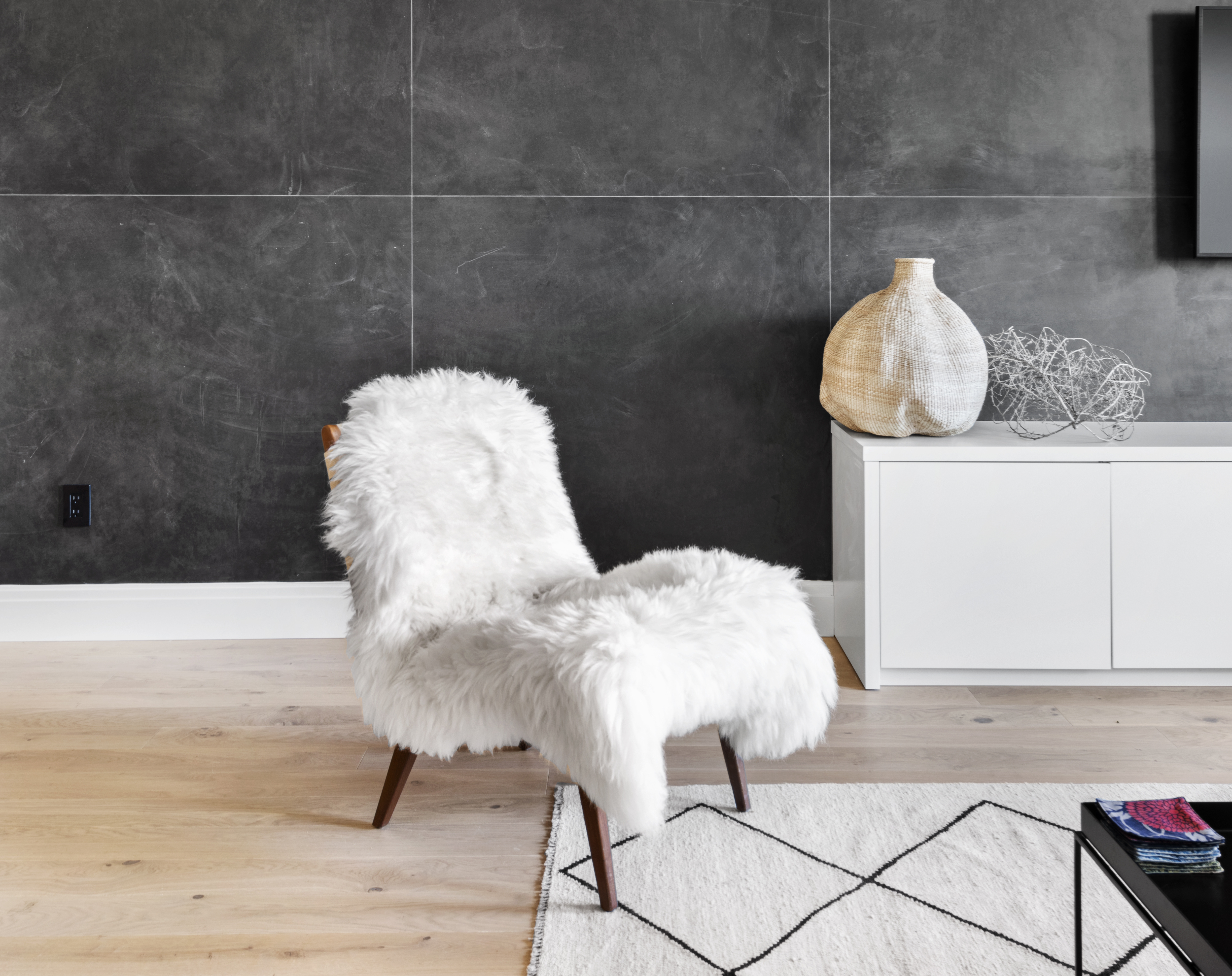
The living room also features Cedar & Moss wall sconces in matte black.
Throughout the home, the homeowners chose European white oak floors from Madera, and Benjamin Moore Aura Interior paint in matte for the walls and eggshell for the bathrooms.
Finally, “Just like anyone in a prewar building, the homeowners wanted central A/C, but in this case it wasn’t a possibility,” said Jessica. “They went with Hamilton Air wall units.”
The Bolster Smart Renovation Zero-Risk Guarantee
How can a design-build firm guarantee a Zero-Risk renovation?
Bolster has pioneered Smart Renovation. We apply quantitative analysis along with our proprietary technology solution to identify and quantify the performance risk on every renovation project. The result is a personalized strategic approach to each renovation that allows us to absorb 100 percent of the homeowner’s risk. Your home will be beautifully designed, and delivered on-time and on-budget. That is our guarantee.
Smart Renovation & Zero-Risk means that Homeowners are now free to dream.
To start your major home renovation project visit bolster.us
The Bolster Promise video
You Might Also Like


