Considering renovating your NYC kitchen? Here are 5 (make that 6!) trends to think twice about
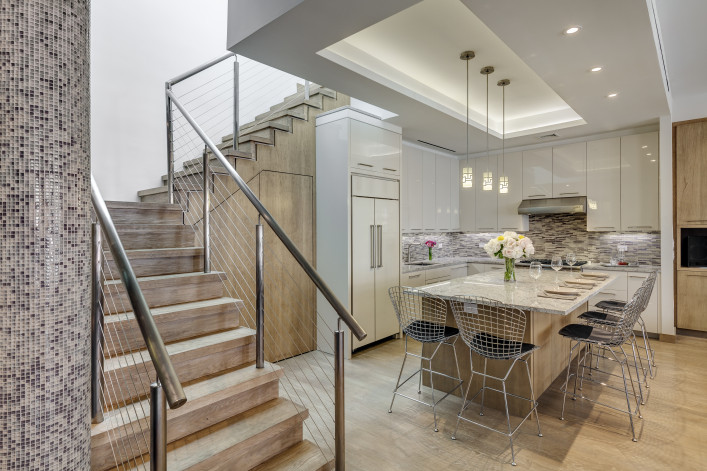
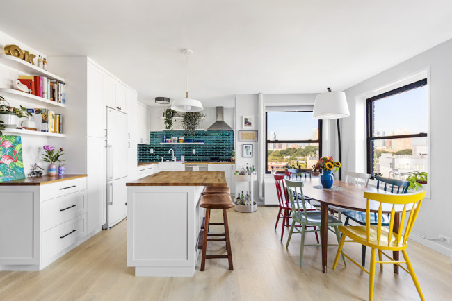
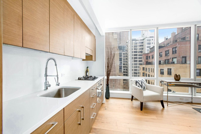
This Nomad penthouse was redesigned by Stephen B. Jacobs Group and Andi Pepper Interior Design.
Woodruff Brown
When thinking about your NYC kitchen renovation, it’s all too easy to be swayed by the debate over what trends are “in” or “out” (and consequently overload your Pinterest board).
Even savvy renovators can get tripped up. “A lot of my clients tell me, ‘I don’t want to do this year's fad and then have my kitchen look ridiculous in five years,’” says Jorge Fontan, founder of Fontan Architecture. After all, following home design trends can be tricky.
That’s why Brick Underground spoke with NYC architects and designers about five of the biggest reno decisions. Is an all-white kitchen here to stay or on its way out? Are open shelves really what you need or more likely to end up cluttered and chaotic? What’s more on trend: cabinet pulls or no hardware at all? (Spoiler alert: You won’t find any hard-and-fast rules but rather information to empower your decision-making.)
First and foremost, Laurence Carr, founder and CEO of Laurence Carr Design, says you should “think carefully about the functionality and look you are aiming for.”
Babak Hakakian, partner at ddc NYC with experience designing kitchens for new developments and renovations, agrees. “A good kitchen should last at least 20 years, much longer if you design it in a way that's both modern and classic as opposed to getting wild aesthetically.”
Given that it’s going to cost you at least $25,000 to renovate your NYC kitchen (and more like $90,000 for a larger space), you will want to make the most of your investment.
Here are five major trend questions for NYC kitchen renovations.
1) All white vs. color
The consensus (sort of) is that the all-white scheme is on its way out, at least if you want to avoid having your kitchen look like it’s out of the box. That doesn't mean you should avoid white walls or cabinetry or surfaces (emphasis on "or") but rather to work those features into a more bespoke space.
Interior designer Jennifer Morris, founder of JMorris Design, says the first question she often hears is, “Am I going to get sick of the paint color?” Her usual response is that it is impossible to say, sometimes your preferences can change over time. In that way, choosing a design for a kitchen is similar to fashion—although your choices will have a longer lifespan. Some people "feel the need to reboot after five years," she says.
For her, white kitchens can be great for a super small or dark space but tend to look store-bought no matter the cabinet fronts. Instead, she has recently been doing a lot of colorful cabinets. “I like to create a vibe or feeling, which can be subtle and silvery or a dramatic bright blue. A playful, fun family for instance shouldn’t hold back.”
Carr also suggests injecting color by doing a two-tone kitchen. “Gravitate towards darker, bold tones for these, such as navy, charcoal, or a natural wood look to stand out against light-colored walls.” She also sees countertops as blending the two colors, "perhaps a neutral marble to compliment."
For Fontan, “darker colors do homey way better than when everything is bright.” His palette of choice involves black or graphite-colored kitchens, with a contrasting backsplash and undercounter lighting to make it really pop. He’s also a fan of texture, citing a recent client who ripped out his all-white Philippe Starck-designed kitchen and put in concrete walls and a wood-look porcelain backsplash. “Texture and contrast are both trends that are going to last,” he says.
As a dissenting voice, Kelly Giesen, founder of Kelly G Design, still believes the white kitchen is ageless, “it’s been around for about a hundred years and will stand the test of time," she says. It will also boost buyer appeal when and if you decide to sell.
And there are other ways besides painted walls or cabinets to introduce color. For example, Giesen recently created a black and white kitchen with "kitschy" red appliances, picking up the same hue on the entrance door and closet interior as well as the staircase leading to a terrace. “I don’t usually work with such bright colors, but it turned out fabulous.”
2) Open shelves vs. concealed cabinetry
If ever there was a coveted component of shelter magazines and Instagram influencers, it’s the stylized-to-a-T kitchen open shelves. Problem is, we don’t live in a photo shoot.
"If clients feel drawn to open shelving in the kitchen, we suggest using them sparingly to highlight handmade artisan pieces or pieces of great sentimental value,” says Carr. “A kitchen with predominantly concealed cabinets will keep with a clean look."
Morris is a bit less measured. “Open shelves come up all the time, and I sort of cringe when they do.” She appreciates how they allow you to easily access frequently used items, but finds the shelves too often get junked up and need to be continually curated. Her approach is to ask how those open shelves are going to make you feel, day in and day out. For example, you may want to put your kids art on display, but what about five grades worth of art?
“If you have a more active lifestyle, open shelves are probably not going to work for you," says Fontan. In other words, if you have a lot of kids (yep, they factor into any reno equation) and lots of plastic cups and coffee mugs, he recommends sticking with closed cabinets.
For those who do opt for open shelves, Fontan suggests exploring nifty new features, including parts that fold up and down (by Cesar New York) and built-in lighting so they become even more of a display feature.
3) Hardware vs. no hardware
Cabinets without hardware? In the past that would be considered sacrilege, and for many designers and end users, handles are still the only way to go.
If you are doing a custom kitchen, you can do whatever you please. Certain manufacturers, however, may only offer one or the other option, meaning you’ll need to decide which way to lean from the outset. (And there's no turning back.)
Giesen and Carr are squarely in the hardware camp. “Hardware to me is the most important thing in a kitchen because most cabinets, even those that are custom-designed, are pretty similar, and hardware adds that extra wow,” says Giesen. She encourages spending your money on distinctive knobs, and also putting a plate behind the knob to make the cabinet instantly more eye-catching. (As for the trend toward mixed metals? “I’m a one-metal kind of girl.”)
For Carr, "hardware provides more functionality in a bustling kitchen and helps keep the worry of fingerprints at a minimum as compared to their counterparts." She always selects pieces in stainless steel or satin nickel, matching faucets and appliances to the hardware in the same finish for a timeless kitchen that will "stay on trend for more than 10 years."
Fontan, on the other hand, is a proponent of the no-hardware look, namely for achieving a more uniform, sleek, continuous appearance, whether you have textured wood cabinets or those with the plain flat fronts. "Finger pulls, where there’s a little groove at the top or along the side, are incredibly popular.” There’s also the less popular option where you push and the cabinet or drawer pops out. “You never know what trends will stick, but there’s something about the handle being unnecessary,”
That same thinking was why (per Hakakian) one of ddc NYC’s top selling designs, Minotti Cucine, did away with handles years ago. “This is one trend that’s worth keeping. Less is more.”
Morris sums up the hardware-or-not dilemma this way: “I love the seamless look of cabinetry where the walnut just curls and becomes your finger pull. That’s such a nice look for the right situation. On the other hand, hardware can be the jewelry of the space and is easy to clean.” After all, when you’re pulling something over and over again, even touch latches, you are going to see that dirt.
Still, she recognizes that "hardware can be an investment if you have 50 pulls at $20 per piece, and you’re limited by the off-center/on-center positioning when replacing them unless you fill the holes.”
Whichever way you land, make sure to consider your budget and your household (lots of little hands argue in favor of handles).
4) Stainless steel vs. integrated (and/or under-the-counter) appliances
“Stainless steel is still considered the most timeless,” says Fontan. “But you can never go wrong with matching the cabinet doors.”
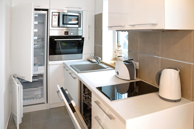
He sees so-called integrated appliances, which bear the same fronts as the cabinetry, as a result of the popular open floor plan, where the kitchen is now on prominent display.
Geisen says she does integrated appliances as much as possible, and always for the dishwasher. “Normally I would panel over the refrigerator too, unless a client wants that pop of color.”
“Even hoods are being put away and the cabinet look is trending,” says Fontan, referring to hoods where the mechanism is hidden and the only thing you see is a two-inch stainless steel piece (“it looks like a tiny hood”). He recently installed the retractable kind that goes behind rather than above the stove. “You can pop it up when you are cooking and then it disappears when not.”
Though Morris likes the seamless look of an integrated kitchen, she cautions that (based on past experience) they can confuse guests. (So you'll have to show everyone who comes over where everything is located, particularly if its a multi-generational crowd.) “Some appliances are just so beautiful too, like these almost sculptural Thermador units that clients are proud to show off.”
Concealing appliances behind cabinet doors is just one of the emerging trends around appliances. According to a 2019 survey by the National Kitchen and Bath Association, appliances are what the designer/respondents found the most interesting in terms of new products and features. (Cabinets and countertops were a distant second and third.) This included color options as well as sizing and placement, with undercounter models (especially refrigerator and freezer drawers) rated as new favorites.
“People are wired to think about having a full upright refrigerator, but it’s just a mindset,” says Geisen, who has used separate undercounter appliances in her own apartments. “You get all this open counter space, the kitchen looks much bigger, and you can really compartmentalize.” Plus, if you were to stack them on top of each other, they would add up to the same space.
She also used them in a client’s post-war apartment with low ceilings, “where a standard fridge would be a big box and ruin the whole look.” Her favorite innovations are refrigerator and subzero columns, which “disappear into the architecture of the kitchen.”
5) Hardwood flooring vs. all the rest
There’s a reason why hardwood flooring has been used in so many kitchens over the decades. “It’s softer to stand on,” says Morris. “Tile is pretty, but it's hard and tends to chip when you drop something.”
You will however have to deal with the usual wear and tear, says Morris.
As an eco-friendly alternative, Morris has been using a lot of cork and the new breed of linoleum lately. “Both are making a comeback as wonderfully sustainable products, and linoleum comes in so many great colors and in rolls or tiles.”
Given the cost of renovations and materials, Fontan says he is always a little concerned about doing natural wood in a kitchen, though plenty of clients choose that route. “I’m very thoughtful of durability, so I want to make sure it is going to last.”
For him the answer is concrete, something he says is also enjoying a resurgence. There’s cast concrete (costly and not always allowed due to soundproofing issues) and also concrete-look porcelain tiles (Porcelanosa and Florim are favorites). “The concrete thing came back in vogue about 10 years ago and has become much more popular within the last five years. I’m not sure how long it will last, but I’m a big fan, and also of the faux look."
6) L-shape vs. other configurations
First there was the U-shape galley kitchen, and then came the galley with the open bar counter and pantry.
“This created a loft-like feel and made an otherwise standard room look huge and gave people a place to eat,” says Stephen B. Jacobs, founder of Stephen B. Jacobs Group, a full-service architectural firm who helped pioneer the movement in many high-rise condos. Now that apartments and living spaces in the city are getting smaller, the galley kitchen started taking over the living room. “That is why you are seeing more and more L-shaped kitchens used, as the L makes it possible for table or an island to be added.”
In Fontan’s experience, more people like having a straight kitchen on one wall and then an island in front of that with stool seating (these are a must).
“When possible people like not having corners, which end up being dead space.” Geisen finds this configuration to be great in tight NYC spaces, as a way of keeping the kitchen big and open but trim by hugging the wall in the back.
After trying every layout herself (she is a self-described serial renovator), however, Geisen’s “absolute favorite” is the L-shape with an island or table in front. It’s also Morris’s default, and she uses Magic Corners to put that awkward corner space to use in “hiding all the stuff you don’t need on an everyday basis.”
Ultimately the configuration of the kitchen depends on the space. “You have to deal with existing gas and plumbing locations so you are going to be limited as to how much you can change the fundamental layout of the kitchen unless you are looking to spend a lot of money,” says Fontan.
Hakakian finds that one of the biggest mistakes people make is overlooking functionality. “They do think about the position of the appliances and the sink, but then they miss the mark in following the hot trends of the moment. Quality comes first.”
That goes for all the decisions in your kitchen reno journey, even if you’ll be bucking a trend or two.
You Might Also Like


