Brick Underground's best advice on how to fix weird NYC apartment flaws
For the last two years, BrickUnderground’s Reno Ready column has consulted with architects across NYC to get their unabashedly honest takes on how they would update apartments on the market across all five boroughs that are badly in need of a little TLC.
Sometimes what they recommend, after looking at the listing photos, is simple—a little white paint to cover up a colorful past, pulling up dated carpeting to reveal the untouched hardwood that lies beneath. And sometimes nothing but a full gut will do. Thanks to their expertise, they can spot problems—and offer creative solutions—that you can likely benefit from, whether you're apartment hunting and want to avoid an expensive project, or want to know how to fix a similar weird layout or lack of lighting in an apartment you already own.
[Editor's note: An earlier version of this post was published in September 2018. We are presenting it again here as part of our winter Best of Brick week.]
The best part in this series? The comments, because architects don't hold back in this situation. There are no clients involved, just hypothetical ones. Poor design really irks them, and they're not shy about taking a sledge hammer to sacred cows.
Below, find out how they tackled NYC projects both mundane and peculiar, including rainbow-colored rooms, weird wall cutouts, and glass-paned bedroom doors.
Revamping an “appalling” Clinton Hill co-op
Conventional wisdom holds that painting the walls a dark color will make a small space feel smaller, but architect Maryana Grinshpun of Mammoth Projects thinks that’s just a bunch of hooey.
“Dimensions of spaces are what they are,” she says. “It doesn’t change based upon what color you paint the wall. There’s this bizarre myth that interior decorators perpetuate that you can make studios look like mansions with paint. You can’t.”
She recommends choosing a dark forest green or a charcoal gray to cover up the honey-colored bedroom walls in this apartment since, as she said, “there’s no universe in the world in which this sherbet color can work.”
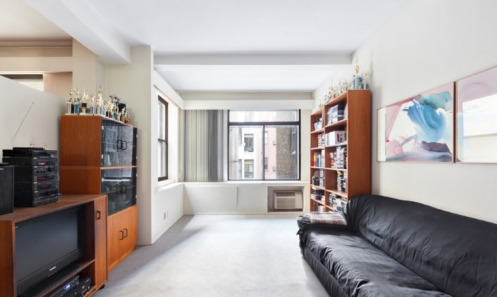
Updating a 1980s-era Greenwich Village three bedroom
There were a number of things that Frank Pizzurro of Frank Pizzurro Architects wanted to fix in this dated co-op—the “disgusting” kitchen, the “ugly” high hats in the dining room, a glass block partition in what looked to be a shared children’s room—but he mostly wanted to figure out why the wall between the living room and master bedroom didn’t go all the way to the ceiling.
“The half-wall on the left is just wrong,” he says. “Either make it all open or close it.” He recommends the latter since he simply couldn’t fathom why anyone would want the goings-on in the master suite to be heard in the living room, and vice versa.
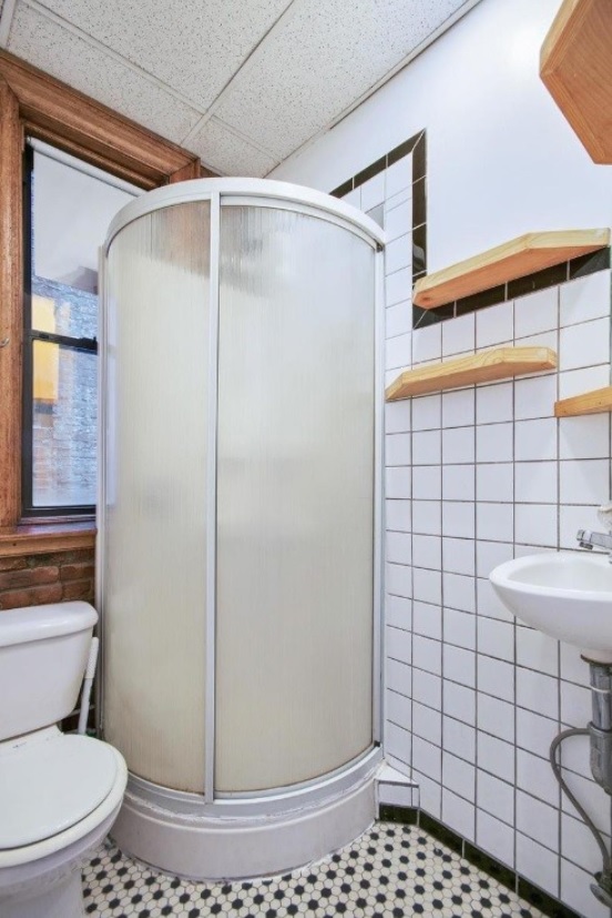
Budget-friendly solutions for a weird East Village bathroom
Architect S. Lindsay Klein of Lindsay Architecture Studio found the bathroom floor tile “depressing.” But she didn’t think it was necessary to take on the expense of replacing the entire floor. Instead, she suggests paying a visit to a discount carpet place, choosing a remnant—“a short pile or a weave, no shag”—and having a piece fitted to cover the entire floor, complete with cut-outs for the toilet “and that funky shower,” as she called it.
“When it gets wet, you can simply lift it up and take it away and let it dry elsewhere,” she says.
As for that shower, “I’d give it a good scrub and pray,” Klein says, explaining that if it still worked—and there wasn’t any money in the budge to replace it—she’d hang onto it.
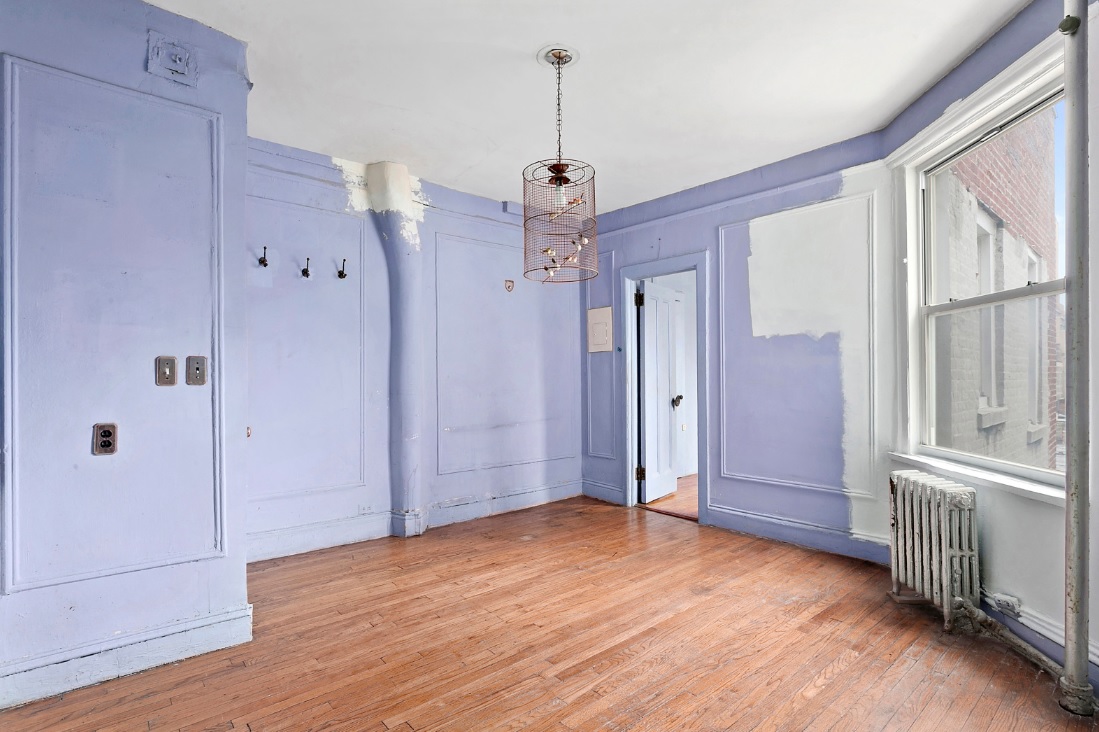
Working around crazy columns in this Lincoln Square one bedroom
“It could be hard to work with the weird wavy column” on the living room wall of this Upper West Side apartment, says architect and Feng Shui expert Anjie Cho, who also likened it to “a noodle.”
Rather than ignoring it or trying to work around it, though, she recommends boxing it out and then adding built-ins on either side for books or other items.
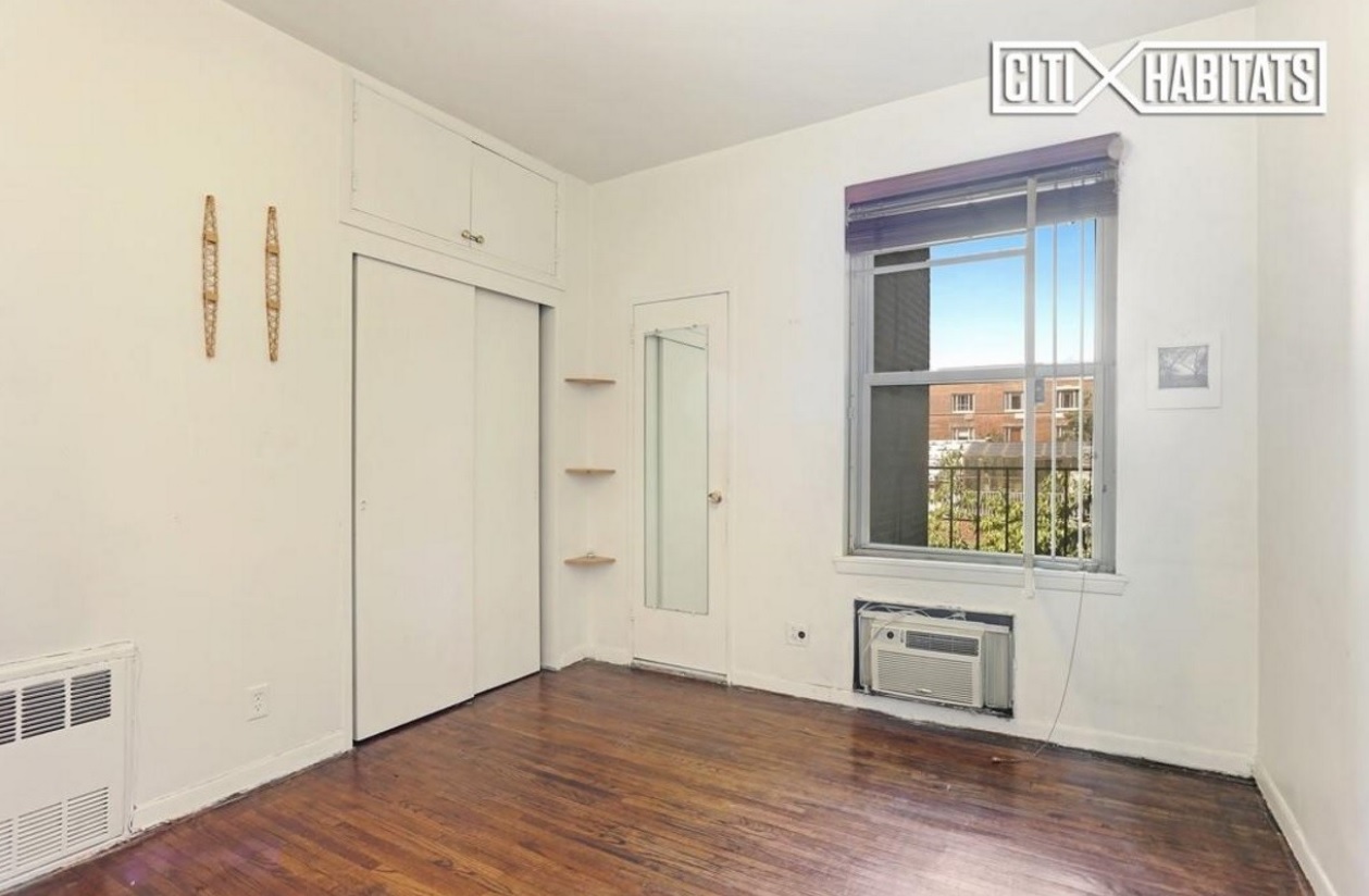
Bringing better storage to this Yorkville one bedroom
This Upper East Side co-op actually had a decent amount of storage on offer, with both a closet and a separate cabinet in the bedroom.
“A personal pet peeve of mine are sliding doors in closets,” says architect Kimberly Peck. “I hate them. They reduce your ability to actually use your storage.”
She has two suggestions for fixing things in here: going with regular swinging doors, plus combining the closet and upper cabinet into a single closet with doors that reach all the way to the ceiling.
Dealing with a strange layout in Inwood
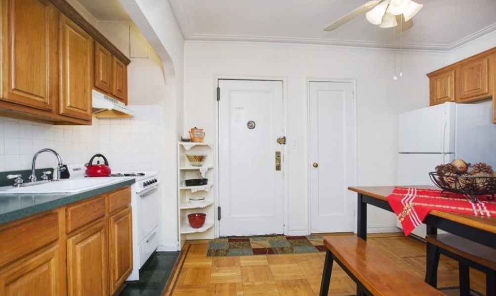
You enter directly into the kitchen of this Inwood apartment, and architect Joe Eisner of Eisner Design wasn’t a fan.
“There’s no real sense of arrival like you’d get with a foyer,” he says. “It’s a strange, bad use of space.”
In order to make some sense of the kitchen—which occupied both sides of this large, bizarrely laid out room, but not the center—he advises moving everything to one side and leaving the entryway somewhat clear so that you don’t feel the need to cook a meal the second you walk into the apartment.
Adding architecture to an Upper West Side fixer-upper
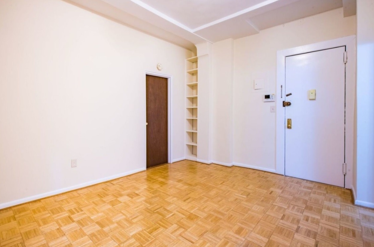
Architect Ritu Saheb of Saheb Architecture calls this West 83rd Street one bedroom “pretty crappy,” but had a lot of ideas as to how to render it less so.
She feels that since it had a more traditional look that adding more ornate floor moldings and crown moldings, as well as new door and window casings would add more architectural “oomph” to the space.
Covering up the brick in Washington Heights
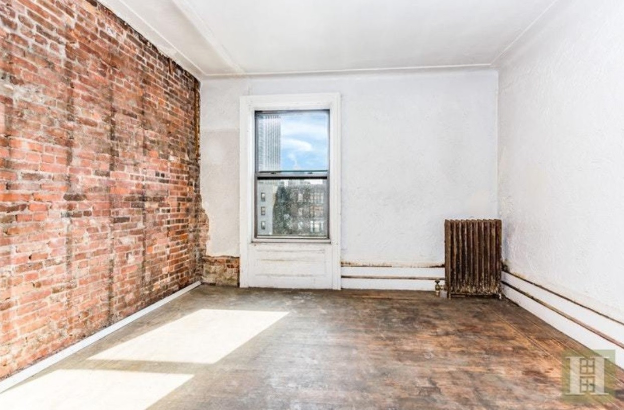
Many people gush about the quaint charm of exposed brick, but Kim Doggett of Kim Austin Doggett Architecture isn’t one of them.
“I’m probably in the minority, but I would cover all the brick walls” in this three bedroom, he says. “Brick is an outdoor material—much too rough to be in a bedroom.”
He proposed having a contractor conceal the brick with drywall.
Making a Jackson Heights bedroom more private
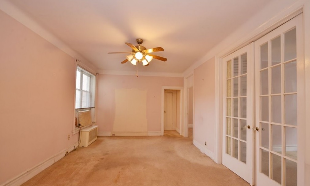
Architect Mark Holmquist was perplexed as to why the doors to one of the bedrooms in this Queens co-op had glass windows, noting that it simply didn’t “make sense.” He advises replacing them with a traditional door that will allow what happens in the bedroom to stay in there.
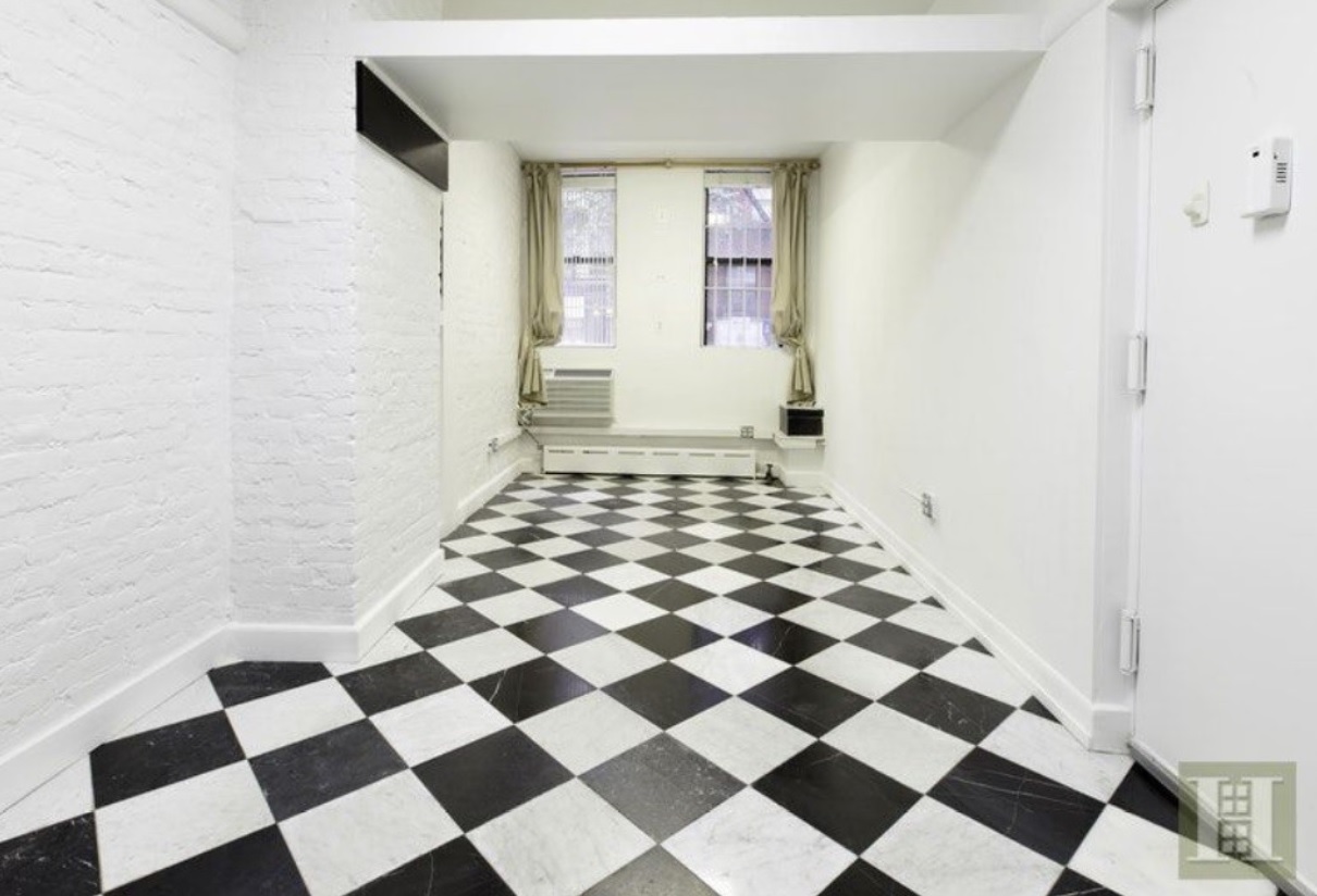
It's too black and white in this Upper East Side loft
Anjie Cho thinks this place is worth fixing, but she isn’t a fan of many features, especially what’s underfoot.
“Those floors are bad,” she says of the black-and-white checkerboard tiles. “[They're] so in your face that you can’t ignore them.”
She’d install new, light-colored wood flooring throughout the unit.
You Might Also Like


