A gut renovation transforms a NYC condo lobby from forgettable to glam

The condo board redid the lobby at the Oxford at 422 East 72nd St., which involved replacing all the surfaces and adding new furnishings, including a digital fireplace.
Regan Wood/The Oxford
It’s not just homeowners who have to consider whether their houses have curb appeal. Condo and co-op boards also need to take into consideration whether their buildings make the right first impression. For New York City buildings, that means taking a hard look at the lobby and seeing it through a prospective buyer’s eyes. Does the lobby convey warmth and grandeur? Or is it more reminiscent of a tired airport terminal? Sometimes we grow blind to the places we pass by every day.
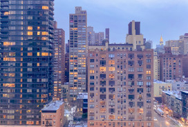
This was the thinking of the condo board at the Oxford, a 191-unit tower at 422 East 72nd St., completed in 1990, where apartments sell for $2.42 million on average, according to StreetEasy. The exterior of the Emery Roth & Sons-designed building has a slanted crown and a long, covered entranceway, which is set back 65 feet from the curb. Building amenities include an indoor pool, fitness room, playground, garden, and outdoor basketball court.
The building is between First and York avenues, a block and a half from the newly completed Second Avenue subway line. Older Upper East Side buildings east of Third Avenue have seen their median sales price rise thanks to increasing demand from buyers since the subway went in, and these buildings also face competition from new luxury buildings such as the Robert A.M. Stern-designed 20 East End Ave., The Kent at 200 East 95th St., and 360 East 89th St.
The Oxford’s 2,000-square-foot lobby is configured in a T-shape, with sitting areas intersected by a long hall that leads to the front desk, mail room, and elevator bank. It had not been renovated in nearly two decades when, in 2014, the board hired an architect to look at it.
Fortuitously, the combination of the canopy and long hall already suggest an impressive entrance, says Francesca Bucci, president and founder of BG Studio International, which oversaw the gut renovation. And so her design for the lobby was geared toward making a “red carpet entrance.” (The board declined to reveal the cost of the renovation.)
Initially, the board hired Bucci's firm merely to come up with a design to “refresh" the lobby, seen in the before photos below.
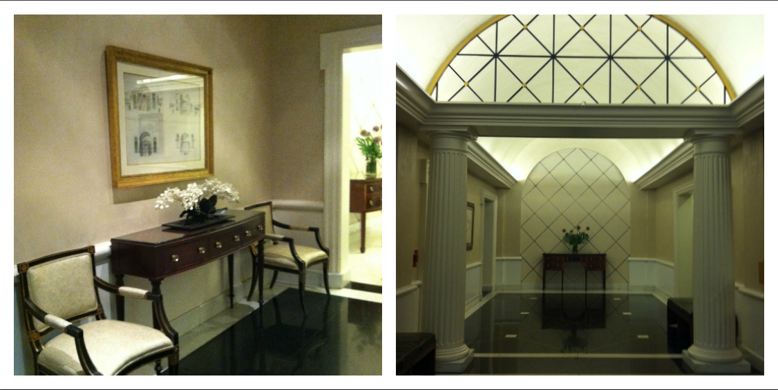
"In the beginning, they just wanted to add a focal point,” Bucci says. But then, “We started talking about doing something a little more revolutionary.”
Bucci came up with an airy, modern design characterized by luminous, luxury materials. Next came winning over the owners, including many who have lived in the building for a long time. The process was involved, but “the majority loved it,” Bucci says of the design, and it was successfully put to a vote.
Still, she and her firm faced several challenges. The building could not close, so construction took place in stages, beginning in 2016 and continuing over the next two years. The lobby was demolished, with only the glass facade and entrance doors remaining in place. The ceiling, floors, walls, reception desk were all redesigned, without moving any of the walls. Other challenges included working with a high ceiling and placement of the front desk—neither could be altered. The same went for the building’s mechanical system, housed in the center of the lobby.
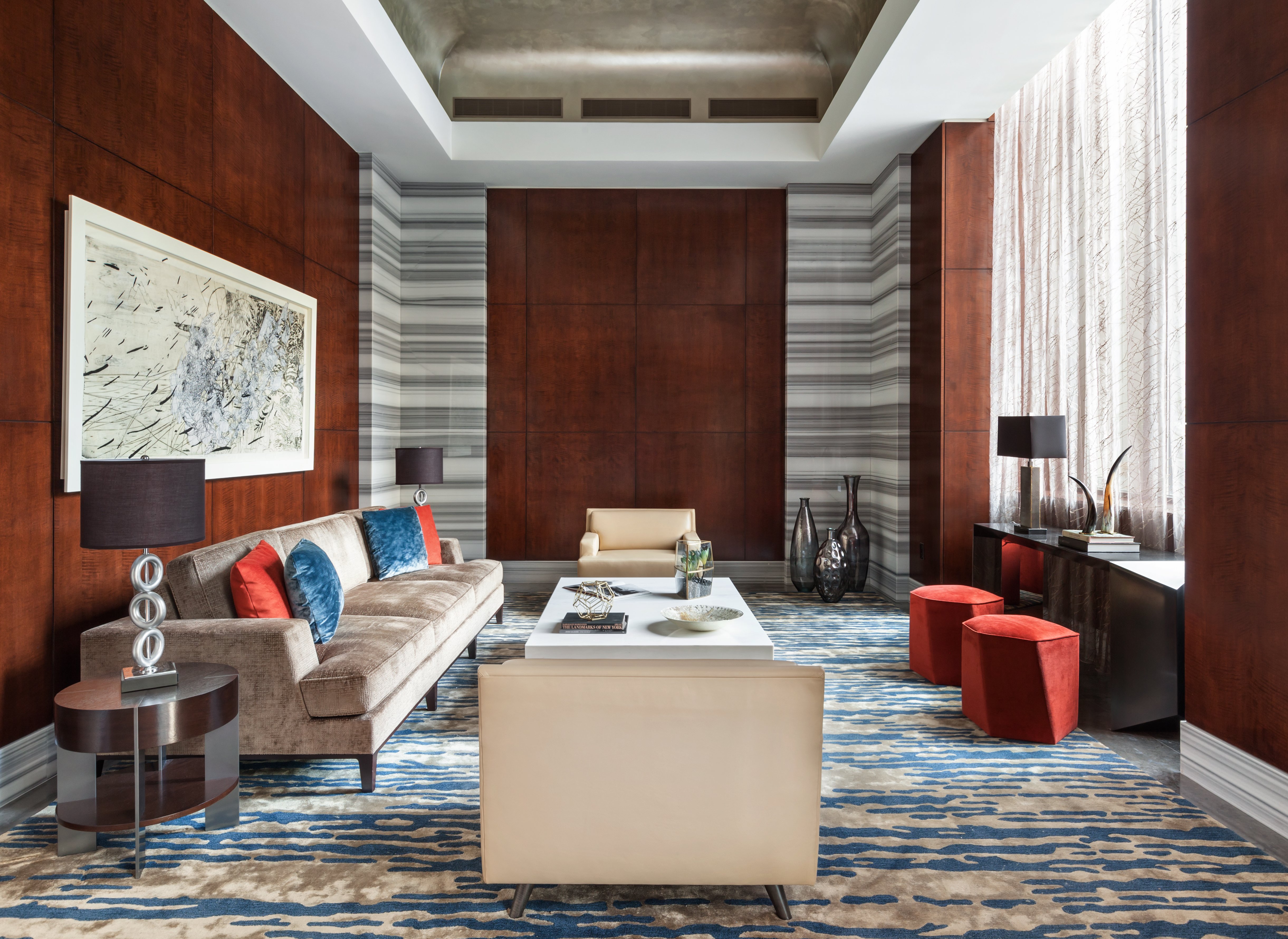
The result: A glamorous space that uses metallic elements sparingly. The chandelier, a simple circle, glows like a diamond bracelet. A dramatic, 20-foot wall with faceted and delicately patterned wood panels serves as a focal point and divider between the public areas and the elevators.
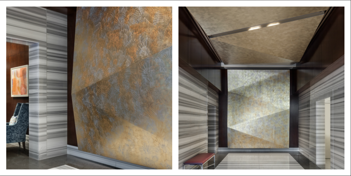
The wall is hand-painted in platinum and gold tones, and gold leaf.
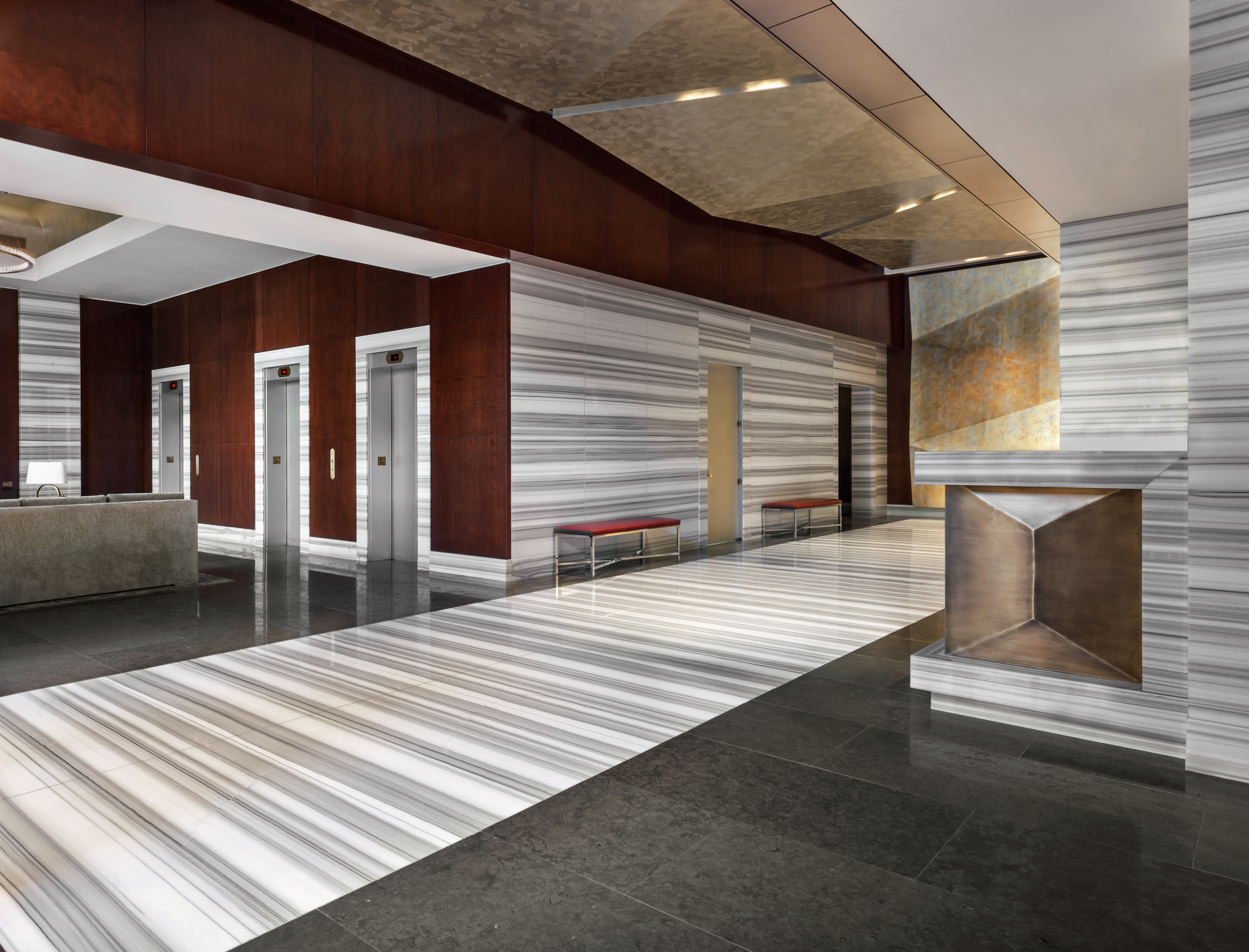
The floors feature large slabs of a striped gray and white marble called Polar Gray, and the east and west lobby walls are accented by brown and dark gray San Penia marble. The faceted ceiling is painted in platinum paint and gold leaf and lit by cove lighting.

Faceted panels along the sides of the lobby desk replicate the feature wall motif.
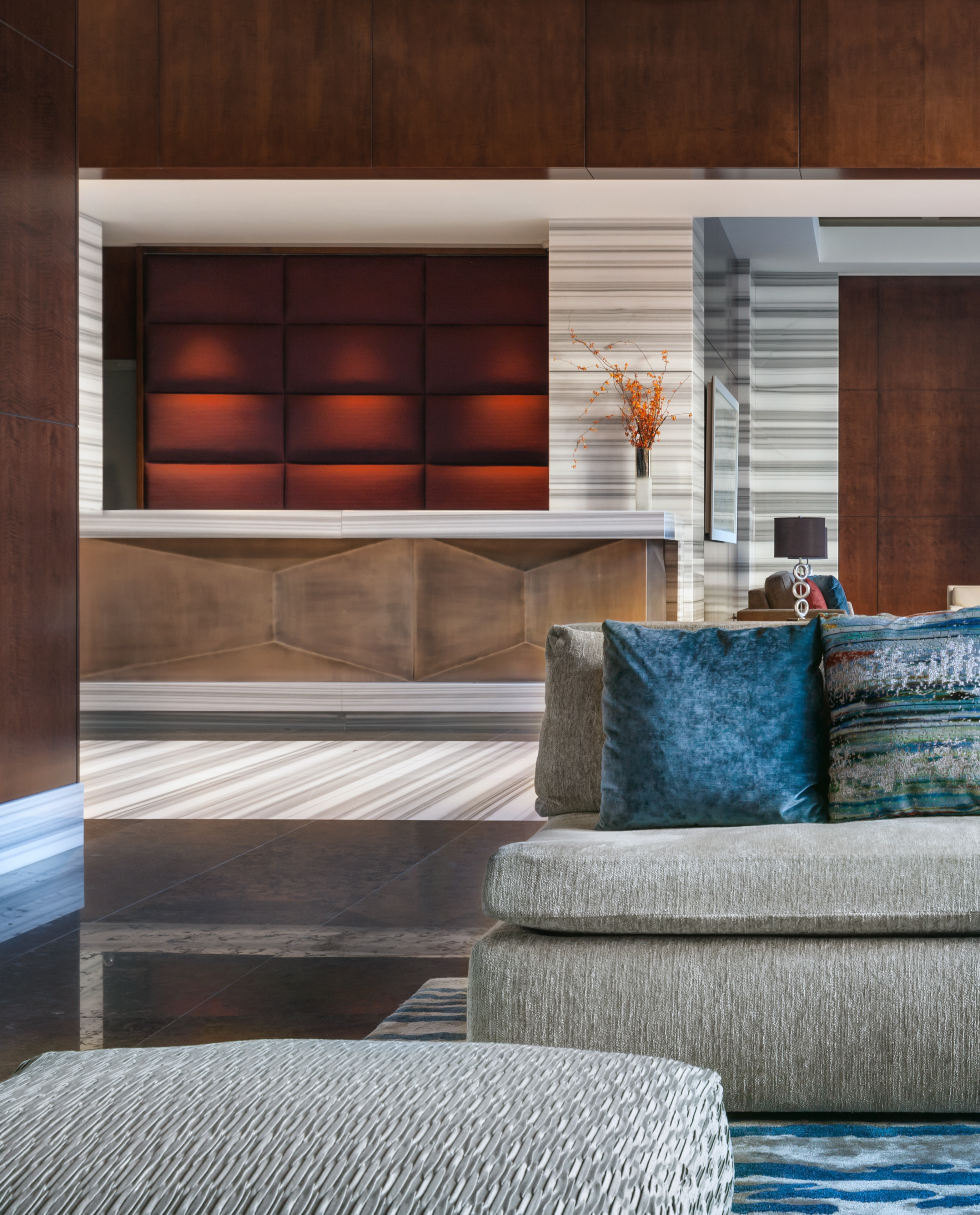
New furnishings include couches and chairs, lamps, tables, and console pieces with upholstery in neutrals and jewel tones contrasted by striped and pattered pillows.
Bucci described going to a quarry in Italy to select a block of Polar Gray marble.
“It’s not super rare but it only comes from certain quarries in Italy and Turkey,” she says. “We were looking for something delicate.”
She needed the striations to match up, a process called "bookmatching." But there’s always some tension involved at this point, because you can’t see what you’re getting with a block of marble until a fabricator slices it like a loaf of bread and the pieces get matched up. There was surprise here, a pattern like a bow in the middle of the block, so the marble’s veins were curved, not straight.
“I didn’t think it would work,” Bucci says. It didn’t make it into to the final design. There’s only so much you can leave to chance when executing a vision.
You Might Also Like


