Kids storage solutions for NYC apartments to help you keep your sanity

Interior designer Jennifer Morris chose a duc duc bunk bed with storage for a child's room on the Upper East Side, left. To create a fancy dressing room for a preteen, interior designer Glenn Gissler lined a closet with shelves and drawers.
Jennifer Morris and Glenn Gissler
Corralling toys like Legos, which proliferate like viruses, or American Girl dolls, which apparently require wardrobe updates seasonally, is a never-ending headache for parents everywhere. But for New York City apartment dwellers, it is especially tricky.
A lack of space makes storage solutions difficult, because somehow less space does not correlate with fewer toys. Go figure. In New York, many kids' rooms can be odd-shaped, small spaces, like the so-called maid's room or the tiny room above the entrance in a townhouse. And even in spacious, open plan apartments there are special considerations, such as fewer walls and so less closets and places for shelves, which again leads back to storage problems.
We talked to New York City interior designers to get their views on kids’ storage (words like “sanity” and “madness” came up a lot) and got tips from these pros on how to do shelving and baskets right, and how to find multipurpose pieces.
“Most people have self-deprecating views of themselves when it comes to storage,” says interior designer Glenn Gissler. “They say things like, ‘I’m a pig,’ but what they really have is inadequate storage.” So when it comes to children, giving them proper storage means giving them “a sense of order and confidence.”
Gissler has been designing children’s rooms for 30 years, and while some things have changed (kids get electronics at increasingly younger ages, for instance) at least one thing has stayed the same: His clients often want furnishings that are scaled to kids' sizes, yet can grow with them.
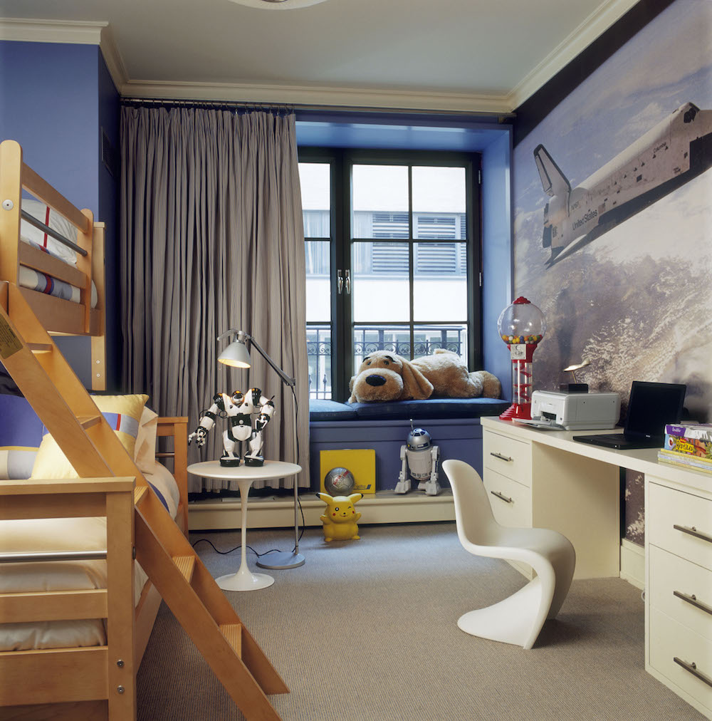
It’s a challenge that Gissler has met in a few different ways. In one children’s bathroom, shared by a boy and a girl, Gissler had the plumbing for a double vanity installed at a lower height. Years later, when the children were older and taller, he had the vanity raised to be more comfortable. He did a similar trick with a boy’s bedroom, shown below, installing a low desk that was raised to full height when the boy was older.
“Everything we do is custom,” Gissler says. In a tiny maid’s room that he converted into a bedroom for two boys, he designed loft beds perched on sleek, white storage platforms, with shelves and drawers built in. Like a berth on a train, the beds have curtains for privacy.
In another project, he lined a walk-in closet with drawers and shelves to make a fancy dressing room for a preteen.
“The thing with toys,” says interior designer Jennifer Morris, who frequently designs family spaces for her New York City clients, is that “you’re always looking to hide them, but when you do, you forget about them.” The better solution, she says, “is to contain them, or at least keep the madness in one spot and make it more manageable, especially if you’re trying to encourage your child to put their things away.”
Bunk beds are the workhorses of a child’s bedroom, enabling two children to share a bedroom that would otherwise be too small. But bunk beds typically are about as attractive as a workhorse, especially when storage is involved. So a bunk bed with storage that Morris used in a recent Upper East Side project that was also bright and modern got our attention pretty quickly.
Morris selected the Austin bunk bed from duc duc, which can be customized with cubbies for toys or extra clothes. Morris favors the brand because she says it uses safer finishes, solid wood, and is produced nearby in Connecticut.
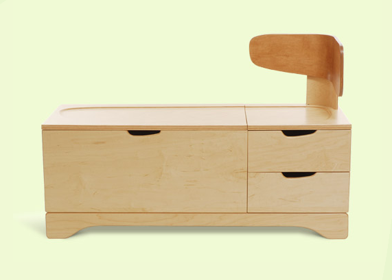
Another multipurpose piece is the toy/chaise from Iglooplay, a children’s furniture collection designed by Brooklynite Lisa Albin. The piece, below, doubles as a large chest with a slow-closing hinge to protect fingers, as well as drawers and seating, with an optional suede seat cushion.
Morris is a fan of taking a sustainable approach to furnishing children’s rooms. For that reason, she cautions against using inexpensive pieces that tend to break and wind up in a landfill. Instead, she likes what she calls “heirloom” pieces that last and can be passed along. Seeking out pieces that grow with a child, such as open shelving that can be stocked with baskets for toys now and books when he or she is older, is one good way to follow this ethos. A trick is to label the shelves with small photos, or Morris’s latest method, using vinyl chalkboard stickers from Blik that can be cut into small tags, to help kids put away their things themselves.
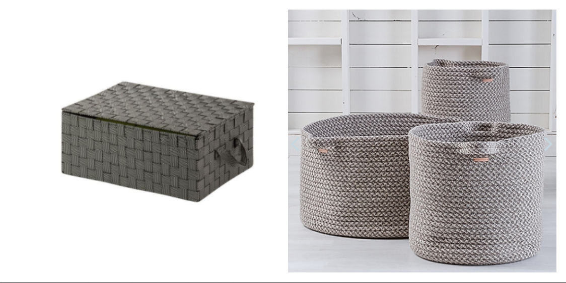
Interior designer Laura Bohn prescribes a mix of low- and high-end solutions to the problem of kid clutter. She heads to the Container Store and Home Depot for “good looking plastic boxes,” like the $15 version from Home Depot, below left. For a pricier pick, she uses woven wool baskets from Maine Cottage, below right.
“Put them in pairs,” she says, “everything looks better in a pairs.”
Another tried and true technique is to use hooks and shelves.
“Do an entire wall with hooks every six inches,” she says. “Hang it all up.”
Bohn makes creative use of the space she’s got: In one child’s odd-shaped room, she put up a shelf that ran the around the height of the room, even over the doorframe, to hold books.
“Kids have a lot of books today, amazingly enough, even with the internet,” she says.
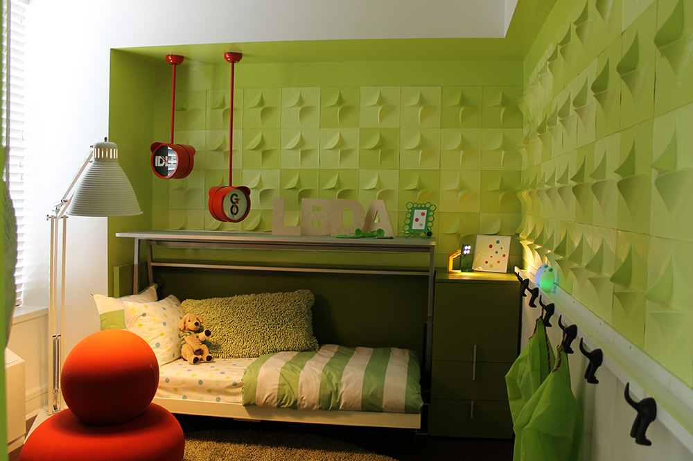
Her more pricey go-to source is Resource Furniture, which offers multi-use furniture, including beds that become desks or sofas and offer storage, a boon for small rooms.
“They are a high-end, but for kids rooms they are great,” she says. For a space-saving child's room in the Kips Bay Decorator Show House, shown above, she used a Resource Furniture piece called cabrio that has a desk that pivots out into a bed. Along green walls with 3D, origami-like tiles she used lots of hooks, so there are places to hang everything up.
You Might Also Like


