Design trends to avoid if you don’t want your space to feel dated, fast

Globe chandeliers may show an apartment's age in just a few years, according to interior designer Sara Klar.
About to undertake a big renovation project? Thinking of giving your living space a fall refresh? If so, you’ve no doubt spent some time down the online interior-design rabbit hole, and you probably have a pretty good sense of current trends.
One thing to keep in mind before finalizing your plans: What might look good now could be in danger of becoming the avocado green of the 2010s. Which trends are most at risk? We talked to some interior design professionals to find out.
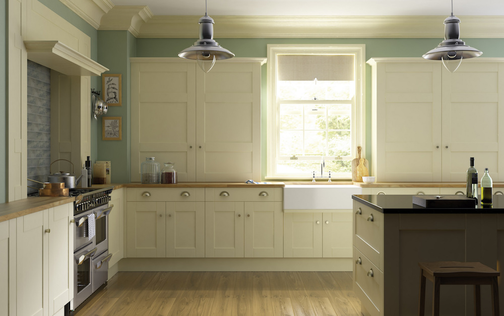
Shaker-style cabinets
Designer Sara Klar of Sara Klar Ltd estimates that 90 percent of her clients bring her images of kitchens with Shaker-style cabinets and white subway and geometric tiles.
As a rule of thumb, "Anything you see everywhere is not going to age well," she says. “Any one of these elements in and of itself, and used in a different and unexpected way, is fine. The problem is people are using all things."
To stand out from the crowd, for example, "If you’re going to use Shaker cabinets, do them in a crazy color."
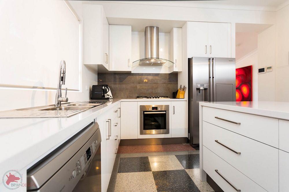
Oversized hardware
Liz Tiesi, lead designer at Threshold Interiors is no fan of the oversized kitchen hardware trend.
"Everyone’s doing it," she says. "I believe hardware should be appropriate to the size of the drawer."
Not only does she think this look will feel dated in a few years, but there's danger involved, she says: "It can be sharp. It literally injures you. It really projects out and you can get caught on it."
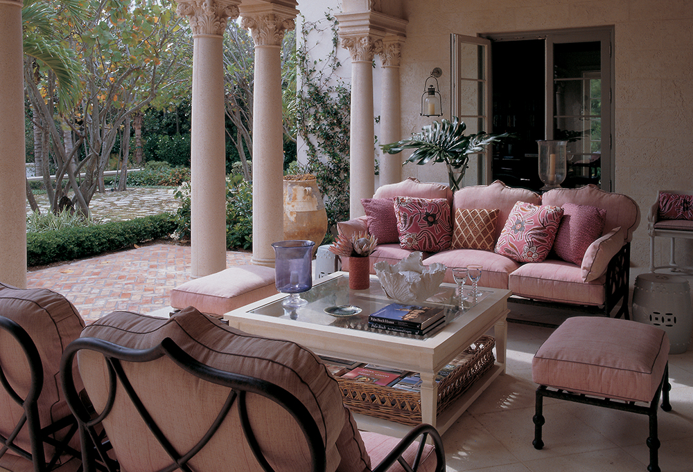
Blush
Sally Gotfredson, interior design manager at One Kings Lane, advises using this popular hue in small doses.
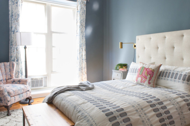
"Blush is beautiful and there will always be a way to do it right," she says. "However, using it in larger scale is a trend that will forever scream '2014,' which is the opposite of timeless. Keep it to pillows or accents that you can eventually get reupholstered."
Relatedly, Tiesi warns against using pale golds for walls.
Quartz countertops
These have been around for a while, and more than one person we spoke to flagged it as a time-specific hazard. Tiesi says it looks like the '90s.
Ann Baumgartner, partner at AT Studio, predicts manufacturers of popular brands like Caesarstone and Silestone will eventually be able to produce pieces that look even more like their more expensive granite counterparts.
"So [today’s counters] are only going to look fake," she says.
As an alternative, Tiesi says to consider natural stone quartzite.
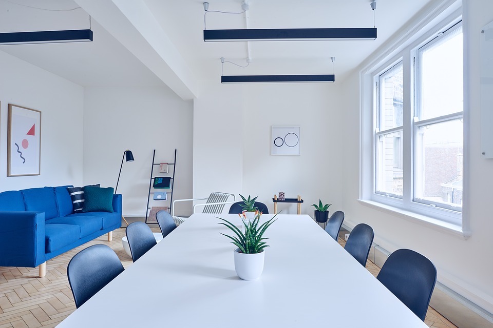
Ultra-modern
Klar says many new condos around town overdo it when trying to be super-sleek and chic.
"It’s another genre," she says. "Every piece is sleek in the same way."
The problem carries over to construction, according to Klar. "Floor-to-ceiling windows, I see them and think, 'Really, you can’t think of something else?'"
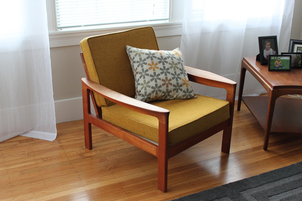
Mid-century modern
“It’s so hip, so that’s what’s going to be going out,” says Baumgartner of the mid-century modern aesthetic.
Instead of doing an entire room in this style, she advises mixing in pieces from different periods to break it up.
Black stainless steel
Westchester County designer Laurel Bern of Laurel Bern Interiors has a lot of opinions on design trends, kitchen ones in particular. For example: Open shelving makes things feel lighter but can create storage headaches; pale grey is a safe bet. But she is perhaps most passionate about the trend of black stainless steel appliances, offering just three words on the topic: "DON’T DO IT."
So, can you indulge any of your of-the-moment favorites? Of course, says Klar, if you love it, do it. But if that design choice is a fad, "Just know it going in."
You Might Also Like


