This Flatiron studio has a quirky layout, but that's not necessarily a bad thing

As soon as we saw the two-story window and the built-in wardrobe in this $2,468 Flatiron studio, we were smitten. Plus, the building it's in has perks, including a lounge space and a bike room, which make it appealing. But on closer inspection, we noticed that the kitchen and bathroom appear to be on a separate floor from the sleeping area. That's not exactly typical, of course, but we're not sure that's necessarily a bad thing.
For some more input, we asked our experts (and veteran renters), real estate research and analytics firm NeighborhoodX founder Constantine Valhouli and freelance writer Lambeth Hochwald, to weigh in with me on this week's Take It or Leave It.


Size: Studio with one bathroom
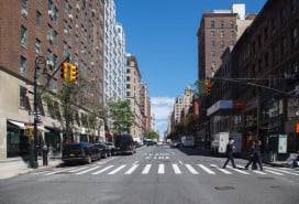
Location: 220 East 22nd Street (between Second and Third avenues)
Monthly rent: $2,468, no broker's fee
Flexible layout: No
Days on the market: 9
Subway: 6 at 23rd Street
Pros and cons:
"This apartment is kind of weird, but in the best way possible. That large window is a really nice detail, and the wardrobe is covetable. Also, the location is hard to beat for those who want to be near restaurants, nightlife, and lots of transportation options. That said, the bottom of the listing says 'All pictures advertised are representative of the exact apartment finishes but may not be of the exact apartment available,' so that worries me a tad. The fact that it has no broker fee is good, but the odd price—$2,468—makes me think that may be the a net effective rent, meaning you're actually paying more per month but getting a free month's rent. " —Lucy
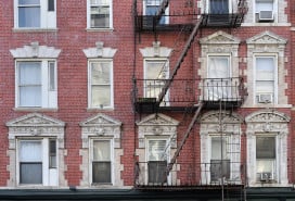
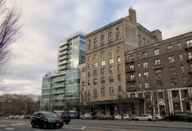
"The interior of the apartment actually has character. While there's no plan to get a sense of the size of rooms or the flow, there is a staircase—rare enough in larger apartments, but almost unheard of in a studio. It looks like there is considerable storage, a full-size kitchen, and a renovated bathroom. It also looks like there's a patio from the photos, but this isn't mentioned. The exterior of this building demonstrates the tofurkey approach to architecture. It looks like someone attached postwar concrete patios onto a classic limestone and brick building. The motivations for this elude me, except perhaps for a deep hatred of classically proportioned buildings. And the street-level conversion is just painful—the wide arches that would have lent themselves to large windows or ground-floor retail (Jane Jacobs, yo)—were instead filled with Lego-looking bricks and two tiny aluminum windows. Sad!" —Constantine
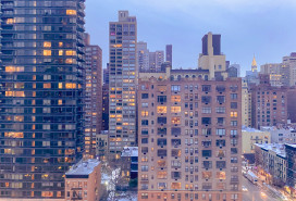
"There's no shortage of light (or storage) in this Gramercy duplex studio with almost floor-to-ceiling windows overlooking a pleasant urban view. What is strange, however, is that the apartment is split with the living/sleeping space downstairs and the kitchen up a short flight of stairs? Then again, there's a breakfast bar up there so you can always sit for a bowl of cereal before heading down to do everything else." —Lambeth
Who this apartment would be perfect for:
"A single person who detests cookie-cutters." —Lucy
"It's centrally located, so it offers a convenient commute to Flatiron, midtown, or downtown." —Constantine
"A recent grad (or new-to-the-city 20-something) whose parents demand he/she live in a doorman building." —Lambeth
The verdict(s):
TAKE IT "As long as you have imagination, you can make this place work. Just make sure this is the apartment that's available." —Lucy
TAKE IT " As long as you can see past the exterior renovations, this seems like an incredibly convenient and livable apartment for the price." —Constantine
![]() LEAVE IT: "I'm giving this a pass. Sure the space is quirky, but it's too pricey for what you get." —Lambeth
LEAVE IT: "I'm giving this a pass. Sure the space is quirky, but it's too pricey for what you get." —Lambeth
You Might Also Like

