This under-$300,000 Yorkville studio could use a little bit of sprucing up, and we're here to help

An “actual separate, windowed kitchen”—albeit a tiny one—is doubtless the choicest thing about this $299,000 co-op studio at 531 East 87th Street in Yorkville, says Jim Hill of Urban Pioneering Architecture. Plus, “there looks to be a halfway decent amount of closets.”
The apartment as a whole does, however, seem to be rather petite, he says, “but that’s pretty typical of a New York studio.” And obviously, it could use a bit of work. Here, Hill describes what he’d do to spruce the place up. His recommendations:
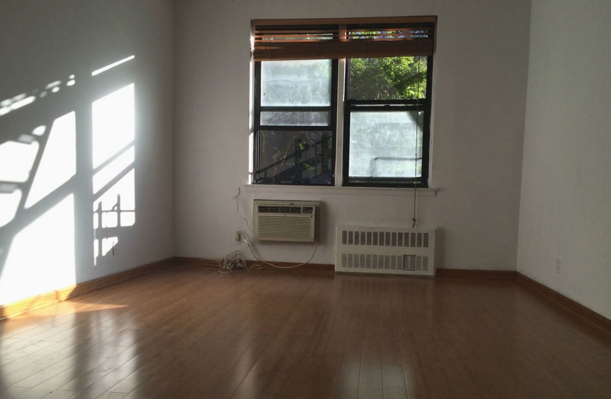
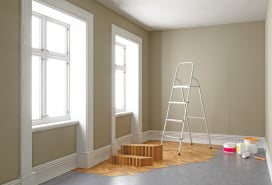
The living room/dining room/bedroom (pictured here and above)
First, Hill believes that the floors can stay. “These look like pre-finished bamboo floors,” he says. “They’re kind of interesting, so if they’re already there and in good shape, there’s no reason to rip them out.”
Next, he points out that the front and bathroom doors are flat-panel (smooth from top to bottom), while the doors on the two closets have six panels each (meaning they have six separate rectangles inset in each door). He recommends changing the closet doors out for flat-panel ones “to give the area more consistency.”
Afterward, he’d replace the moldings around all the doors. Right now, there are two-inch moldings, but Hill believes three-and-a-half-inch moldings would work better here since your eye would more readily be drawn to them and “they wouldn’t just look flat.”
He’d also swap out the base moldings running around the entire room just above the floor, which he believes look to be around three-and-a-half inches in size. He’d prefer them to be six or seven inches. “It wouldn’t look as cheap,” he says. “It doesn’t have to be ornate. It just has to look like you put a little thought into it.”
He advises going with something that can be painted a white semi-gloss (rather than the wood-like ones that are there at the moment) “so it won’t compete with the bamboo look of the floors.”
As for the wall color, he proposes “sticking with a neutral, but something warmer than an industrial white. Maybe an off-white.” For the ceiling, he’d opt for a flat white.
It’s impossible to tell if there’s any sort of recessed lighting from the pictures—the only item illuminating this space seems to be a floor lamp—so Hill says that if there isn’t anything up above, he’d offload the lamp and go with wall sconces instead to light the room up. “They look a little more finished than floor lamps,” he says.
Moving over to the window, Hill says he’d remove the current molding around it in favor of molding that’ll match the doors on the other side of the room. It’ll help keep the area looking consistent, as well as “make the window look bigger,” he notes, explaining that this is because “the eye tends to read outside the molding instead of inside.”
If the building gives you permission to replace the windows (some won’t), Hill recommends it since the existing ones look ancient, filthy and tough to actually see through. He would also prefer white borders instead of the current black ones because the black “contrasts” with the rest of the mostly neutral-colored room. If management vetoes new windows, he’d “at least have them reglazed so you can actually see through them.”
Venetian blinds like the ones there now (albeit newer) would work well for these windows since “they tend to bounce light in.” Either that or he'd go with a drop-down roller shade that lets in some light.
Last, Hill proposes getting a radiator and air-conditioner cover. “It’ll give the area a more finished appearance as well as add a counter space in front of the window” in case you’d like to display anything.
Price: According to Hill, new flat panel doors can probably be purchased for “less than $100” each. New moldings can be obtained for “around $1 to $2 per foot” from a place like Spiegel Architectural Woodworks. Gallons of paint for the walls, ceiling and moldings can be purchased from Farrow & Ball for $99 each. Prices for sconces start at $155 at Design Within Reach.
Reglazing the windows should be “$300 or less,” says Hill. Replacing the windows outright would probably more than double that. Prices for these Venetian blinds start at $29.99 at Bed Bath & Beyond. Stock radiator covers, like these from Fichman Furniture and Radiator Covers, cost a few hundred dollars. Custom ones, in the thousands. Labor will obviously add on to these costs.
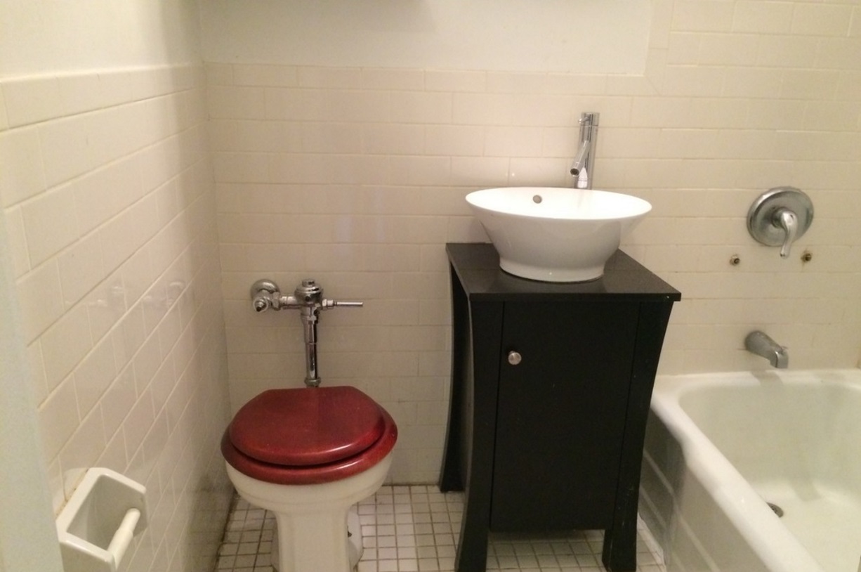
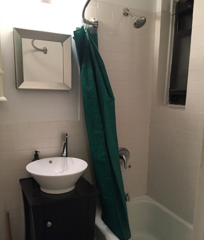
The bathroom
“There’s a lot that can be done here,” says Hill, noting that “it’s already a relatively neutral palette.”
First, he recommends discarding the vessel sink because it looks a bit too big here. Instead, he’d opt for either a pedestal sink or a wall-mounted vanity (both white, making for a more neutral look than the current multi-colored mish-mash on display now) so you’d be able to see, and easily clean, the space underneath. Both would look “cleaner,” he says.
He doesn’t love the “industrial look” of the tank-less toilet, so he’d flush that and instead get a typical tank version. “It’ll take up a little more room,” says Hill, but it shouldn’t make the space appear any smaller.
Next, he’d change out each and every fixture in the bathroom—the showerhead, tub and shower faucets, sink faucet and knobs, and the like—since what's there looks to have seen better days. He also suggests getting rid of the mirror. He’d prefer a “real medicine cabinet, perhaps something recessed into the wall” to maximize storage in such a small space.
He'd keep the tub, but suggests getting a new straight curtain rod (instead of the current curved one) that would lie flat along the tub and make for a tidier appearance.
If the building is indeed okay with replacing windows, Hill would do so here too, getting rid of this black-framed one in favor of a white-framed model.
Next, he’d replace all the tiles—on both the wall and the floors—since he thinks that they too, look a little old. For the walls, he’d go with a white subway tile. And instead of stopping where the current tile does and painting that small part of the wall beneath the ceiling, he’d simply extend the tile all the way to the ceiling. “It makes for a more finished look,” he says. Then he’d paint the ceiling a flat white.
As for the floors? “A small-scale mosaic could be nice here,” he says. And while a mosaic tends to be more expensive than straight tiles, it's not likely to be too pricey since the bathroom is so small. “You can put down something with a little bit of quality because you only need about 10 square feet of it,” he says.
When it comes to lighting, he’d ideally want something on either side of the medicine cabinet so as to shed the most flattering light on the person standing there, but he isn’t sure if there’s enough room in this bathroom for that. If there isn’t, he’d go with a beauty bar right on top of the mirror.
Price: This Kohler pedestal sink from Home Depot is $349. This wall-hung vanity from Kohler is $705.90. This Toto toilet is $216 from Home Depot. This Watermark tub and shower system from ybath.com (complete with shower head and tub spout) is $1,150.50. This Watermark sink faucet is $626.25 at ybath.com. This Robern medicine cabinet costs $1,249. This medicine cabinet from Pottery Barn is $249. This clear shower curtain from Bed Bath & Beyond is $19.99. This rod is also $19.99.
A new window for this space should cost around $500 to $600, says Hill. He believes the white subway tile for the walls can be obtained for around $3 a foot from a place like Nemo Tile. The mosaic tiles should be more, around $10 per foot. A gallon of ceiling paint from Farrow & Ball will run $99. These sconces from Lighting by Gregory are $268 each. Labor will be more.
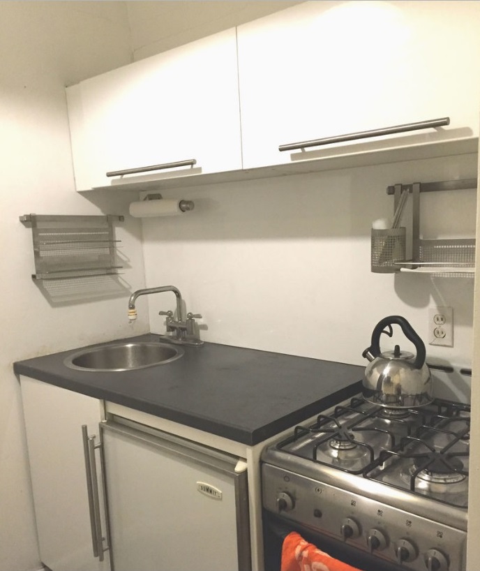
The kitchen
To begin, Hill recommends getting rid of the current cabinets with their impractical lift-up doors that “tend to break,” instead going with a more typical tall cabinet that will reach up closer to the ceiling. Rather than white, he’d opt for “something with a wood finish like oak that would warm the space up a bit.”
If you’re looking to save money on cabinets, Hill recommends IKEA. But, he notes if you still want a bit of a custom look, you should check out Semihandmade, a company that makes semi-custom door and drawer fronts for IKEA cabinets. “They have a really great variety of finishes and it’s a lot less expensive than a standard cabinet-maker” he says. He’d also opt for under-cabinet lights to make finding things in here a little bit easier.
While there aren’t many options in the way of layout, Hill thinks it would be nice to get the sink out of the corner. “It’ll be more comfortable when doing dishes,” he says. “You won’t keep banging your elbow against the wall.” As such, he’d replace the current circular sink with a D-shaped one. “The flat side goes against the front and you end up with corners in the back,” he says. “You can put a single-lever faucet in one corner and a soap dispenser in the other.”
Next, he’d chuck the countertop in favor of a Caesarstone if possible. “It’s very durable and available in all sorts of different colors,” he says. If you’re going for oak cabinets up above, he’d aim for counters that are lighter in color. He’d even run the Caesarstone all the way up the wall until the cabinets like a backsplash. “It’ll give it a really nice, finished look and it’s easy to clean,” he says.
He’d replace the current under-cabinet half-fridge with a new (similarly sized) one. “You can even see about getting a custom door-front like the cabinets,” he adds. He’d also get a new gas range since “this one looks pretty old.”
For the floor, Hill says he’d like to “try and match the wood from the rest of the house.” He might bring in bamboo to match the living room floor or even cork floors. “If you’re someone who cooks, it’s better for your back,” he explains. “It has more give.”
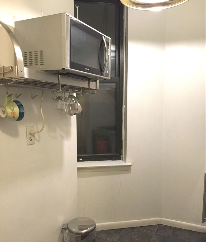
As for lighting, there is currently some sort of low-hanging pendant that’s hard to see from the pictures. “It looks like you might bang your head on it,” he says. Hill would get a different pendant—preferably something open on both the top and bottom so that the light would bounce up and down and illuminate the space more warmly and evenly—and raise it up a bit to minimize head-banging.
He’d also take down the shelf holding the microwave since “it looks like you might bang your back into it and it’d be better to leave that wall as open as possible” to make the space appear more open. He’d try to find a microwave that’ll fit above the range, instead.
Finally, once again, he’d urge replacing the black-framed window for one with a white aluminum frame so that it blends more seamlessly with the walls around it.
Price: This IKEA Sektion two-door cabinet is $190. Under-cabinet lights should probably be about $50 a cabinet. This D-shaped undermount Kohler sink is $636.75 from faucetdirect.com. This Grohe faucet is $373.46 at Home Depot. This soap dispenser is $39.90. Pricing for countertops varies widely, but Hill thinks it’ll probably start at around $500, especially if you choose IKEA here too. This Summit under-counter fridge is $1,118 at Amazon.com. This GE 24-inch gas range is $674.99 at Best Buy.
Hill thinks a cork floor should be around $1,000 for a space this size. Bamboo flooring should be around half that. Gallons of paint for the walls and ceiling can be purchased from Farrow & Ball for $99 each. This Crisscross cigar pendant lamp from Design Within Reach is $318.75. Prices for over-the-range microwaves start at $138 at Home Depot. Hill thinks replacing the window should cost around $700 or so. Labor will add on to these costs.
You Might Also Like


