Swipe to find your next apartment: the Tinder-ification of the rental search

Updated, 12:21 p.m., with a comment from Doorsteps: Tinder and its quick-swipe way of approving potential hook-ups may have captured the hearts (or loins) of unattached New Yorkers, but are city dwellers ready to apply that same approach to the apartment hunt?
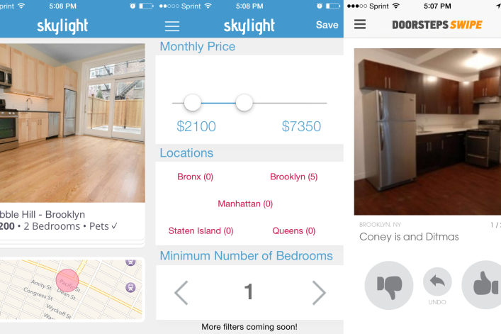
At least two new-ish smartphone apps are betting yes: Skylight, which launched earlier this month, and Doorsteps Swipe, the mobile extension of the online buyers’ resource Doorsteps, which launched in April and added rental listings about a month ago.
Like Tinder, both these apps are free to use—Doorsteps makes money from subscriptions for brokers and lenders, while Skylight is still ironing out its revenue model, but also plans to charge agents—and both employ the now familiar yay-or-nay model of scanning through search results: Swipe left if you don’t like, swipe right to save, and tap for more info.
For Tinder and its ilk, this approach is not just a marketing gimmick: swiping accomplishes two actions with one movement (saving or discarding what's on your screen while simultaneously flipping to the next screen) and presents a lot of information in an easy-to-digest format, as the tech blog Re/Code observed earlier this year. In other words, it's a more efficient and attractive setup than, say, Facebook's news feed.
The question is, does it work when you’re scouring rental listings, as opposed to potential mates? After all, being single isn’t quite as bad as being homeless (despite what the headlines would have you believe), and on a practical level, a lot more decision-making and money goes into locking down an apartment versus a regular hook-up. (Sad, but true.)
The founders of Skylight—Michael Lisovetsky, a senior in finance at NYU’s Stern School of Business; Dean Soukeras, a real estate broker and former e-commerce entrepreneur; and Jason Marmon—maintain that the rental hunt lends itself to swiping and to an exclusively mobile-based search. “We’re able to bring the same information that you’ll see on hundreds of thousands of website pages in a very simple format,” says Soukeras, adding that people think “somehow real estate needs to be a difficult, painful experience. We don’t believe that.”
Skylight’s listings (about 8,000 so far, the founders say) come from various New York City brokerages, including Bond New York and Keller Williams NYC. While that keeps a lid on duplicate listings, it means that only a fraction of the offerings are no-fee (about 300 or 400, the founders estimate). The app also doesn’t have a no-fee search filter—yet. On Doorsteps Swipe, the listings come from local brokerages, landlords and other websites, and there’s similarly no option to search “no-fee.” The upshot? This may be a new way to search, but the listings are the same ones you'll find on other websites. (More on that below.)
Still, many observers contend that apartment-hunting by phone is the next frontier. It's smart for real estate startups to turn their attention to renters' smartphones, says Joe Charat, the founder of NakedApartments, a rental search site and BrickUnderground sponsor, who has not yet tried Skylight. “If you look at the growth of Naked Apartments, StreetEasy, Zillow and Trulia, you'll see a common theme,” he says. “A significant portion of our growth comes from mobile users, and that trend is only accelerating.”
And it’s true that on both apps, it’s easy to get searching right away, in part because of the Tinder-like setup: You enter only the minimum number of details—price, area, number of bedrooms—and start swiping.
“When we watched people who were browsing potential homes, they would just look at the pictures," says Doorsteps founder Michele Serro. "How do we take that behavior that people are already doing and not show them all of the information that they’re not necessarily ready to receive yet?” For Doorsteps, the answer was an app with a swiping function, which displays the most important info for buyers or renters in the early stage of a hunt (price, address, photos). Once you've saved five listings, the app will show you a summary, with the goal of illuminating what you're looking for.
On the other hand, there are certain features that get lost in the migration from a browser. Neither app takes into account a renter’s need to compile information from a variety of sources—say, looking up commute times or Googling a broker—at the same time as looking for listings. And one of the biggest issues is that you decide to swipe left or right based on a single photo, since you have to tap on a picture to look at additional images or to see more information about an apartment. This may work on Tinder (I’m not conceding that it does), but it does not work in real estate. I found myself tapping on almost every listing looking for more information and more photos, negating the utility of the swipe altogether.
Of course, an app-only rental search site could have loads of useful features, including the power to scan listings on your evening commute; check if you can afford anything within the immediate radius of your brunch table; or get “push” notifications, so you’d get alerts when an apartment that fits your criteria hits the market, or if the price comes down on one of your saved listings (which Skylight plans to add).
Indeed, Zeb Dropkin, the founder of RentHackr, a website where renters post info on available apartments, considers the swiping function to be the "weakest" part of Skylight, more a way to capitalize on a trendy method of interacting with existing content, rather than a useful addition. “I have strong feelings that using the same firehose of listings and giving a different [user experience] to it is not a long-term positive or high enough value proposition to sway users to change the marketplace,” he says.
At the end of the day, Skylight and Doorsteps Swipe offer a different way of looking at the same apartments that are listed elsewhere. That’s not nothing—a beautiful, intuitive way to see what’s out there is a boon for any bewildered tenant. But I’m not quite ready to swipe right just yet.
Related:
The 8 best websites for finding a no-fee apartment in NYC
The 7 best real estate apps for New Yorkers
New website Swapt lets apartment hunters get the dish on buildings--before moving in
Broker-free rental site Zenly touts video footage for every listing
What 68 New York renters wish they'd known before they moved in


