5 biggest trends in “classic” NYC renovations
The Situation
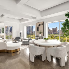
Nothing lasts forever, and the fussy ostentation characterizing the pre-recession renovations of many classic prewar New York City apartments is finally giving way to a cleaner, more modern look.
One good reason: As even my most traditional clients have realized, it’s cheaper to achieve a great look if the materials are simpler.
Here’s the deal
Here are the five major trends I’ve been noticing lately:
1. Kitchens
Before: Granite countertops and traditional glass-and-wood upper cabinets with a lot of moldings.
Now: Simpler shaker-style glass-and-wood cabinets without moldings. Increasingly, more kitchens do without upper cabinets altogether, relying instead on one floor-to-ceiling wall of cabinets that also includes appliances.
Granite, especially the speckled varieties overused by some mediocre developers, often appears dated. Understated countertops like white Caeserstone and stainless steel are the new materials of choice.
2. Bathrooms
Before: Ornate and stuffy. European-hotel-style tubs buried behind a stone- or wood-paneled face, tomb style. Small tiles in intricate patterns and idiosyncratic colors. Over-designed toilets and pedestal sinks.
Now: Sleek modern tubs and modern, unfussy plumbing fixtures. Modern European-style toilets from Duravit and Toto.
Clean neutral palette. White tile on the wall, possibly a mosaic on the floor. Overall use of large-scale 12”x24” ceramic wall tile that only became available recently—fewer joints produce a cleaner look.
3. Wood floors
Before: Medium to dark brown
Now: Really pale or almost black “gallery” floors. Slightly wider, 3 ½” planks cost a little more but are an inexpensive way to balance the effect of a restrained hand elsewhere. Some clients are starting to ask for distressed flooring in random sizes.
4. Home office
Before: Preference for home office in a maid’s room or other totally separate space.
Now: Partly because more people are using laptops as their primary home computer, and partly because of a growing affinity for modern open-plan living, home offices are shrinking and coming out of the closet into the main living space as a small dedicated area.
5. Lighting
Before: Circular recessed lighting
Now: Rectangular recessed gallery-style lighting installed around the perimeter of the room and directed at the walls. Slightly more expensive than traditional recessed lighting but it looks more sophisticated and is a much more subtle way to light a space.


